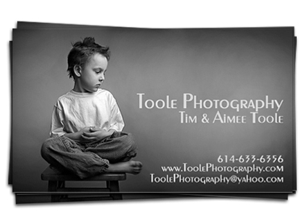
 Tim Toole is a BIG FAT WINNER. He won through a random draw, but his cards are still nice and they clearly communicate who they are and what they do. Do yours?
At the beginning of the month I announced the BIG FAT BUSINESS CARD GIVEAWAY THING. The contest name was big. The prize package was also big. It was launched this month because November was the month VisionMongers was released. I got a new book, one of you got a bunch of stuff. Seemed only fair.
The winner, after pulling out mulitple entries, adding extra points for the top ten creative entries, and consulting the random-o-tron, was Tim Toole, which is particularly gratifying to me because like me, Tim was once a comedian. He’s also a heck of a photographer and his images of the tooth fairy still make me chuckle. So Tim, I’ll drop you a line and arrange to get this stuff to you.
Honorable mention goes to Magda and Maciek for Most Creative entry, Toni from daily vignette for Biggest Attempted Suck-up, Scott Sporleder for Most eye-catching, and Matt Beatty for Most Sarcastic. Sadly, there are no prizes for these categories, only the knowledge that you made me smile 🙂
Tim’s got a nice box of goodies coming his way, thanks to all of you for playing.
I encourage you to all look through the Flickr pool, even if you didn’t enter. The take away from this is that business cards can be – and should be – as unique as the people, and businesses, they represent. But they are all pieces of visual communication, and all of them say something about – intentional or otherwise – about those same people and businesses. Consider taking a long look at the business card you use to represent you. Is it consistent with all your other marketing efforts? Is it creative? Is it congruent with who you are, and what your branding says you are? Is it well-designed or does it need work?
I bring this up because it’s so easy to get a stack of business cards done for $20.00 but can you afford to? This is communication, in much the same way as photography is communication. I’m not suggesting you go into debt to get great cards, just asking you to consider who you are, who your market is, and if your current cards are truly the best way to represent you to your market. Some of you have photographs on your cards; are they the best images you could be using? Do they open conversations or do they pigeon-hole you? Some of you have cards that are hard to read – why? Some of you have cards that you really like but that are poorly designed, have you considered how this establishes an expectation in your market that will affect what you can and can’t charge?
Such a small thing, but it’s often the first impression or the one that lingers the longest because it says things about you when you are not there to say those things yourself.
Congrats again to Tim, and huge thanks to OnOne software, Kelby Training, Evrium, Peachpit, Steven Pressfield, and Selena Maitreya for sponsoring the giveaway!

Comments
Pingback: Who Are You? & Business Cards | Graphic Design
PS One of my proudest moments as a photographer happened today – you might want to read it. 😀
http://shuttersisters.com/home/2009/12/1/vision-is-better.html
and on my own blog:
http://dailyvignette.com/2009/12/01/vision-is-better/
Congrats to Tim! At least my attempted suck up didn’t go in vain…well, I guess it did go in vain, but at least it didn’t go unnoticed and brought a smile. 🙂
Toni | Daily Vignette
I did some searching and found out the series that made me build my card.
http://www.pixelatedimage.com/blog/category/on-design-series/
Congrats Tom – I really like the card! Now I’m inspired to go and revamp my own.
Cheers.
Thanks, Marge. Cool cards. And agree, Tim’s was a worthy winner.
David…you didn’t mention who was the top-10. Soooo who got the extra points and why?
Congrats, Tim. Enjoy the formidable price!
My congratulations, also. BUT, I feel as if I won in this contest also. Even though my ‘card’ was a tongue in cheek spoof on my previous ‘lurkiness’, it got me working on ‘real’ cards and also introduced me to Moo Cards who will be printing them. Thanks for that inspiration and that lead.
Here’s the Flickr link:
http://www.flickr.com/groups/1236250@N24/
Flickr pool link, please.
Congratulations Tim!! As David says, a worthy winner despite the random draw, and many thanks to David & the sponsors for giving us all another great competition. Cheers guys! 🙂
Whooh hooh! You know I built that business card for your last business card challenge where you were giving away a couple of Lexar cards. I was one of three to enter and you had a minimum of 8 needed. Guess this card wasnt meant to win that one. But seriously – if it wasnt for your series (and I cant for the life of me remember the name of that series) I wouldnt have taken a serious look at my business card design. And people have loved it. Thank you for the inspiration and direction David.
And thank you for the package. My gosh there is alot of stuff there. Looking forward to getting my hands on the books. Thanks again!!!
Geez, not even an honorable mention for being the “first” business card… You run a tough competition David 😉