
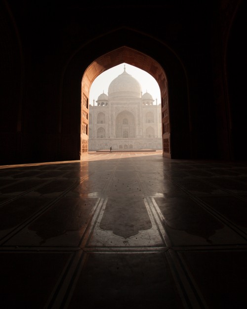
I recorded a new episode of About the Image this afternoon. Episode 14. It’ll be online in a couple weeks, I think. But I wanted to post the images here. 3 different versions. If you want to play, here are a couple questions to consider:
- How does the top image use shadows as a compositional tool?
- What does the choice to leave the shadows free from details give us that a more detailed version, below, does not?
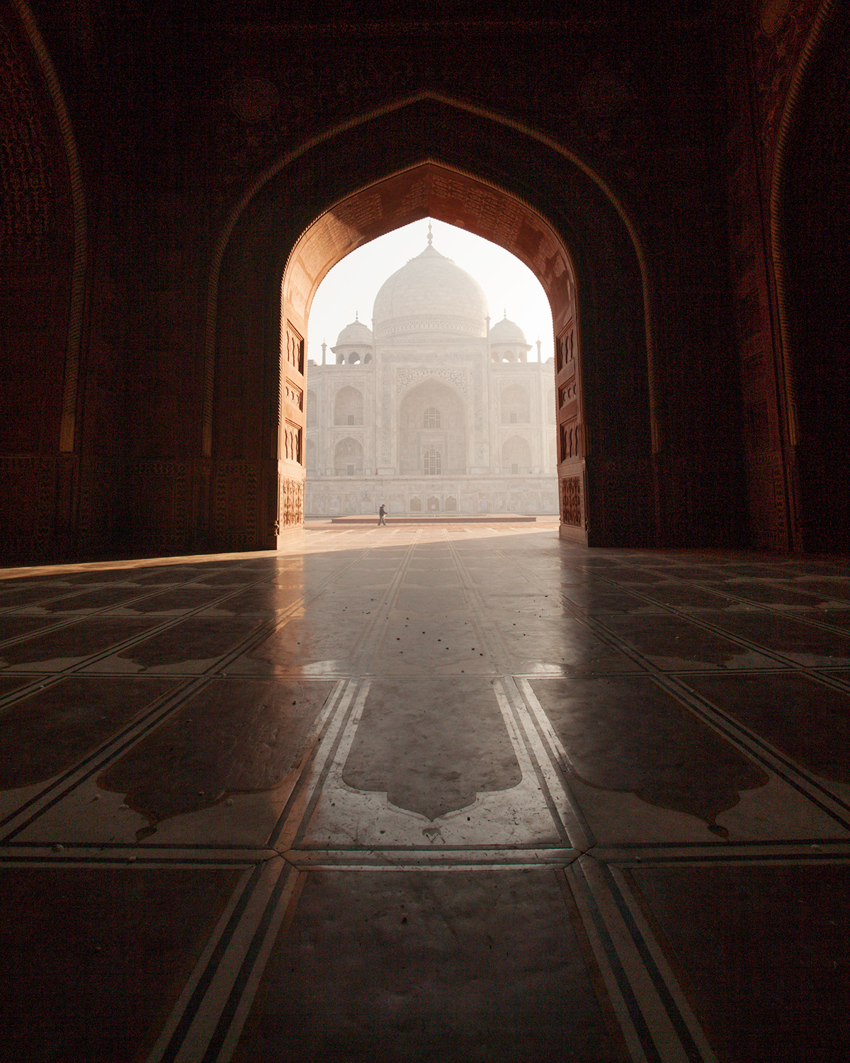
- The second image, below, has much more detail in the shadow, popular these days among those who insist on this sort of thing. Is it stronger to you? Weaker? Why?
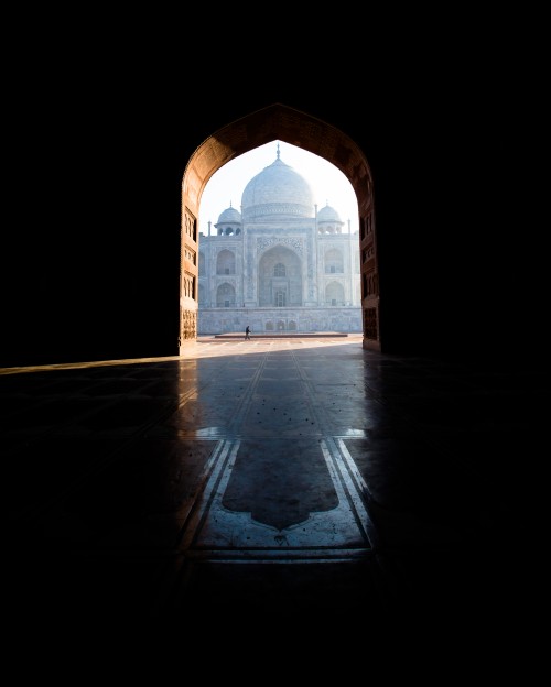
- The third image is the same as the first, with a change in colour balance. How does that colour balance shift change how you read and experience the photograph?
There are no wrong answers, just a chance to exercise your visual language skills. Comments are open if you want to play.
If you enjoy this kind of discussion, you can get more on the free Craft & Vision video podcast here, and more still in Photographically Speaking (Amazon link), a book I wrote a couple years ago that is, I think, my strongest teaching on composition.
Comments
It’s difficult to place a choice since all three has its merits and have it’s own intent.
The first uses the dark shadows as a solid frame around what is the main focus of the image – it would serve the intent of drawing all the viewer’s attention to the center of the frame.
The second softens the focus on the main building but instead sets up more context in the elaborate interiors of the buildings in the complex – main focus of the frame still tells you the location and sets up the core intent of the image but also clues in the other contextual details that are available.
The change of colour temperatue perhaps makes the intent of the cooler choice of temperature towards making the image more ‘comfortable’. This may differ with from viewer to viewer – coming from Malaysia that sits just above the equator with a year round warm climate – the cooler temperature makes it more ‘comfortable’ and as we sit our perpetual summers longing for the cooler climes of temperate countries – it adds a level of intrigue to the drab warmer temperatures of the scenes we see here?
I’m late to this party, but… The flat shadows of the first image really emphasize the abstract design. Lack of distracting detail also serves to increase mood and feeling. I really like how the symmetry of the image’s design is broken by the shaft of light and tiny off-center figure – the perfect moment. I would have experimented with bringing ever so slight a bit of light into the top shadowed area, the barest wisp.
Although the viewer can enjoy more of the beautiful architectural detail in the second image, a degree of design strength and mystery is lost.
I find the color temperature in the third image doesn’t ring true enough to nature for me to ‘buy” into this piece. Objects become cooler in color as they recede into the distance, but the distances portrayed here aren’t that great. I think that the first two images are warmer than nature, but we “buy” into their reality because the relative range of warm and cool colors seems appropriate.
The first image gets my vote. I imagine this very scene was “built in” to these structures by the original architect, right down to “the implied reflection of a portion of the Taj’s structure on the floor” (thank you Tricia above…) It’s a very strong vertical graphic, beautifully rendered in stone and masonry, and captured and finessed perfectly here in this image. The tiny figure marching towards the center brings in a human element that adds depth and scale, allowing us to appreciate the vastness of the architecture we’re viewing.
Too much floor detail (image #2) and that strong sense of vertical space is diluted, for no apparent gain. The third image returns to the proportions of the first, yet the (seemingly) unnatural color contrast confuses my eye and distracts my mind from the stronger image qualities mentioned above.
Now here’s the kicker… I think what moves this image out of the “good” and into the exceptional is that cantankerous diagonal shaft of bright sunlight ripping across the floor at an unholy angle – it challenges the whole image – it skews the balance and peace of the vertical perfection – it ruffles the feathers – it makes me crazy, to tell you the truth. Why couldn’t we just have a nice happy architecturally graphic image of pretty buildings and all go home? But no….. Yet the tension it creates is a big part of what brings me back and back to this image.
One last thought – that much pure black space (+/- 25% of the entire image?) in the top half would usually not work, but here it seems to be just fine. Interesting.
Thank you David, for this image and this web site…
Thanks for adding to the conversation, Barrett.
Great thoughts, friends. Keep an eye out for About the Image, Episodes 14 and 15.
I personally like the first image. As for the third image, it doesn’t seem quite to fit the feeling of the place as I think of this place as warm (hot) and a warmer tone seems to better match the location. The second image seems to let the eye wander too much around the edge of the image and away from what I perceive to be the main subject of the image.
I would have to come down on the first of the three images. I feel the third is too much color contrast between the building and the sky and almost makes the blown out sky even harsher. The second has just a little too much light on the foreground and creates a little bit more distraction. When thinking about what is within the frame this image has A LOT within the frame. There is a lot of good stuff but all of that good stuff quickly can compete for the viewers attention.
All of that being said, I would throw my hand up for image 1 although I might like to see a bit more of the detail on the floor to show it is a repeated pattern (not too much though to keep from becoming a distraction).
I write this without reading those earlier comments. I will read after I post it. 🙂
I am not a photographer but I like reading your blog and had read one of your book. My comments is base on subjective view without photography terms . I like the 1st image. The second to me , – too much details The 3rd is a bit of odd bec the 2 colors were fighting 🙂
Avoiding looking at the previous comments first :). For me the third image is the stronger. The darker shadows surrounding the opening frame the subject much more strongly than the image with detail in the shadow areas. The eye is drawn strongly towards the Taj. The shaft of light on the left is a powerful element that complements the framing and because of the dark shadows is made even stronger. The colour shift to cool blue in the foreground and on the Taj also allows that shaft of light (warmer) to have a stronger visual pull on the viewer.
I enjoy the bottom image the most, slightly darker, it has depth and mystery, and draws me in….
I prefer the first image. The floor design is subtle enough to draw your eye into the archway and the subject beyond. The second image with the more pronounced floor design, takes away from the mysterious subject beyond the arch. I so not care for the coloration of the third image. Your work inspires me and I benefit greatly from your publications and videos! Thanks!
I like how the 2nd image gives the inside more depth than the first image. I can see the floor and know how far I am from the door, and then to the Taj Mahal outside, and leads my eye better out the door.
The third image feels too cold for me and I don’t like it at all.
My favorite is the 2nd one.
I have just come across your blog and the first post i see i love! Gives you a lot to think about! I like all the 3 images but i think the third is the strongest. blog.ziphotography.co.uk
First I must admit that I did not recognise the subject. I have never been there, but as an architect I should know 😉 Thanks to those commenting above we have that sorted; a quick check at the sat map reveals that the Taj Mahal is east of the mosque. The light angle is quite low, so I guess it’s a winter morning.
The knowledge of what you’re looking at always affects your opinion. The first image is the obvious choice – monochromatic rendition in a pleasant colour – let’s one concentrate on the geometry. But knowing what is in the picture, namely a Temple and a Tomb, I would go for the third version.
As for the second rendition, as said above, the extra detail lessens the WOW effect of the discovery of the floor pattern/reflection similarities.
But what I would really like to see is a FOURTH version: a couple of minutes later with the light stopping at the edge of the archway. For me the floor pattern is enough to suggest the space inside, and the apparent void where the beholder stands would perhaps make the image even stronger.
The other thing that we’ll never know is whether the pattern/reflection similarity was deliberate? I would say no. The ornament is a traditional one and it faces towards the inside of the mosque, and is repeated all over the floor. Life, and the world around us, is always bigger than any design.
First of all – what time were you there to only have one person in the image?!
I love the deep shadows of the first and feel it is a more powerful way to frame and draw attention to the subject. I am often afraid to use this myself because my photo instructors always said we had to have details in the shadows, which can be frustrating at times.
But, I also love the added detail of the 2nd image. They help as leading lines and further frame and accentuate the shape of the Taj as well as show the ornateness of the whole site. I don’t find it distracting from the subject as others do, or stronger or weaker from the 1st. Just a different way of seeing.
The third- I really like viewing work where colour temperatures are mixed, as in this one – but I shy away from it as well in my own work because I often worry mine looks funny. I like how the detail in the Taj comes out more with this colour shift and the colour contrast also helps theTaj stand out more from the frame of the room around it.
Great exercise – I really should remember to do this myself while shooting.
I think that the first image shows what you normally expect to see after you take the image, the eye see something but the camera sees another thing, the sunrise there is quite warm so this image shows what you see there, I took the same photo based on one that shows in one of your books 🙂 but I think that showing the shadows somehow distracts you from the real component of the image here, the taj mahal, anyway the decorations in that part are quite nice so it definitely deserves a photo on its own. thanks, I have used your images as guides and where to visit…
My eye likes the color contrast in #3.
My brain likes the architectural information in #2.
But for strongest mood, I prefer #1.
I’d like to see it with a square format. The slant of light on the left is very important to me; it gets me looking left and right, not just up and down at the view and the mirror image in the tile. I try to imagine how far the beam reaches left, and where the sun is outside on the right. This adds another layer of interest for me.
Personally, I think #1 is the strongest, or at least captures my attention the most. #2 is a bit too bright as it lights the tiles on the floor which leads my eyes all over the place, a little confusing. #3 is too cold and too much contrast in my opinion. The warm arc and then cool Taj throws me off as a sharp contrast of the warmth of the outside, and coolness of what is inside, which I don’t think is true when visiting the Taj.
So, personally, I like #1 best because the reflection on the tiles only highlighting the Taj, the warm color tones and the realistic feeling it gives off of India (if that even makes sense) 🙂
The juxtaposition of light-line-powerful moment principle you teach so well may best be rendered by #1 because it is most simplified (distraction-free). Having stood in that same spot, it captures the mystery and awe I remember. But, I wonder about #2.
The Taj’s story purports to be of love, and was built to memorialize the emperor’s ‘favorite’ wife who, it is said, died during the birth of their 13th child. The Taj is stunningly beautiful and close inspecton of the marble covered by inlaid precious-gem flower patterns renders you speechless. What if #2 was cropped vertically, (more as 8×12?) to eliminate the arches on either side and draw focus to the three taj shapes in the foreground that remain? Somehow I notice their combined shape resembles a blooming flower, hinting at the feminine quality and essence of the place’s reason for being, and because of the low angle, work with the converging lines to draw a viewer’s eye to the ‘real time’ moment.
Maybe too complex and overthought, but the exercise showed me how experience impacts interaction. Thank you for continuing to thrive so that we, in turn, may as well.
It looks to me like the changes between the three are changes to the entire image.
Of the three presented I tend to agree with most others that #1 is the most attractive.
However, if I were using the photo to document my travels I’d probably prefer #2.
Also, too, I’d like to see the image of the Taj building from #1 or #3 but the detail from #2 in the same image. I guess you could do that with photoshop by masking the arch part. I’d also like the Taj to be less fuzzy.
Wow, so much to think about/like in each image.
The first is perfect. Color, tone, leading line, shadow. If I hadn’t seen 2 or 3 I wouldnt have thought anything more but…
2 has too much detail in total but I really like the added light around the arch. That second layer of light really pops it for me. The rest I could do without.
3 with its blue tone does make the outer buildings detail much more visible to me. My brain isnt sure likes it but there is something Im drawn to.
The first image clearly directs my attention to a subject: the Taj. While the second image allows my eye to wander the massive room from which you took the image giving me a sense that the subject has become more about the massive structure form which the photo was taken and echoed by the looming Taj Mahal. The symmetry the first image creates by isolating the Taj and the floor tile, for me at least, hints at an ancient design, a hidden pattern for the ages only visible from the spot from which the image was taken. And while the third image is similar to the first, it gives the feel of a cold early morning versus a warm afternoon. Its funny and fascinating how that all can be conveyed in a photograph and altered with relatively simple adjustments. Great image by the way!
I discussed this with my husband who has been helping me develop my photographic skills. He prefers the second because he wants to see the details on he floor. I prefer the last because I like the idea of coming out of the darkness to see the beautiful scene beyond. it gives me a main focal point and makes me want to go further into the photograph for more information.
I like #1 best but would like to see the Taj a little more strongly like in #3. In #2, the shadow reveals too much and draws my attention away from what I believe is the focus point. I like seeing some detail in the floor and walls but only after I’ve explored the figure and temple. I feel that #2 is too flat and much prefer #1.
Really interesting exercise, I enjoyed doing it very much.
I’m not keen on the blue tint of the third photo and between the other ones, my preference goes to the first, but the second is also beautiful for other reasons.
I find what’s really interesting to note is that in the first one, the foreground appears almost as a vertical plane, with an old keyhole through which we look at the mystery beyond and the beautiful building which is truly the subject.
In the second one, the plane of the floor is clearly horizontal so the dimensions are changed. The pattern of the floor becomes the subject, as well as the immensity of the room whereas the Taj seems much smaller, almost inconsequential.
Thank you for this fascinating exercise and very beautiful images.
Dear David,
Personally I prefer the first image and think this is the one you prefer as well 🙂
Here is my reading of it :
You have made a nice symmetry in this picture by well balancing the upper and bottom parts but also by letting the soft shadows in the dark. Moreover the design on the pavement is almost the reflection of the mosque itself. With more details, the symmetry disappears and the image starts to lose a lot of purpose. You have chosen the right exposure and the right position for this symmetry.
The sharp shadow of the entrance reveals a strong sun outside, but not at noon… rather the morning of late afternoon suggested by the far penetration of the light inside the room. This ray of light leads the reader to go straight outside, to the mosque and then come back inside and observe the reflection of the light on the pavement. This moment inside suggest mediation, hope and expectations when the eyes go back and end finally on the mosque.
I think that it is the morning because of 3 reasons :
1. the moisture in the air
2. There is only one person outside, walking from left to right. He is on the left and it suggests me a one-day journey has started
3. The orientation of the camera for this picture, looking from a dark room to the bright mosque outside suggest a new start, a kind of revelation after a meditation or a re-birth after an inspired moment in the dark.
The presence of that man gives a piece of life and his small size in this spiritual place inspires a strong humility.
Finally, the color balance chosen provide a contrast that fits very well with the symmetry : the upper hot atmosphere outside suggested by the sun and warm colors against the cool bottom, suggested by the deep dark inside and the fresh pavement of marble. The third picture gives the feeling that it is cold both inside and outside and makes the symmetry without contrast, rather uninteresting and uninspired.
This is the way I read this picture and this is why I think you prefer the first one as well.
It is a wonderful picture David,
Thank you for it
I prefer the second. Before I explain though, I find that the fact the image is ever so slightly tilted to the left, i.e. not horizontally straight, very distracting.
That said, #1 is nice, #3 looks too unnatural. In #2 the leading lines take my eye straight to the building, which then quickly reflects back to the pattern on the floor that appears to almost be a mirror image of the building.
To my eye #2 has the most depth and sense of completeness as it provides the most comprehensive framing and frame of reference to understand the image.
All of which goes to show that “beauty is indeed in the eye of the beholder”. 🙂
the first image for me communicates the place most powerfully…its dryness, the heat, the haze of the morning sun…I looked at these pictures from last to first (i tend to read magazines backwards) and oddly did not notice the man until I looked at the first one – as someone noted above, apparently this image, perhaps in its simplicity and tone draws the eye across that beam of light entering the room towards the man outside. The second picture has me looking at the floor and not so much the building in the background. The third one, the tone of the building sort of clashes with the tone of the arch. I have a stronger feel of place in the first one…also interesting that the first one has the pattern in the floor almost looking like a shadow of the building in the background.
I prefer the first, because of subtle context, and I feel clever at making the connection between the floor pattern and the Taj (?). The 2nd is too blatant and you also lose the effect of the leading diagonal line from the left. In the 3rd, the hue doesn’t feel quite right, and the subtly is lost. ALTHOUGH… it does draw out the human element.
Lovely composition nonetheless.
For me, the temperature contrasts between the arch and the monument (both in the background, and the reflection in the foreground) prove to be the most powerful in telling the story of this location.
I am referring to the third image. Oops.
OK, I’ll play….the first image is about the journey of life with hints of big questions such purpose, direction, brevity and eternity. The focus is the silhouette of the figure. The buildings and interplay of light and shadow provide us with context and to a certain extent commentary for this story.
The shadow choices in the first image remove detail that would distract from this story. We are left to ponder where we (individually, corporately?) are headed? What set of clues does the past and its architect/philosophers give us? Does our journey take us towards ‘sunlit uplands’? Or is the journey like a swallow passing through a warmly lit banqueting hall simply a brief escape from Winter’s cold and dark?
In the other two images the buildings dominate in one way or another and the figure merely seems to be there to give us a sense of scale. Just real estate brochures really 🙂 The blue colour in the third draws me to the outer building, whereas the tiling pattern detail in the second leaves me more ‘trapped’ in that building. Because of that I prefer the third to the second.
The coolness in the reflection in the third looks unnatural to me, in contrast to the golden light on the doorway. The lifted shadows in the second one diminishes the focus on the Taj, as another comment mentioned.. As I type this I wonder if my reaction to the white balance would change if I saw them in the opposite order – might be fun to randomize the order in posts like this to see if that changes anything…
I choose the first for its simplicity, fewer distractions, the focus on the primary structure and its reflection below, the bright line leading to that very “central” focus, and the overall warmth in colour. Thanks, David, for starting this discussion!
I’m a sucker for warmth so in the 3rd image, the cool building contrasting against the warm light confuses me. The foreground shadows are also darker.
There is an argument for the second but it’s a flat literal interpretation of a location. It has it’s purpose.
The contrast of the first one directs attention to outside and the walker. I’m more interested and focused on the wall textures of the second image.
While I can see myself sitting there in both, feeling like I’m sitting in the dark (the first one) and looking out into the bright outside has a stronger connection and mystery. It still has enough detail in the floor to show depth.
I’d want to see the second in a travel guide but a print of the first. The 3rd is a dud. 😉
Well no signed print of #3 for you, then 🙂
The first image uses shadows as a guide for me to look towards the light – first the figure, and then to the Taj.
The second, HDR-like rendition, leaves little to the imagination. With so many details in view, my eye meanders around the whole image. There are multiple subjects – the repeating patterns, the figure walking towards the light, the Taj. The answer to whether it’s weaker depends on the photographer’s intent. Was it to show me everything in the frame? If so, it’s a success. But it’s not my preference.
The coolness of the third image conjures a different season – Winter sun, perhaps. Having stood in this spot a couple of weeks ago, I believe this is late afternoon sun, from inside the mosque. I think the “truest” white balance is between the first image and third image, and that rendition would be most pleasing to me.
Of the three here, I like the first image the most. I like the implied reflection of a portion of the Taj’s structure on the floor. I like the use of the arch as a perfect frame for the Taj. I like that the figure is walking towards the light, and that the shaft of light enters the mosque, pulling our eyes to scan that space. It’s a lovely perspective on a place usually crowded with visitors, and a tribute to the beautiful architecture.
I like the third one the best. The color contrast adds depth and inspires my sense of touch. It’s easier for me to imagine what it feels like to stand there.
The second image merely gives my eye room to wander, but leaves me wanting more. Also the lines on the floor draw attention to the fact that it’s not perfectly symmetrical, and it’s driving me crazy –especially considering the impeccable detail of the Taj Mahal…
David you are so excellent at what you do. You get to the small details that make me think about all the choices I have at my disposal to really make an image into what I want it to be.
Thank you for sharing your wisdom. I don’t know if you ever tire of hearing it, or if it gets so repetitive that you start to dismiss it, but I mean it from the bottom of my heart. You are so talented as a photographer, but even MORE SO as a teacher.
You’re welcome 🙂 Thanks for being part of this!