
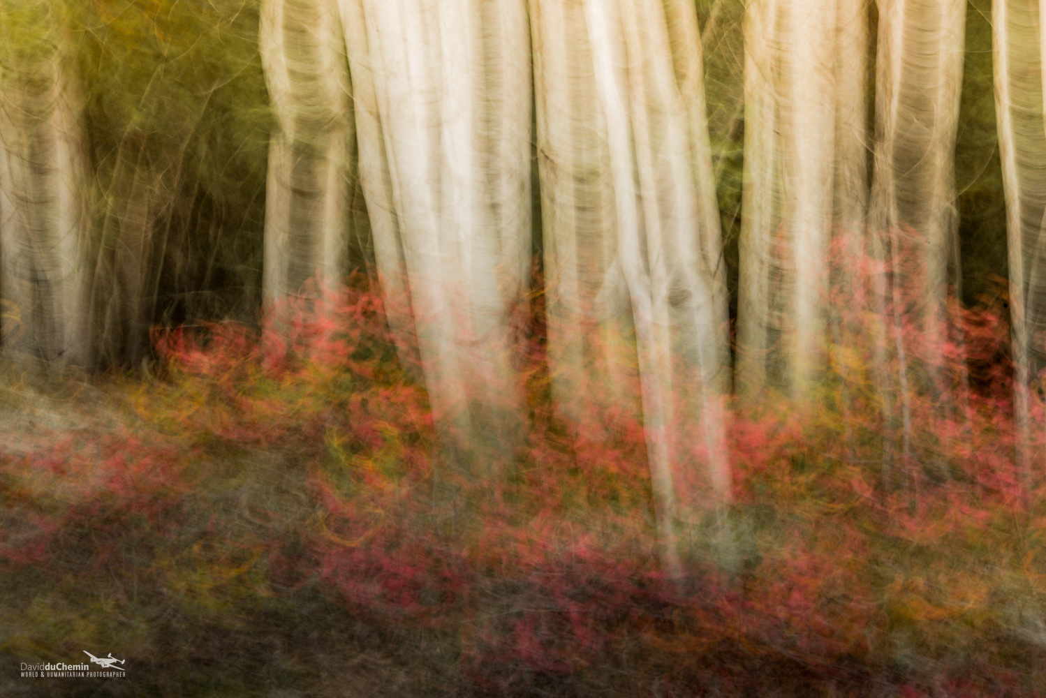
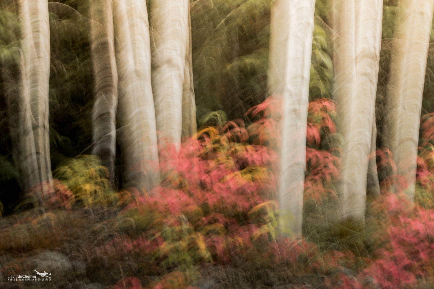
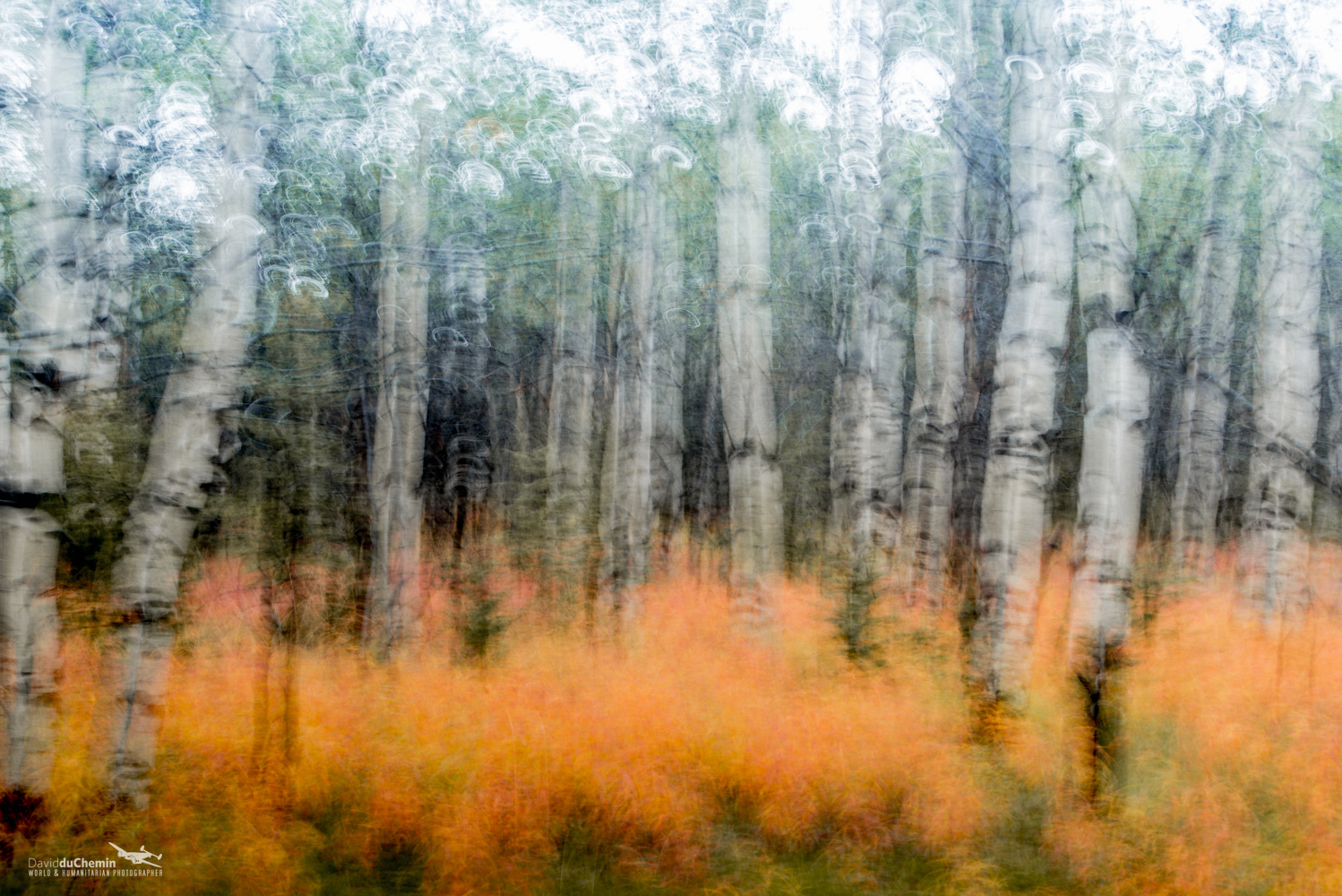
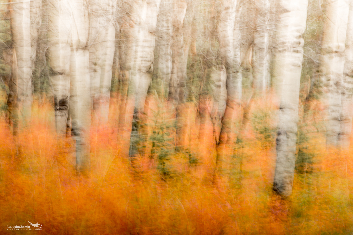
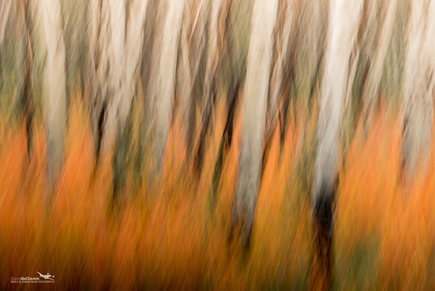

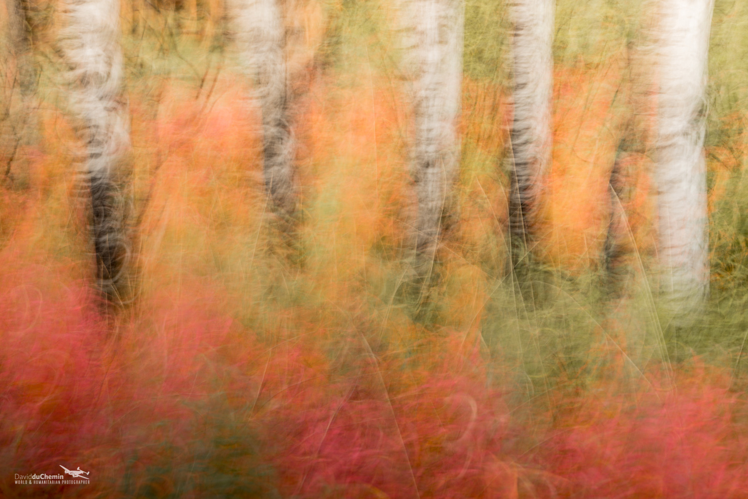
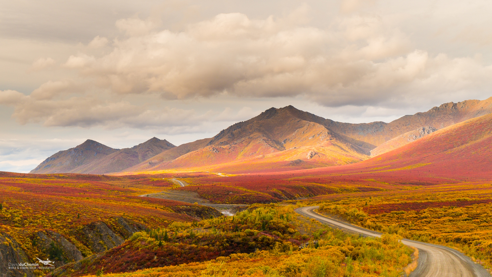

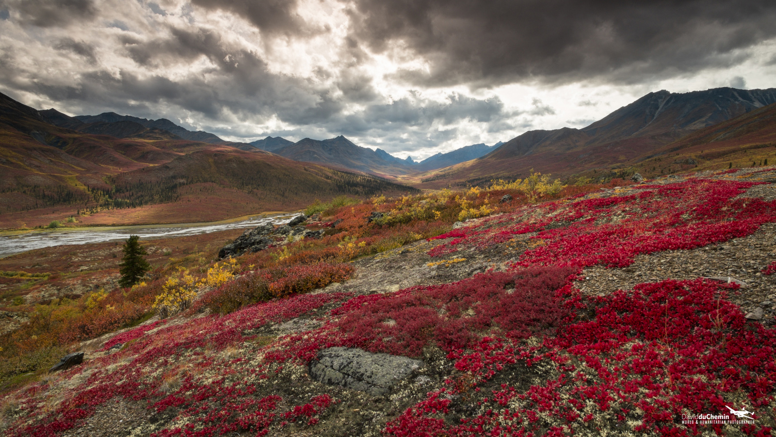
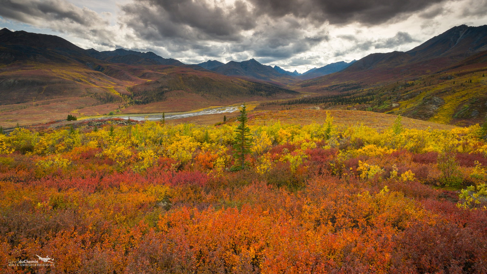
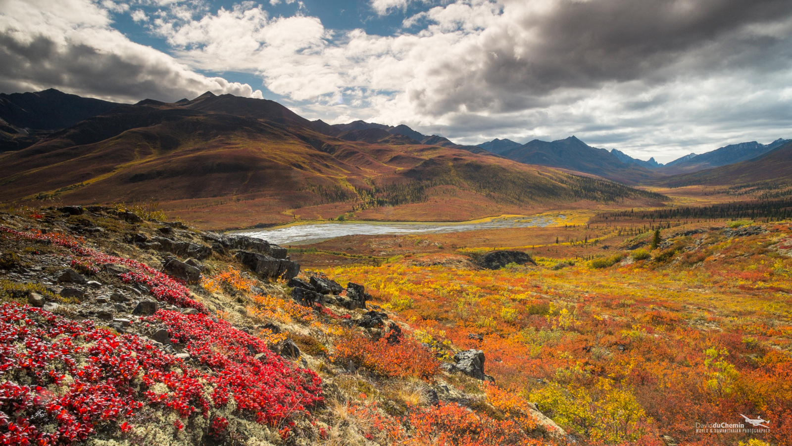

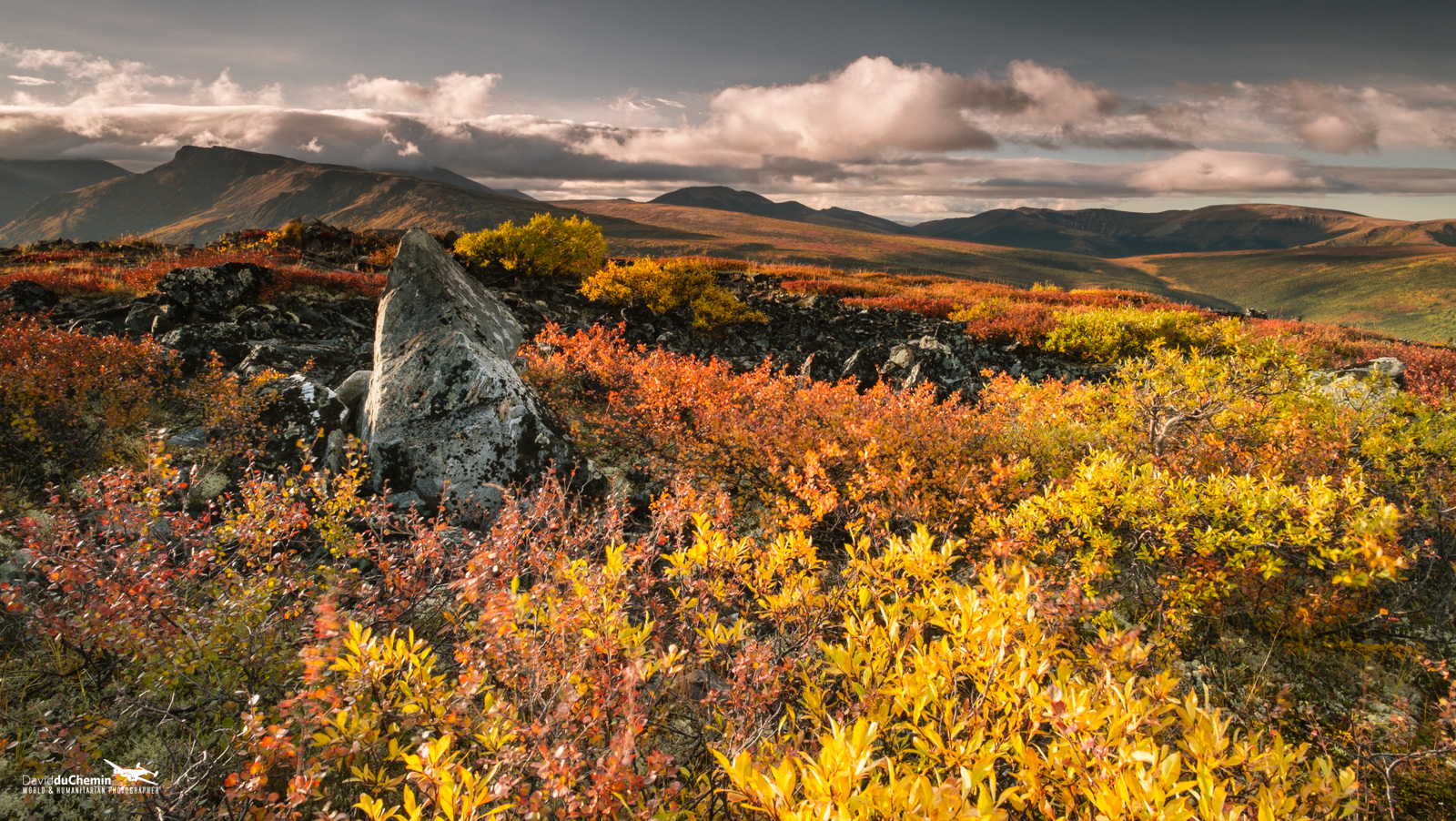
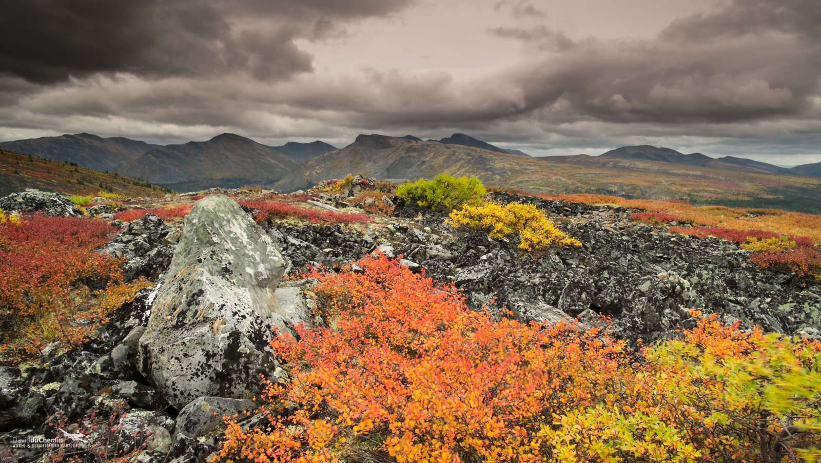
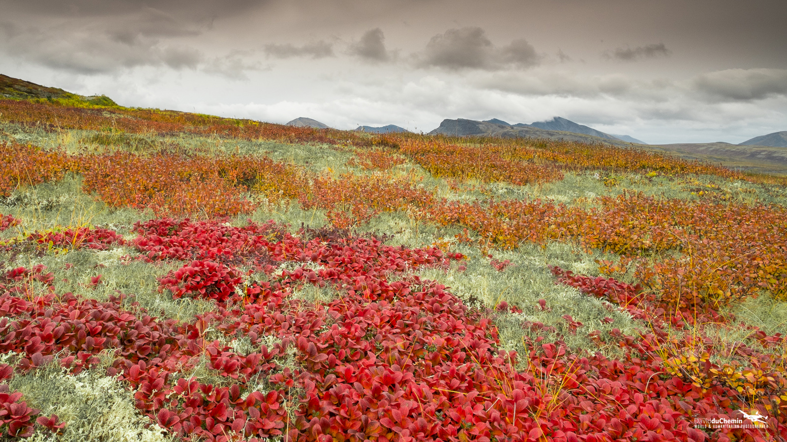
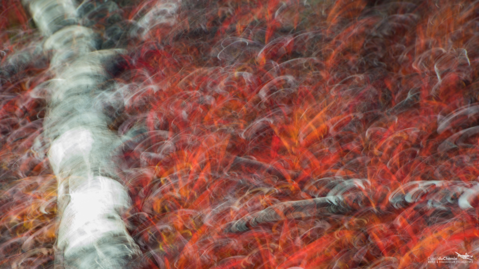

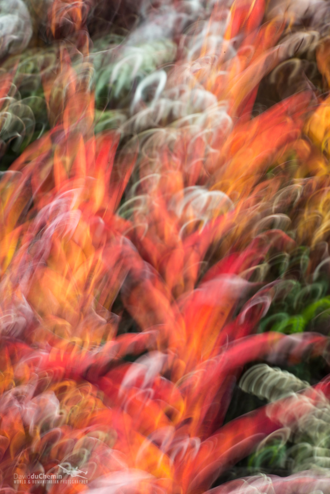

Here is a small body of work that I brought home from the Yukon, before cutting my trip short with an axe to the leg*, which has proved not to be one of my better ideas. When I headed north last year I was blown away by the colour, even though we’d missed its peak by a good week. This week we went earlier, hit the colours perfectly and just didn’t get the time I wanted there before we turned around and headed south. A 9200km round-trip, we saw an incredible amount of wildlife, camped in some beautiful places, and had a truly epic adventure. The colours hit me this year like flame, and from the beginning I tried to work with a flame-like colour palette and experiment with intentional camera movement to better express that in some of the photographs. Next year I plan to be driving across Canada for a couple months in the fall, so I’ll add to this with the maples in the east as they too turn blaze red before settling in, bare-branched, for the winter. And then I suspect you won’t be able to hold me back from the Yukon in early September the year after that.
Click the first thumbnail and it’ll enlarge. From there you can scroll through the larger images to see the whole collection.
Earlier this week we released **The Visual Toolbox, 50 Lessons for Stronger Photographs, my most recent book. It’s the lessons I wish I’d learned and applied myself to when I was much younger, instead of becoming so side-tracked by gimmicks and gear. For more information, see this post.
* I’ll tell you about the accident on Monday. I’ve got a post all ready to go.
**UPDATE (SEPTEMBER 24, 2014): The Visual Toolbox has been acquired by Peachpit Press! This product has be pulled from the C&V store never to return. When Peachpit publishes it in early 2015, it’ll hit bookshelves with a new cover, and 10 new chapters.
Comments
I can’t believe you were up in Yukon and I missed you! Clearly I need to subscribe to your blog…
Can I entice you to come back for some northern lights? 🙂
Alistair
Great work again. You’ve been experimenting a lot with slower shutter speeds lately. Creating paintings with the camera. Nice idea 🙂 Please be careful on your trips. Hope you get well soon and we’re back on enjoying your art and learn from your thoughts.
Beautiful colours David. Pity it’s all still green, green and more green over here in the UK at the moment. Can’t wait for Autumn to roll around properly!
Hi David,
I’ve just read your tale of the axe wound..
This is just a short note to wish you well and a speedy recovery. Hopefully nothing like the Italy experience!
All the best,
Clive.
Hello David,
You mentioned a while back in your old post a way to track your route with a little machine. I lost that post. Can you please indicate me which post is it or which device/system you used ?
Thanks,
Cary
Cary, it was this: http://www.findmespot.com/mobile/index.php/main/gen3/
Hi David
Sorry to read there was an axe incident. You’re kind of dangerous…
The impressionist approach in some of these hits me very hard. Sure, I enjoy an accurate photograph of fall color. But this technique you are using just feels so good. That probably doesn’t make much sense. Let me try again; these photographs capture a great deal of what I feel when I just let a fall scene pull me in.
Hi David,
Wow what a beautiful colours and I really love this art. Nearly can’t wait for the moment the colours are changing here (everything is still green). But probably I will already try something with green to have the experience when the colours are there. Thanks for sharing……
Cheers Stefan
So, David, did you try processing these as black and whites? ;o) (Sorry. I couldn’t resist the comment.)
Such beautiful, evocative images. They brought back memories of a trip 41 years ago, camping on the flame-red tundra of Denali NP in August, while the grizzlies chowed down on berries.
I especially enjoyed the sense of exploration embodied in this portfolio, both geographically and artistically. Very inspiring. Can’t wait for that new eBook on motion blurring.
Thanks again David, for sharing some insane photos. Fall is my favourite season, always has been and always will be. Maybe it’s because I was born in the Yukon – land of the Canadian Gods; nothing up there is small…
You have a very unique ability to really capture the true essence of a place.
Cheers,
Beautiful, just beautiful. I love how the circular pan movements accentuate the shapes of the tree trunks. Having just come home from a second workshop with Freeman Patterson and André Gallant where a good amount of our time was spent experimenting with exactly this panning technique, I can’t help but wonder if you and André have crossed paths at some point?
Thanks, Michael. Andre and I met for the first time this spring at the CAPA Conference in Fredericton. Lovely man. And Freeman Patterson’s been a hero of mine, now a friend, since I was 16.
Very cool. Yeah, they are both awesome people and photographers. So incredibly open and giving, passionate about their art and environments. I feel similarly regarding Freeman, though I didn’t discover him and his work until my late twenties. Went digging in the Yellowknife library for photography resources to try to satisfy a burning desire for “more” and his books leapt off the shelves at me.
Fablulous photographs, David. Now I know why you are riding 1.600 Mile with a Jeep. Have a nice grat time tanking colours.
Hi David,
Fantastic collection of images. The landscapes are magnificent, and the ICM images beautiful!
Getting aware from the photography for a moment, though …
Having reached the bottom of the post, though, I tried to click the yellow “Up” button to return to the top and found it dysfunctional. Checking the browser’s console log, the page is throwing loads of Javascript 400 errors — bad requests, and items not found — and these errors are breaking subsequent Javascript from running lower on the page. As a result, the “Up” button is breaking, and who knows what else isn’t happening.
I then checked a few other pages on your site and found other errors being thrown in the console log on your Home page, and on every other page in your main site menu.
You should definitely get your web person to look into resolving these issues.
Cheers,
Matt
*Getting AWAY from …
Seems to be working just fine here. (Firefox 23.0.1, IE 8)
Thanks Matthew. Seems to work OK for me, but I’ll raise the issue with my IT guy. Appreciate you taking the time. Thank you.
No problem, David. If you’d like to take a look for yourself, Chrome browser makes it easiest to see these things. Hit CMD-I (CTRL-I on Windows, I suppose) to bring up the developer panel, then click on Console. Reload the page with the console open and you should see the errors logged. Your IT guy should already know the drill.
Cheers,
Matt
Awesome
Wow – so incredibly beautiful, so incredibly envious! 🙂
What’s really interesting in you, David, is to follow in real time your progress to new achievements. You really show both an artist and adventurer mind. Congrats on your gallery, it’s really amazing.
Stunning….and OUCH
good job! very, very interestig… I like it! Greetings!
Hi David, You have it great up there in the Yukon. Colors and photos are just simply great! I will be getting my color fix in The Great Smoky Mountains this year.
Really beautiful images, just incredible colors, love them all.
What’s so interesting to me, growing up as I did in New England, where most of the color is high in the trees, is the amazing colors at ground level, along with the great contrast the rocky outcrops add.
I do worry, however, that you are not your legs, best friend! 😉
Thanks, Tom. My legs and I have had a chat and are seeing a counselor about these seemingly irreconcilable differences. Turns out I’m an abuser… 🙂
My impressions going through the gallery:
Blurry,
Blurry,
Blurry,
Blurry,
Blurry,
Blurry,
Blurry,
OMG THAT’S THE MOST BEAUTIFUL THING I’VE EVER SEEN
[jaw on floor through the rest]
Note: I know it’s not “blurry”, but it read more funnily than “Painterly, Painterly, Painterly” 😛
Thanks for the laugh, Alan. I needed that. 🙂
Awesome color pallet. They bring back great memories of two years I spent in Nome AK, the autumn colors on the tundra were amazing. Of course the midnight sun in June and aurora in Winter weren’t bad either.
Can you give some instruction on your technique for the blurred images, or is it already in an ebook?
Mike, it’s a lot of experimentation, but yes, there is going to be an eBook about expressionism/abstraction in the near future. My guess would be early 2014.
Yes! I absolutely love your abstract birch images in “Seven”, most notably the plate 32 image which I regularly envision in my mind’s eye hanging large over my fireplace 🙂 Can’t wait to get an insight into your techniques with another fabulous ebook to add to my already vast Craft and Vision collection. Best wishes for a speedy recovery from your leg axe-ing 🙂
Hi David,
In the intentional camera movement photographs did you set the camera so that the picture was slightly out of focus to help with the softened edges?
I didn’t, no, but there’s such a variety of technique available, that that would certainly produce some interesting aesthetics. For my eye I like the sharp focus as it gives me more defined streaks of light to brush with.
I like the impressionist quality, it gives me a feeling of what it must have been like to be surrounded by all that wonderful color.
wow!! good job!! looks like an oil painting