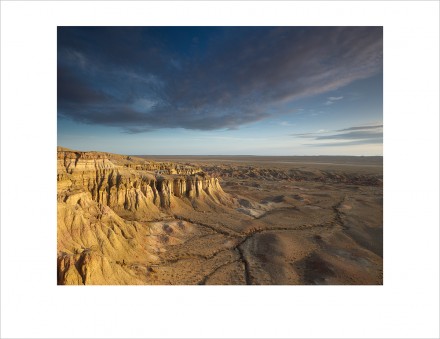
Gobi Desert, Mongolia, 2012. Click to enlarge.
I shot this image in the Gobi last week and used it to show a little dodge and burn to some of the photographers I was traveling with. Most of my images get a little dodge (lighten) and burn (darken), to push and pull the eye subtly through the image. If you know that the eye is pulled by lighter, brighter, sharper, more colorful, and that it is pushed by the inverse (darker, duller, less sharp), you can use that to give an image visual mass and depth. Having done it, with various levels of frustration, for years in the darkroom, I can tell you that the digital approach is much easier. Here’s the sequence:
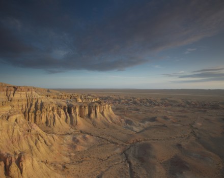
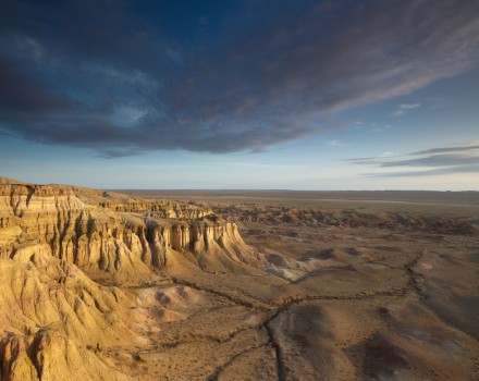
The White Stupa, RAW file, no adjustments. Nikon D3s, 16mm. 1/13th @ f/11, ISO 200. 3 stop ND grad and Warming Polarizer. Tripod mounted.
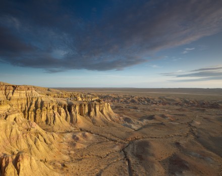
The White Stupa, after global adjustments (Exposure +0.35, Blacks 5, Contrast +15, Clarity +27). No dodge or burn.
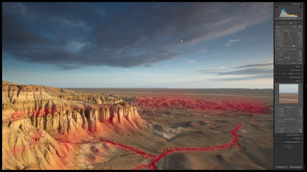
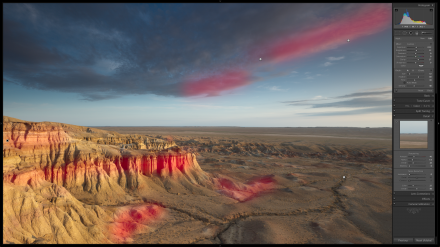
In Lightroom (LR3) Brush set to -0.62 Exposure, -46 Brightness, 37 Clarity to darken lines of river bed, line of background hills, darker features in cliffs. Clarity for texture, and greater pull on the eye. I use either my Wacom Cintiq 21 or smaller Intuos 4 for this work, because it allows me control over my lines and my flow. A mouse just won’t do a fraction of what a pen tablet, even a fairly small and basic one, will do. The red shows the strokes of the Adjustment Brush.
In Lightroom (LR3) Brush set to 0.33 Exposure, 22 Brightness, 37 Clarity, to lighten brighter sides of small hills and call out features of brighter bands in cliff wall. Begin working cloud. Brighter underneath and a little darker on top…
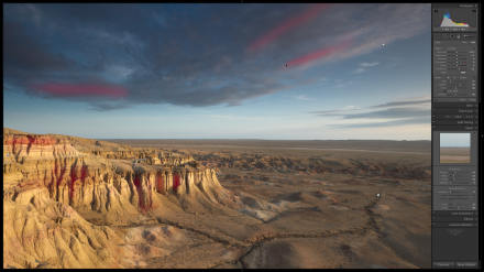
In Lightroom (LR3) Brush set to -0.33 Exposure, -12 Brightness, 25 Sharpness. Burning subtle details in clouds and cliffs to give depth and balance the dodging done in lighter areas.
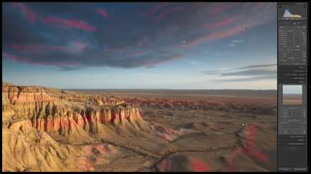
In Lightroom (LR3) Brush set to 0.45 Exposure, 52 Brightness, 25 Sharpness. Dodge final areas to bring out dimension in hills and add final pop and local sharpness. Doing this with separate brushes in separate stages gives me more control.
Final image. When the changes are toggled on and off they are strongly noticeable, but when seen in sequence, less so. Dodge and burn should lead the eye, but remain subtle so you don’t destroy the logic of light on a scene. While it’s tempting to simply brighten something to pull the eye there, it’s usually more in keeping with the logic of light to do both a little dodging on one side and a little burning on the other. It’s a subtlety that prevents the reader of the image from feeling something’s not quite right. Where there is light, there is shadow, so be sure to give attention to both the push and pull of the process.
The visual push and pull of dodging and burning works for every kind of photography, from portraits, and food photography, to weddings, and photographs of kitten and rainbows. I can’t recommend strongly enough that you look into dodge and burn techniques. If beginning photographers spent more time learning this and less time chasing gimmicks and the latest style, their images would be more compelling, their art stronger. We released Piet van Den Eynde’s DODGE & BURN this week. Check it out on the Craft & Vision website. If you go to the post about this eBook you’ll find a discount code; it’s good for a few more days, ending July 22, 11:59 PST.

Comments
Interesting workflow demo, thanks for sharing. It’s always great to see how others work;
…and Glen, the camera, no matter the price, just doesn’t have near the tonal range of the human eye, so post is always needed, in the past and in the present…
Thanks so much for posting this sequence! I haven’t used the brush in Lightroom much yet, but it’s helpful to see how you used it to get to the final image. I look forward to diving into the ebook!
Hi David,
I’ve bought mine and I was about to ask you if you used this “dodge and burn” technique too. Now I have my answer.
Thank you for sharing this picture.
Have a nice trip.
Maïeva Voyage
Good evening.Great to read your post.Thank you so much.
Best Regards
Rupam { xhobdo }
As always thanks for the help David. The way you explain the process and how you use the images with markings to explain what you did to the image really really helps. I have been reading your Lightroom book (Vision & Voice) and its really terrific. I am so grateful you included the files with the book.
In regards to Glenn’s comment, I used to try and get everything done right in the camera, but after further research and readings on nondigital post process performed by the “masters” (HCB, Ansel, etc) I realize that they all post processed to some extent. Some of the famous photos of the past were heavily post processed. For example, I spent some time at the Ansel Adams gallery in Yosemite and if you look at Ansel’s famous Tunnel View photo you can see that the way the light falls on different parts of the image it isn’t 100% real. He was a master of the dodge and burn, and took creative license to make it the way he wanted and to guide the eye through the image much as David is doing above.
For me anyway, learning that fact was very liberating. Now I work on getting the image to look the way I envisioned it in my head starting with the best in camera shot I can but continuing the creative process into the digital darkroom. In camera or not the goal for me is to get it the way “I” want and envisioned it. FYI, David’s books have been a HUGE part of helping me develop and more importantly enjoy all the aspects of my own process. Thanks David for all the work you do with the books, the website, and the classes (some day I hope to attend); your work has really contributed to my joy of the hobby.
Hi nice tutorial. I find however, that having the cliffs the lightest portion of your image draw your eye right out of the frame. What do you think of burning in the left edge of the cliffs?
David – fabulous insight. A Pareto thing where a little editing makes a dramatic impact.
Loving this, love the steps through. I find, like what you say at the end, for this to be successful you finish and kinda feel “huh, doesn’t look like I did anything!”. Then you switch the before on and the difference leaps out at you. If your changes are really obvious while you’re doing it you’ve likely gone too far.
In respect to Glenn’s comment. Until this year I was an ardent “get it right in camera” and minimal post-processing kinda guy. I still aim to get it right in camera (though definitions of “right” may vary!) but I understand that post-processing is a vital step in completing an image. Frankly some of the changes David made to this image aren’t possible to “get right in camera”. I think we may be too hung up on the “get it right in camera” mantra as if that means any subsequent changes are bad. I’d interpret “getting it right” as getting the crop right, getting the exposure right (or at least capturing maximal data), appropriate use of aperture/shutter speed/ISO, avoiding sun flare if you don’t want it, etc. It’s about avoiding sloppiness and resorting to “fixing it” in PP, it’s about getting your field work right and enhancing the result in the dark/light-room. There’s always post-processing going on either in camera, or manually – I’d prefer to be in control!
Btw I love that image David (the top one, not the one with the red squiggles :)).
Thanks David, I learned to dodge and burn in wet darkrooms in the ’60s. I use ACDSee on my laptop when travelling in China and outback Australia. ACDSee Pro5 has dodge and burn facility and it’s so good to use that I’m reprocessing old images and uprating 3 star maybe’s to 5 star keepers. Your eight- image example and workflow description is a lesson in a teacup. Nicely done.
merci pour cette parfaite leçon qui vient compléter l’ebook de Piet que je suis en train d’étudier. Et je suis très contente car je viens juste de m’acheter une tablette Intuos 4 !!
Pingback: Mongolia Dodged & Burnt « National-Express2011
Wow, just downloaded eBook, and there’s a whole lot more in there than “just” dodging and burning. It’s really a whole workflow for the LR Develop panel. And I’m not complaining. I’ve been meaning to start doing more in LR4 rather than PS, and this is going to help a lot.
Wow! Great info, in fact I checked out a pen tablet – mighty pricey. I thought good artists’ brushes were expensive!
Thanks for sharing David. It’s great to see the process.
Wow, I’m amazed to read this article. As a relative beginner who doesn’t know how to use all the settings on my DSLR and only the most basic editing in PSE9, by your description, I do this dodge & burn ever since I took up photography 2 years ago. I never knew what Dodge & Burn meant. People are really starting to notice the editing ‘tweaks’ I do in my zoo photography.
Thanks for a wonderful article. Looking forward to seeing more images of Mongolia.
This post is soooo helpful to me! Thank you so much. Is there a reason you used LR3 instead of LR4? I’ve got to get good at this technique. I’m going to Nepal next year and I want to be able to make the images as strong as possible. Practice!
Glenn, I do everything I can to shoot the best in-camera file I can. But old-fashioned dodge and burn just has to be done in the darkroom, digital or traditional. Even Ansel Adams, who’s considered pretty traditional now, did his fair share (possibly more than) of this. If I can do it in-camera, I will.
You change eveything in POST lightroom or PSD etc..? I have seen your lightroom book. That goes against what other photographers tech. Meaning to shoot it right in camera ! Okay that said and off my chest. I do like your photo work and style and in many ways want do what you do. – Good luck out there, best regards. 🙂
Fantastic insight into the science David, thank you.
I do use Dodge & Burn on my personal work but it’s always interesting to see how it’s applied by others. Have purchased Piet’s software which is great and I’m reading thru the eBook.
Once again, thanks for sharing.