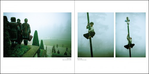

 One of the things I most dreaded about the building of SEVEN was the learning curve related to the CMYK conversions. Last week I set aside some time to prep a collection of images for the printer, putting 15 photographs into a Lightroom Collection and then taking a deep breath. The first thing I learned was that Lightroom 4 has soft-proofing that can’t do CYMK. So scratch the idea of seeing what these RGB files were going to look like with any kind of CMYK profile. Then I tried to Export as a CMYK, but that didn’t work because I couldn’t get the right ICC profile to show up. So I exported the collection of images in Adobe RGB, opened them in Photoshop CS6 and converted them one at a time with Edit > Convert to Profile > Coated GRACoL 2006 which is the profile my printer specified. Then I re-saved them and fired them off.
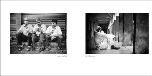
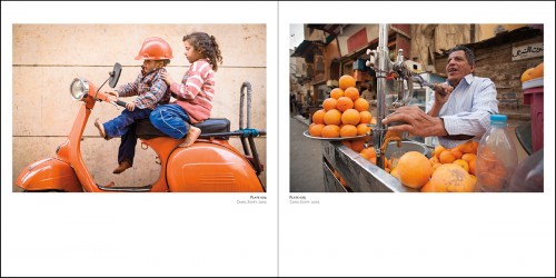
What worried me about CMYK, and this will only ever matter to you the moment you, or your clients, decide to do offset printing (as opposed to digital), is that the colour gamut of the CMYK space is much smaller than even sRGB which is what we use for the web. A smaller colour gamut means there are colours, specifically the more saturated ones, that simply can’t be printed. So if you’ve got an image with vibrant oranges and purples, for example, that fall out of gamut, you’ve got to either use another image and avoid the issue all together (tempting!) or make a series of small compromises to retain the look and feel of the image while still playing within the constraints of the printing process. So far so good.Included in my submission were 5 black and white photographs which we’re going to be presenting in the book as slightly warmed duo-tones, which will give the photographs some warmth and depth. So I’m leaning on the pre-press department to help me with those. I chose Hemlock Printers, among a couple factors, for their work with Lenswork, and their ability to create such extraordinary duo and tri-tones in that magazine.
The next steps hinge on the feedback of the pre-press department, which I’m nervously awaiting.
In the meantime they’ve got the artwork for the book cover, and will begin making me a dummy book – a perfect replica of my eventual book missing only the printed content. I chose embossing without foil for the names of the seven continents that form the number 7 on the front, but a tone-on-tone foil for the name of the book, SEVEN, and my own name. So there’s the first “gotcha.” Turns out I need another die for this. So they’re going to send me a quote for adding a second die. While all this is going on I am slowly, painfully, editing out images I love, in order to make the strongest book possible. It’s a tough process because I want images that represent the best of my work, while at the same time being sensitive to the reality that some of my images have seen a lot of eyes already in books like Within The Frame or Photographically Speaking. I want new work in this book too, so the work I do in Nepal, Antarctica, Kenya, and Japan in the next 5 months will need a little space. With about 150 pages of photographs, most of those pages with only one image on them, there’s an opportunity here to really put my best foot forward, but God is it painful choosing one and not the other. I’ve settled on a loose concept, allowing spreads to work together, as paired images, either by complementing each other, building on each other, or contrasting with each other.
Like this year’s efforts to turn my attention back to printing my work, this is pushing my craft forward in new ways. It’s forcing me to be brutally honest about how strong my work is. And it’s pushing me to see similarities and themes in my work, which is good, and areas in which I repeat myself, which I’m striving not to do. It’s also forcing me to tweak my post-processing. Learning to do CMYK conversions has been relatively easy next to forcing myself to sit down and re-work my black & white conversions, pay attention to noise and sharpening, and yes, go back to older work and make my vignettes a little more subtle.
For a couple more days you can still get in on the print giveaway. Read my earlier post, Building Seven, A Fine Art Book, for details (and to make a little more sense of this one.)
Thanks for your patience this last couple days. The site got hacked not once, but twice. Lots of you got scary malware messages from your browswer and chose not to take the chance. Thanks for coming back. 🙂

Comments
We covered those issues in a pre-press class I had to take – it was an eye opener. When I was taking the class I was thinking it would be more in conjunction with graphic design projects, but it definitely applies with photography as well. Although I think it’s always fun to learn something new….
Yes, the CMYK conversion can be a bear. I’ve been doing calendars the past 4 years with offset printing. I’ve had a lot of problems with the greens and yellows in particular. I’ve used the same procedure that Tom talks about above, using PS to preview the CMYK conversion – though it is always different looking on the monitor versus the actual proofs from the printer.
I can only image how difficult a process this is. I can see that this endeavor will entail a lot of blood, sweat & tears. Looking forward to more updates.
Thanks for the insights and updates. Would be looking forward for more updates. 🙂 All the best on those photos!
Welcome BACK! I’m happy to hear your site issues were resolved, what an annoying thing to deal with last week.
Thanks for sharing your experiences with CMYK printing. This last year my goal has been to get prints that I love, so I have been focused on learning digital printing and I finally feel like I have a handle on it. That’s complicated enough, before adding CMYK into the mix. I’m sure I’ll refer back to your experiences in the future, when the time comes for me to tackle CMYK. 🙂
Yep, it’s a lot more complicated to get the right colors in print, compared to the screen. Not necessarily a bad thing, however, as some of the web images we see are not anywhere near realistic.
Love how you keep pushing your boundaries and skills, way to go David.
Can’t wait to see the finished product, but of course, I’ll have to! 😉
Thanks for the update David, and for answering my question on digital or offset printing, really enjoying hearing how this process is going and cant wait to see the final art work.
Ben
Hang on in there David, it will be fine. It sounds like you’re working with a very good printer who will/should spot any issues well ahead of going to print. Even then you can still pass the book on press (this is what we do the latest was our ‘as others see us’ book – http://www.broaddaylightltd.co.uk/as-others-see-us/) at which stage you can still make slight, last minute adjustments then.
Look Forward to your next post.
All the best,
Ross.
Can’t imagine how hard it must be to choose… paring away some of the emotional attachment to hard-won photos in order to include some that read better on the page.
Must be a powerful experience too, revisiting so many people and places.
Hi David, CMYK can be a nightmare, you really need to tweak the images gently.
This may help you.
When I do my CMYK conversions I process the image in RGB in PS5 and use Ctrl/Command + Y to preview the CMYK conversion. Converting the image to CMYK straight away removes some filters and colour correction features, plus I’m more comfortable dealing in terms of Reds, Greens and Blues.
Hope you’re well.
Tom
It’s Shift, Command, Y on a Mac……