
One of the things you’ll notice consistently about the bodies of work of photographers who’ve been doing this a while, is that many of them, though not all, seem to work very intentionally to create a consistency within that body of work – some kind of unifying element. Often that element is on a theme, so it’d be a body of work about the female nude figure, for example. That theme alone can create a visual unity.
“Color is a power which directly influences the soul.” ~ Wassily Kandinsky
Another way of doing the same thing is with consistency in other constraints, like a shared crop ratio: every image being square or 4:5, for example. A consistent colour palette also does this powerfully, with every image sharing a common set of hues and tones. This creates a flow when the images are presented together, creating a common mood or emotion through the work, even when the gesture within the images changes dramatically. You can choose this palette while you photograph, and refine it as you become more and more aware of what the body of work is becoming.
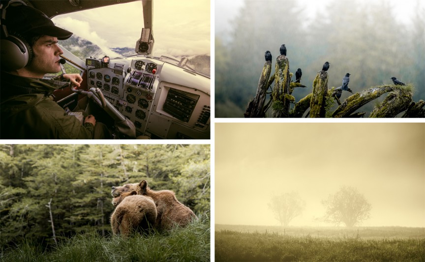
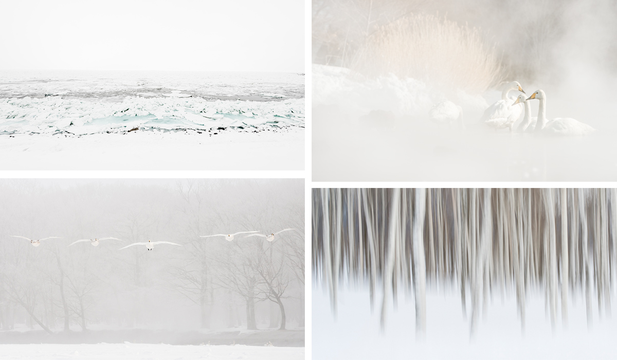
Not all of us begin a body of work to find it becomes, in the end, the thing we imagined it at the beginning. There’s often an evolution and that often creates stronger, more unexpected, work than if we’d not allowed ourselves to divert in a new direction. You can also chose, or refine, this palette in the digital darkroom. In the case of my Hokkaido series I was very intentional while I photographed and needed very little adjustments in Lightroom. The grizzly series from the Khutzeymateen all shared a consistent palette when I photographed it, but not the one I wanted, so I worked hard to subdue some of the hyper-saturated greens, and bring a common warmth to the images, which I made over seven days in very different weather, needed some help with the tones to bring them all a little closer to being cohesive
 Intentionally chosen colour palettes are not only for unifying bodies of work. A painter sitting at his easel and wanting to create a certain mood, will choose a colour palette. It’s a little easier for painters, but photographers work with an existing reality. While we can do anything we want with Photoshop or Lightroom, it’s not my style to be so heavy handed. But you can be selective while you still have the camera in your hand. Being intentional while you look at the scene, choosing weather or time of day that contributes to what you’re trying to accomplish, or lighting the studio and dressing the set – none of these happen accidentally and if you go into your work remembering that a well-chosen colour palette is a powerful tool, you can at very least begin to exclude elements that do not conform to your vision.
I like to get this kind of thing right in camera, but the refinements can also happen in post-production. Using shifts in colour temperature is one way to do this. So is the use of a tool like Lightroom’s Split Tone panel. Or you could use presets as your starting point. My friend Piet Van den Eynde has some excellent colour-grading presets from which you could probably learn a lot about the use of colour tools in Lightroom if you dig under the hood a little. You can find those here at Craft & Vision if you’re interested.
Your Assignment:
Fashion photographers, and commercial photographers, do this very well. If you can get your hands on either Applied Arts or Communication Arts, both magazines produce Photography and Illustration annuals. Take some time to look through these and look at the way both photographers and illustrators chose their palettes. You’ll notice it in both single pieces and bodies of work.
Often you can tell a photographer simply by her consistent use of colour. My friend Dave Delnea – DaveDelnea.com – does this really well and at the time of writing his website has some excellent examples of this. Do a Google image search for Erik Almas – you’ll notice an amazing intentionality and consistency. Same thing with Brooke Shaden. Annie Leibovitz, too. Spend some time looking at these, and other photographers. See what you can learn from their use of colour. Check out Saul Leiter, too. I like Google image searches because it shows the images well together and allows easier comparing and contrasting. Note that when I talk about consistency, and you’ll see it in the work I’ve suggested you look at, that I do not mean homogeny or uniformity.
Tell the World. Share this Post.
Comments
Pingback: The Andrew S. Gibson photography blog » Blog Archive The Gap Between Making and Processing Photos - The Andrew S. Gibson photography blog
This is so true. I seem to be able to do this on small projects but not for a full body of work. It tends to feel so restrictive. For example, I just love monochrome work and I would say half of what I put out there is just that, but just when I want to commit to only doing that for an extended period of time, I start to feel creatively boxed. Maybe I should just commit, push through that box and see what’s created on the other side.
Hi David
I take a similar approach when shooting interiors for clients. Some use design houses or ad agencies of manipulate their images however many rely upon me to deliver a consistent colours throughout the shoot output. Shooting in RAW and using Capture 1 processing tools ensure that this consistency is maintained see the Byron Burger interior at the O2 Arena (once referred to as the Millenium Dome) in Greenwich, London see http://www.adamcoupe.com/#!recent-projects/cudy
Hi. Very nice and informative article. Thanks a lot. I like colorful images and would like to share with you with a nice post from our blog: http://blog.picsart.com/post/how-to-instantly-improve-composition. Hope you’ll like it.
When I worked in the medium of ceramics my color palet was automatically limited by the fact that I worked in high fire, where most bright color were fugitive or unattainable, which turned out to be a blessing and a challenge. I had to work hard to create interesting contrasts.
Color photography, however, is completely different, as colors between “reality” and software are virtually unlimited. Being a person who loves color, it’s a constant challenge not to overdo it, but one I have come to enjoy, but it is a constant challenge because one is so unlimited in possibilities!