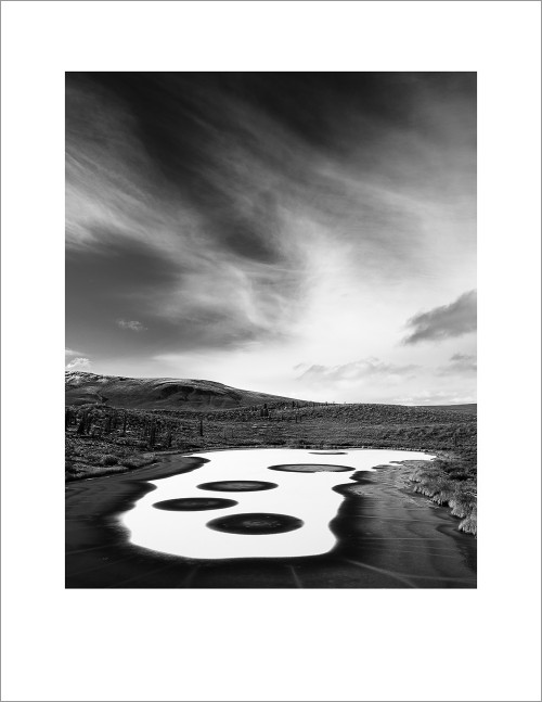
 Here’s one of my favourite images from the trip up to the arctic last month, and a quick walk-through on the post-processing. In Vision & Voice I explain what I call the vision-driven workflow, and there are 4 steps: Identify Intent, Minimize Distractions, Maximize Mood, and Direct the Eye.
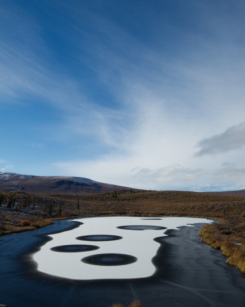 Identifying the intent here was simply a matter of asking myself what it was that most drew me to this scene, and then figuring out how to make the post-processing support that. While the colours in the arctic were amazing, it was the shapes and textures, the lines, of this scene that most drew me, so I knew it would be a black and white image. That’s my first move. Then, moving on to minimize the distractions, I cropped a little from the bottom to remove the errant bush, and spend 5 minutes dealing with dust spots. I work best when I am un-distracted by little flaws. Below is the black and white, cropped and dusted image.
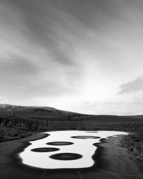 My next move is to maximize the mood, which in this case will be a graduated filter across the sky, pulling the exposure down and adding clarity, which brings the subtle drama back to the sky (below). The best way to see these changes, by the way, is to click one of these images and let it enlarge itself. You can then scroll through, image by image, and see the changes more obviously.
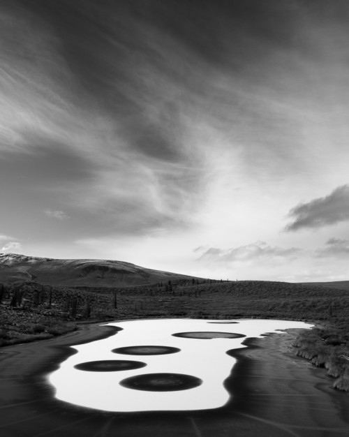 The strength of a black and white image lies in its tonal contrast, which can be tweaked several ways, including the use of colour temp and tint sliders, the Black & White Mix panel, and the tone curve. Below you’ll see the mix change a little as I darken the blues and lighten the yellows, bringing some of the contrast back in the grasses of the muskeg around the lake, and punching the sky a little more.
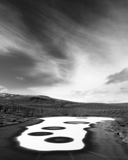 Lastly, in terms of my process, I make changes that direct the eye. In this case a little dodge and burn in the clouds to both lighten the whisps and darken the space between those whisps of cloud (below).
 Finally a last tweak to contrast (increased in the tone curve), clarity (added), and sharpening, before creating the image below for output to the final print (top image).
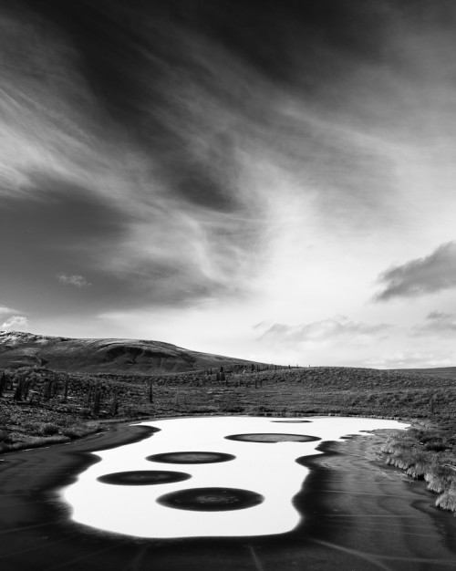 If you want to hone your post-processing skills, the best thing you can do is play with your tools – in my case it’s Lightroom 4. Play with them until you understand them. You can get Vision & Voice online at amazon.com or Barnes and Noble, etc., and while it was written for Lightroom 3, it still has much to say about the process of post-processing. If you want more info on black and white conversions in Lightroom, I can’t think of a better, or cheaper, resource, than Piet van Den Eynde’s The Power of Black and White from Craft & Vision.
I know this was a fast walk-through, and it probably leaves a few questions. Fire away.

Comments
How long would you say the editing process for this image took you? I’ve noticed I seem to have got slower at editing but doing daily images for my blog seems to be helping me speed up the process again..
I suspect most images that I go so far as printing take about 5-10 minutes of post. Anything more than that and I’m probably trying too hard to rescue an image I should just admit is fundamentally flawed. 🙂 But then I’ve done this for a while and I’m comfortable with my process and my tools.
i have 2 questions:
1. wouldn’t a graduated filter on the scene have been better than using one in lightroom, or did you hav eone and it wasn’t enough?
2. the snow (water? white ice?) of the lake after one of the step seems to get blown out, or is it my crappy screen
Basp – 1. Yes, it would, and I did use a 3-stop grad ND on the lens. But sometimes you want more, and remember a grad filter in Lightroom can be used to add things like Clarity, which an on-the-lens ND filter can’t do. 2. Maybe in one of the steps I lose some details, but I always bring it back. That said, it’s probably your monitor. Nothing wrong with the histogram on this shot. 🙂
Thanks David. Always good to ‘sit on your shoulder’ 😉
For recent switchers to LR4, I found two videos by Michael Frye were a great kickstart…
http://www.michaelfrye.com/landscape-photography-blog/2012/04/13/lightroom-4-the-new-tone-controls/
Those 4 steps – Identify Intent, Minimize Distractions, Maximize Mood, and Direct the Eye – PURE GOLD.
Cheers,
Steve
Hey David,
Very nice tutorial. Did any Acros find its way along for your journey? This scene would be a great setting for an orange or deep red filter with B&W film…. Just saying, haha.
Hope all is well in BC
Craig
Craig – I brought 10 rolls of Acros with me. Sadly I didn’t load the Hasselblad once. Just never got around to it… Next time. 🙂
I love this sort of tutorial and hearing the thought process behind each step. More like this please! 🙂
(In the past couple of months, I’ve read about 10 library books on B&W processing and I think I learned more useful insight from this one post!)
Absolutely beautiful.
The tones are amazing.
Looks other-worldly.
Hi David. Just need a quick input on LR4. I bought the upgrade a couple of months ago but have not installed it yet. I read a lot of people complaining about the slow speed when compared to LR3. What got me worried was that these people have more powerful system (12GB RAM on current Mac) than I have (I have a 2010 MBP17 with 8GB of RAM). What got me interested was the reported ability to recover even blown highlights (some). I’m not willing to sacrifice workflow speed though for that feature. I’m also not interested in the Photo Book and the GPS tagging features of LR4. I’m being extra cautious coz I’m running LR on both PC and Mac. The thing is, if I upgrade to LR4 on my Mac, I wont be able to work on my PC anymore (as it is running the unsupported XP). Are these worries about slow speed of LR4 realistic? Any input from you will be a great help. Thanks much!
Hi Noel – To be honest I’ve not really noticed the lag that others are talking about. I am thrilled to have upgraded. Perhaps you should install the LR4 demo, import a thousand images or so, and give it a whirl before you commit to it and upgrade the catalogs to LR4. I will say I’m thrilled with the upgrade and the look of the images is truly much improved. That difference alone is worth it to me. But if you’re worried about it, give it a test drive first.
Thanks, David. I appreciate seeing the steps that you took, along with your thoughts on the process.
So, it is a general visual truth of nature that the values (photographers seem to call them tones) in a sky are lighter than those of the land, with some of the darkest land values often seen in the foreground. This is apparent in your initial B&W conversion. Then, art trumps nature, as it should – as seen in your other edits. So, is it just a matter of gut feeling or instinct that takes you each step of the way, accumulated knowledge of great photos/art you’ve studied, memory of the scene and feelings from that experience, or a mixture of these elements???? Maybe it’s something that can’t easily be expressed in words?
Anna, I think it’s exactly as you describe, that it’s a mix of gut feeling, learned skill, memory of the scene, and -often- whatever the latest thing we’re exploring in our ability to express things. And then you play with this mix and, at least in my case, I “know it when I see it.” But the “I’ll know it when I see it” game is like shooting at a moving target for me unless I first sit down and identify my intent for the image and get some sense of the direction I’m moving in before I start messing around.
Great walkthrough, David.
The whole “mess with the sliders” thing seems to be a popular route, especially when the finished product is a result of “I’ll know it when I see it.”
Thank you for sharing with us. You are a great inspiration.
Dion V
Waiting for October Wallpaper.
Thank you.
Pingback: Things You’ll Find Interesting October 1, 2012 | Chuq Von Rospach, Photographer and Author
Wonderfully instructive workflow walkthrough. I like the simple steps and the superb results. I love the circles in the lake especially. I can see why you went black and white with this one.
Truly Awesome.
What kind of camera did you use? KIDDING!!
Do you use the the lens correction feature in LR4 and any vignetting?
Also, do you use LR for the framing as well?
Hey Paul – Yes, the last thing I do with an image is turn on the lens correction feature and use the automatic profiling. Most of the time I leave it on, but sometimes I just like it better without the adjustments. As for vignetting, I don’t do much of that these days, I’ve learned to be a little more subtle. Sometimes. 🙂
When you ask if I use LR for the framing, do you mean the white border? If so, yes. I do that in the Print module and then print to JPG. Works beautifully, though I added a grey stroke in PS before uploading it.
Thanks, David. What, no magic bullet?!! 😉
Truth be told, my processing is a lot like yours—”mess with the sliders until it looks right”—I’m just not quite where I want to be yet. I guess that means I need to play some more!
Looks like a different planet.
Thanks Ulrik.
Aaron, thanks also for the comment. I’d love to do a post like this but it will have to happen at some point a little futher down the road when I’ve got something a little more intelligent to say. Truth is, I am still learning Lr4 by trial and error. I’m a very visual person, so my technique is a little closer to “mess with the sliders until it looks right” than something easily explained.
Thank you, David. I really appreciate the process you’ve outlined for post work—it’s helped me a lot in my own work to think about why I do what I do. I’ve worked through Vision & Voice, and I feel my images are stronger now for it.
Could you share a bit about how you’ve adapted your processing to LR4? After a couple weeks, I think I’m getting to where I’m pretty happy and mostly used to the new sliders, but I’m still playing around some. I’d appreciate your take.
Nice and easy walk through. I like how you think about the photo and what you should do to get to where you want – “Identify Intent, Minimize Distractions, Maximize Mood, and Direct the Eye.”
Would like to see more of these!
It’s a wonderful photo and thanks for sharing 🙂