
I made the mistake recently of saying, out loud, that I hated rainbows. I could have said, “I like to eat kittens and gravy” and the reaction would have been no less appalled. You HATE rainbows? It wasn’t exactly what I meant. I had been called to the deck of the sailboat with “Get your camera!” I came on deck with my camera and the expectation of a whale or a bear on shore to find that it was “just a rainbow.” Perhaps the word “hate” is too strong. No one really hates rainbows, do they?
What I meant was this – rainbows don’t do it for me photographically. We all have things we like and dislike, and rainbows always seem a little saccharine to me. All those colours competing for attention. I don’t mind the sun showing off a little, but rainbows make it seem a little like the sun is suddenly fishing for compliments. It feels needy. But that’s not the point I’m trying to make.
I don’t hate rainbows. I love the arc of the bow. I love the dramatic light in which rainbows occur. I just don’t dig the colours.
“Well,” I was asked, “what about Galen Rowell’s image, Rainbow over Potala Palace?”
“Nope, doesn’t do it for me.”
How he made the image is a great story, but the late Galen Rowell, of whom I am a big fan, made hundreds of images which are much stronger, more resonant, to me. It’s a very symbolic image, but to me not a particularly beautiful one.
My friends went back to conjuring images of me eating kittens.
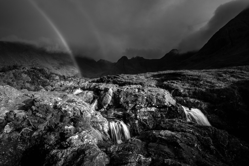
So when I saw the rainbow over the Fairy Pools, a long series of cascading falls at the feet of the rocky Cuillens on Skye last week, I knew I was going to catch shit for photographing it. But here’s the thing: a rainbow is not only colour. It’s light and shape and those to me can be insanely beautiful. But if I want to focus on that luminous arc and not on the trying-too-hard festival of colours, then black and white is a great choice. I have precisely one other rainbow photograph in my published work – it too is in black and white.
My point is this: recognizing what you like, and what does nothing for you, and then finding a way to include the one while excluding the other, is much of the creative task of photography. And it takes a little courage because someone (probably several someones) is going to ask you why you killed the rainbow. They lack imagination. I didn’t kill it at all. Anyone that sees a black and white image of a rainbow can imagine the colours. They fill in the blanks themselves. I don’t need to show it in colour to provide new information – this rainbow, like all others, is going to be the same progression from red to violet. For me the impact is greater if I’m unburdened by the need to provide that information.
Everything we photograph has several aspects to it. We make choices about which aspects we show and which ones we do not. We choose one moment or another when making a portrait, and what we do not show strengthens what we do show. We choose one point of view, or perspective, over another, and again, something is shown while something is hidden. The same is true with our choice of lens, exposure, focus, depth of field, and crop. The more intentional we are about those choices the more able we will be to control both the impact and the information in our images.
Whether, by the way, the image is stronger to you in black and white, is not the point any more than Galen Rowell was worried about my opinion when he made Rainbow Over Potala Palace. He had his own vision, and his own way of doing things. I have mine. You have yours. Be intentional about it. Own it.
Comments
Wow. None of my rainbow pictures seem to have the same appeal as they used to!
I agree, though. I recently was on a road trip with a co-worker when this massive rainbow appeared out of nowhere (well, it did just stop raining). Funny, he slowed the car down so I can take a picture, assuming photographers like taking pictures of rainbows, which I did (as in take the picture), but unless there was a pot of gold at the end of it, it looked like every rainbow I’ve ever saw.
Anyway, great post. Puts a lot in perspective of why I didn’t jump out the car trying to take a picture of yet another rainbow.
Great article! Thank you Fotografo Napoli
David – funny, I always pegged you as a more classy Hollandaise kind of guy – not gravy! 🙂
Great discussion about different photogrphic view point equally effective and inter sting!
Am i the only one who sees 2 rainbows? I gotta stop the lagavulin!
Definitely don’t stop with the Lagavulin. There are 2 rainbows.
What’s wrong with eating kittens? Besides the fact that there’ not much meat on them.
Agree with the others about grey on white, i guess it’s just artistic
I’m in the same boat as Patti and Graham regarding the grey on white, It was my preferred font earlier in life but now stresses my eyes.
David, love the post and the black and white rainbow does provide a wonderful perspective of the rainbow not often seen.
I love your honesty, not many people would admit they hate rainbows or anything that signifies happiness in most, but I would have to agree, they don’t do anything for me as a photographer either.
Pingback: Weekly Wanderings – Pierced Wonderings
What cracks me up is people freak out if you don’t like what they like.
It’s like a pair of eye glasses. “They work for me so they should work for everyone!!!”
Well, some people like eating kittens, some like rainbows. To each their own.
Nice image David.
Enjoy the kittens.
I love the B&W image. Art is what we create for ourselves and hope others enjoy from time to time. (I love rainbows!)
Gosh, to me so much depends upon the rainbow. I know some don’t make it photographically, but some are dynamite.
Here is one of mine I really like:
http://theblogatainsworthimages.ainsworthimages.com/blog/archives/3181
An interesting note on what to put in and what not. I’m always impressed by seeing one, but capture them rarely as I can not compose it to a level, where it is more than a rainbow (or aurora borealis). And finally also showing that creating art has always a strong personal note in it.
Agree. I’ll also add small type as an issue.
My comment was supporting Patti’s about grey on white.
But do like the grey on white in the photo.
Thanks for the input, Graham. You should be able to increase the font size in any window easily on your own machine – on the Mac it’s Command+
Great insight David, I think it really cuts to the heart of why we make art in the first place. Personally, I find the Potala Palace image mind blowing and not because of the story behind it. Not everyone has to though, just like not everyone likes the work of other artists as well. Personally, while the Afghan girl is an amazing photo, plenty of McCurry’s other photographs are equally as amazing for me, if not more so. Sometimes it’s hard to accept the subjectiveness of art, but I think that’s why the authentic creation of it is so important in the first place, because it teaches us to have our own voice and perspective rather than someone else’s.
David O’Chemin……. much easier seeing the pot of gold when it is in black and white!
Great shot….. I so love black and white……. the lighting in the foreground with the water falls is almost three dimensional looking….. if that makes sense- where’d I put my 3D glasses?…. Nice….very nice.
….pint of Guinness for your efforts, laddie!
I love rainbows. I do see them in a lot of other people’s pictures the same way I see a lot of aurora borealis in other people’s pictures. But I myself do not see the rainbows too often (even though I live in rainy Vancouver) and I’ve never seen the aurora borealis. So, yes, as soon as I see one, I will stop whatever I do and marvel at it and if I happen to have a camera with me, I will take a picture of it. For me, it’s nature’s surprise gift, a feast for my eyes and I will never take it for granted. Wait until I see the aurora borealis…I will most probably shed tears of joy.
Maybe it’s just my eyes getting older but gray letters on white is a tad hard to read.
I love it.
It has a bit of an O. Winston Link quality about it in B&W.
And the mystery in the shadows helps make it more interesting.
Sage advice for landscape guys, much like shooting baseball from the media pit will get you the same shots as the rest of the guys with the 500mm lenses in said media pit. But go be the only guy with a wide angle in the upper deck…..
Following the crowd just gets you to the same place as the crowd
I don’t care for rainbows (in photographs) either. Or families in coordinating outfits sitting on a blanket in a field, or babies in random baskets stuffed with pastel blankies. I’m not a fan of the photographs that anyone with a working camera and neurons that are firing could take. I’m always searching for a new perspective… whether that means a different camera angle, a different focal length…. choice of crop…. color, or lack thereof…. there are so many ways we can see the same old things with new eyes. That is where my photographic comfort zone is.
As always, David, thanks for sharing your thoughts and experience with us.