
When legendary NY photographer Jay Maisel was asked how to make more interesting photographs, he unflinchingly replied, “Become a more interesting person.”
You might have heard that story. It doesn’t surprise me at all; Jay is a blunt man who suffers no fools and saves his subtlety for his photographs. It’s a good answer, but it’s not very immediately applicable, is it? And interesting to whom? I think I’m pretty interesting. Hell, I can spend hours with myself and not get bored. But my photographs? I have terabytes of photographs that didn’t make the cut and would, in no one’s definition of the word, be described as ‘”interesting.”
So how do we make more interesting photographs?
Look for the contrast. See the differences. And then amplify them.
No one ever taught me this, and as I look back over 35 years of learning this craft, I’m starting to wonder why. I mentioned the use of contrast in an article I posted in December, though in hindsight, I didn’t elaborate the way I could have. So here we go.
Identifying the contrast in a scene and maximizing it when it’s an important part of the photograph will—while you’re working out what it means to be a more interesting person—make your photographs more interesting. More captivating.
Here are five kinds of contrast you might want to look for and some thoughts on what it might mean to maximize or amplify them in the image.
Tone and Colour
Contrast in tone or colour is the most obvious area where we can find or establish differences in our photographs. Tonal contrast is the difference between the light and dark areas of the image, but there can also be differences in hue (the specific colours), temperature (warm vs. cool colours), and saturation. Being able to notice them is the first step. Knowing the eye will be drawn to them, do we leave those contrasts in the image, or do we exclude them? That’s an important question, but with the tools of the digital darkroom, we can also exaggerate or downplay those differences by adding or removing saturation, changing hue or tone, or by pushing one of the many contrast tools.

Size
We call contrast in size scale. When we make scale an important part of the image, we call attention to it, emphasizing how large something is relative to a smaller element in the frame or vice versa. We can also use scale not only with objects relative to each other but relative to the frame of the photograph. If you make a photograph of an elephant but keep him quite small relative to the rest of the image of his environment, it will draw our attention in a way that is different than if you filled the frame with that same elephant. One choice is not right or wrong: they simply accomplish different things.
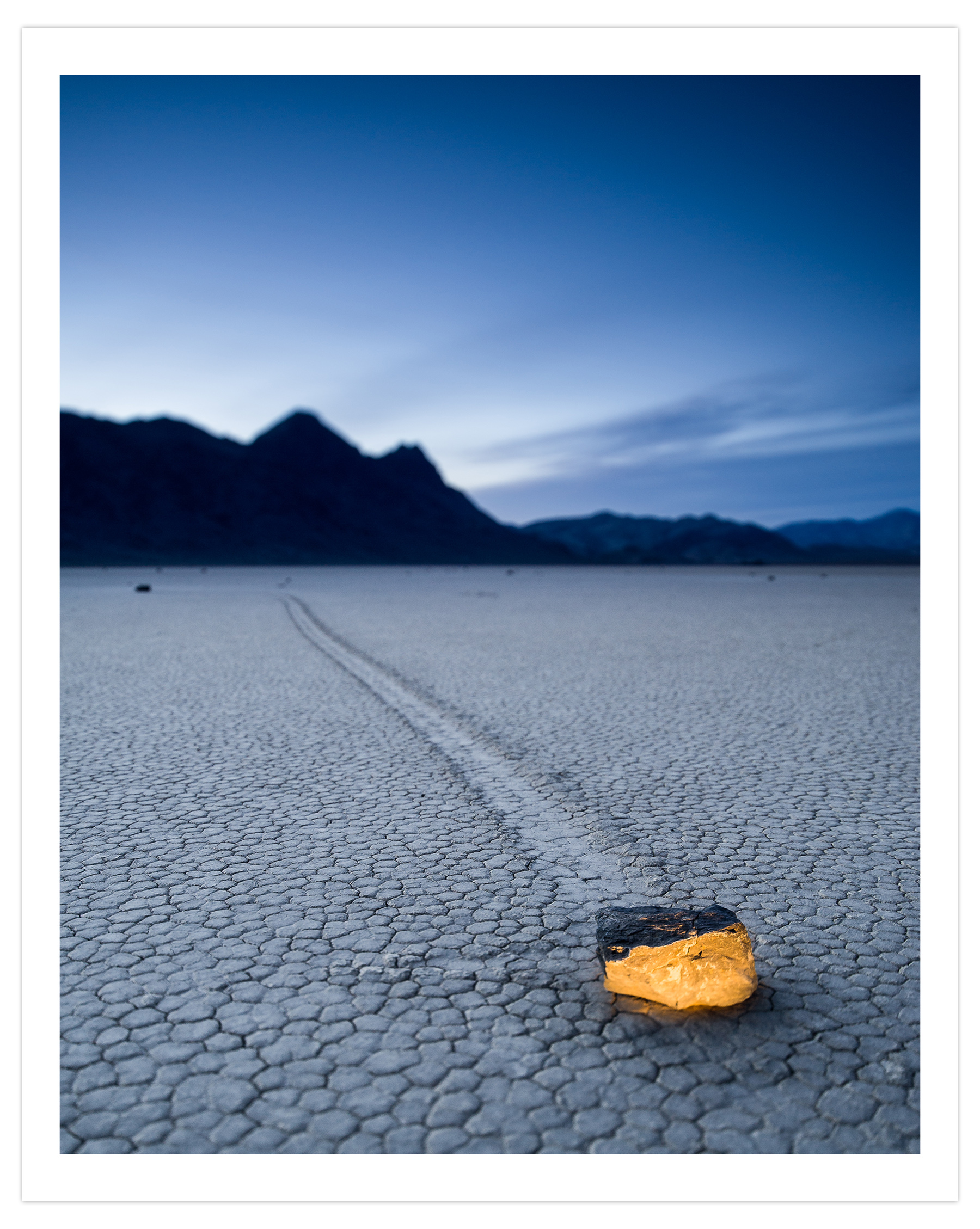
That’s one way of controlling the scale of an image. The other is by using the laws of perspective and the known effects of our lenses. If you know my work, you’ve seen the image below before. It’s a good study in the different kinds of contrasts I’m writing about here.
The smaller, warmer rock calls our attention for a couple of different reasons. Colour contrast for sure. Conceptual contrast, too. And there’s some good use of scale, the rock made to feel smaller than its surroundings by using plenty of negative space. It was made with a 24mm lens from a few feet away. But imagine what it might look like if I got much closer to that rock with the 24mm lens or a 16mm lens. Much closer, say within 12 inches. Can you picture the change in effect? What happened? The rock got much bigger in the frame. The background mountains got much smaller—a change in scale or contrast of size.
The reverse is also true. Put a 200mm lens on, back up a fair distance, and make the same photograph. You can’t. It all changes when you move away from the subject; even if the rock in the foreground occupies the same space in the frame, it won’t look relatively as large. Why not? The mountains in the background got much larger in appearance. One choice exaggerates the contrast; the other diminishes it.
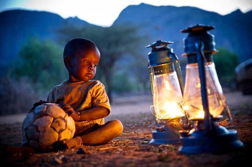
Ideas
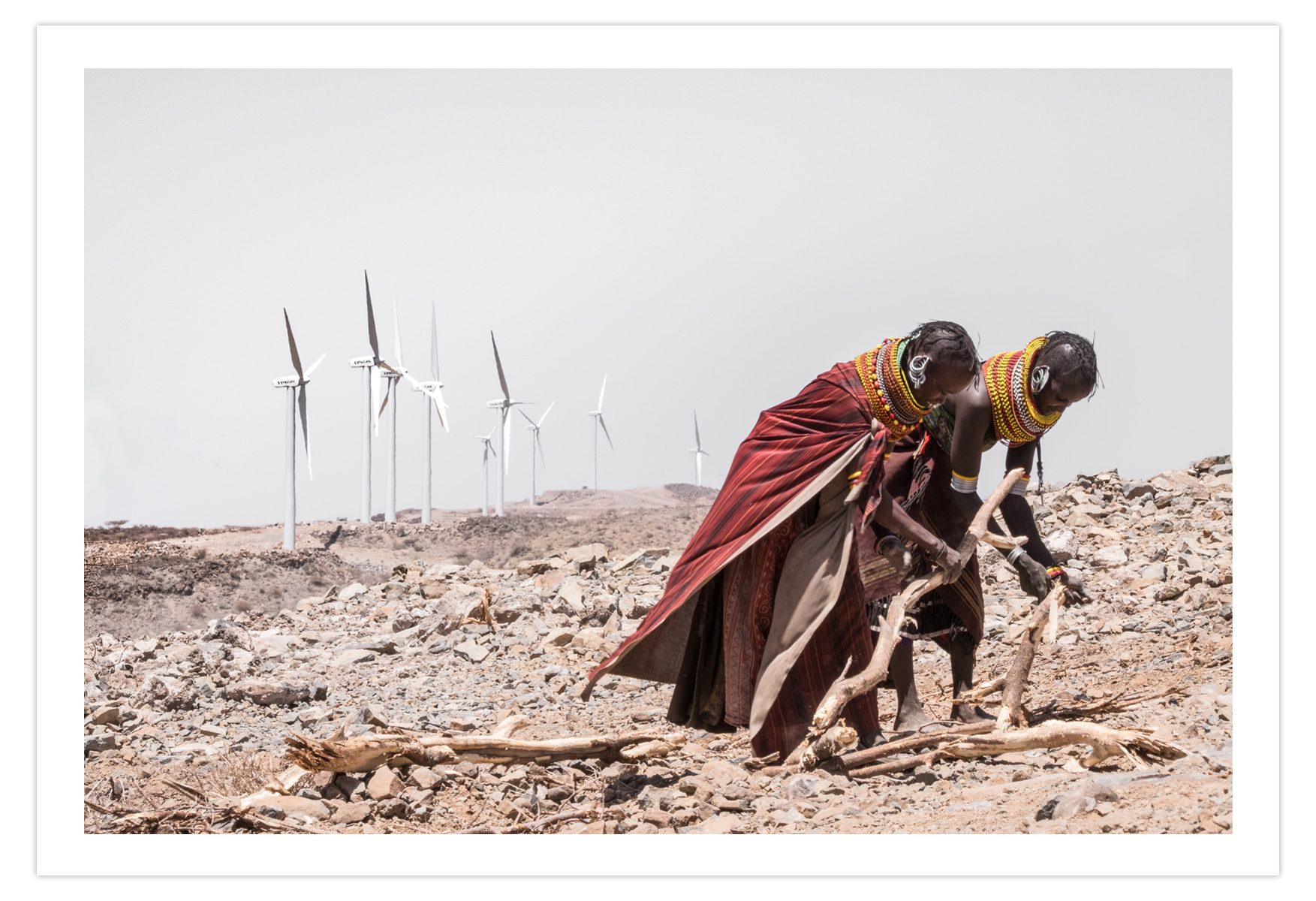
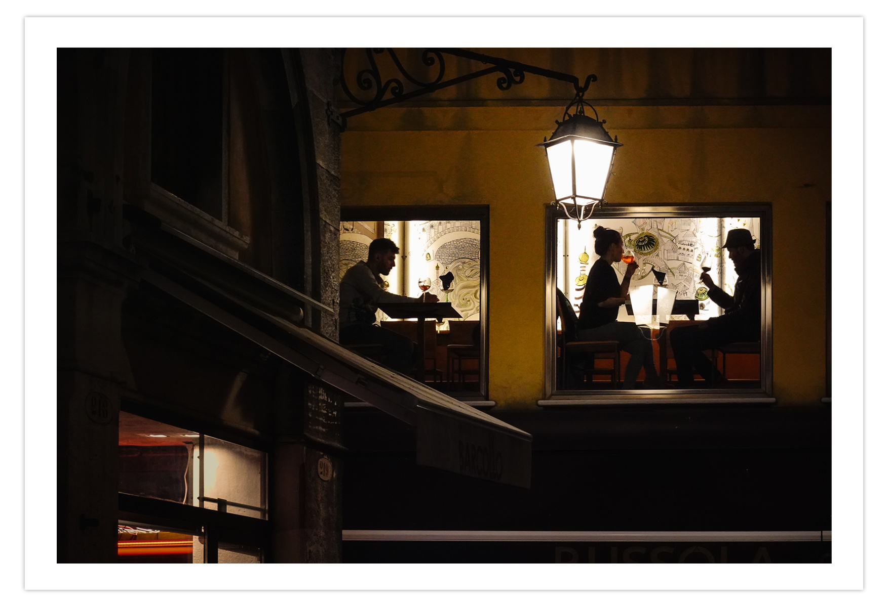
Contrasts of ideas fascinate me, and as I mentioned in this article (link), few people do it as well as Elliott Erwitt; his work is worth studying. Contrast of ideas might be shown in an image of an elder holding an infant (a contrast of age). That same contrast might show in a photograph of old buildings in the presence of new buildings. As in the first image below, it might be a contrast of ancient vs. modern . Or in the image after that from my Hokkaido monograph (which is new and can be downloaded free here), a contrast of natural vs. man-made. Or the third image below, which is about the contrast between being alone and being together. These are harder to manipulate with a change in focal length or perspective, but the choice to leave them in the frame—and to exclude elements that do not distract from the main contrast—can make a big difference in how much impact that contrast has.
Motion
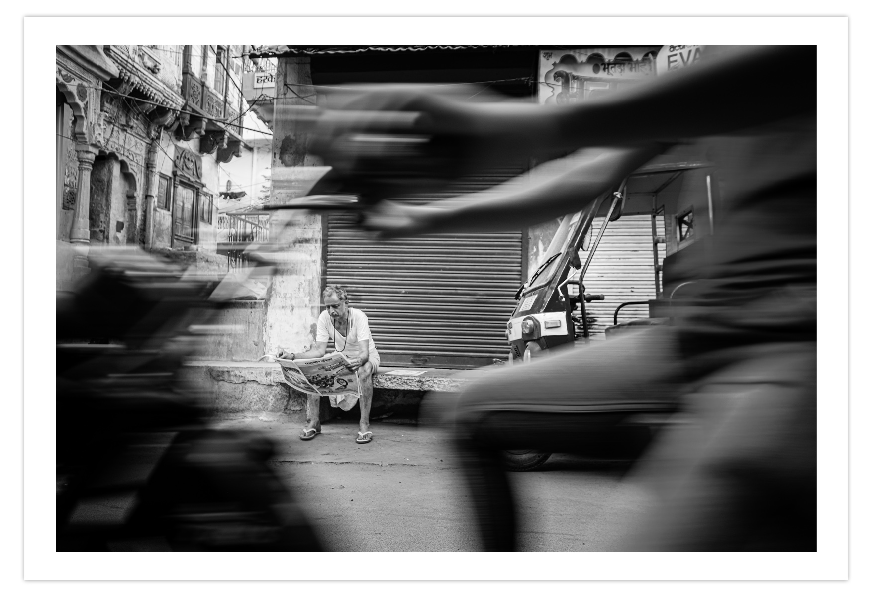
A stationary element shown in relationship to moving elements can exaggerate the sense of motion, pointing both to the motion on the one and the unmoving nature of the other. In the image below, the photograph gains interest because of that contrast. The quiet, still moment of a man reading his newspaper seems more static when framed by the moving motorcyclist, who appears to be moving faster when compared to the man reading his paper. Being willing to use a slower shutter speed (1/30 sec.) creates this effect, and becoming comfortable hand-holding your camera or learning to brace against light posts to eliminate lugging a tripod around makes this a versatile technique. If things are moving, I want to see that motion, but it’s often best shown next to things that are not moving to show the contrast between the two.
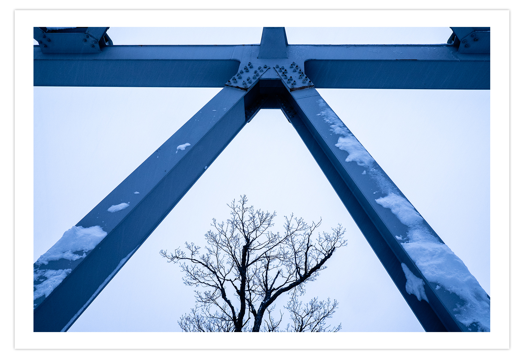
Textures
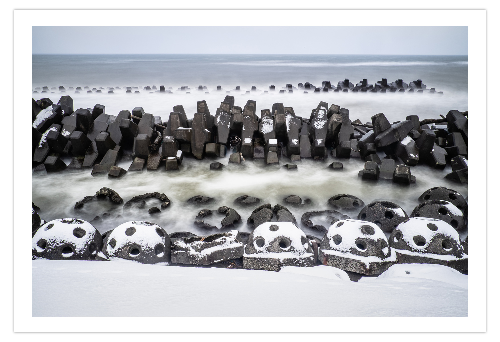
Finally (though these are not the only types of contrast), you might consider a contrast of textures. The image below, also from my Hokkaido monograph that you can download here, makes use of contrast of texture: the smooth, almost ethereal water and texture-less snow contrasts with the rougher textures of the concrete breakwater. A slower shutter allows that water to blur and become smooth; this contrast would not have been as apparent using a faster shutter speed. There are other contrasts in this image as well: colour and tonal differences, natural vs. man-made, and a contrast between what is moving and what is not moving, though that’s subtle.
We are drawn to the differences. It’s just how we’re hardwired. And if you can become more mindful of those differences and how they play within your images, you’ll find yourself able to tell stronger stories and make more captivating photographs. I don’t mean to imply that your use of contrast always has to be as strong as possible, just that it be considered. Sometimes you need to dial down these contrasts, and sometimes you need to avoid them altogether; too many contrasts or points of interest in an image is more likely to dilute any impact rather than increase it. Contrasts are a tool, a way of grabbing our attention and piquing our interest.
Want more interesting photographs? Look for the contrasts.
For the Love of The Photograph,
David
PS – Want more like this? I send these articles out every two weeks to photographers around the world who want to improve their craft and explore their creativity and I’d love to include you. Tell me where to send it and I’ll send you a copy of my best-selling eBook Make Better Photographs, as well bi-weekly articles, first-glimpse monographs of my new work, and very occasional news of resources to help you keep moving forward in this craft we love.
“Each and every one of your emails inspire and motivate me to want to jump right out of my chair away from my computer and shoot for the love of it . Thank you David.” – Millie Brown
Comments
These are amazing! I love the sharpness and vitality of the images. This is a much better tip for me than “be an interesting person,” as I doubt if I can ever make myself above boring haha
Sophie, being self deprecating is fine, but I really hope you don’t actually believe that you are boring. Certainly there are some people who have done truly extraordinary things, but each life is unique and no one else in all of history will have your story. I truly believe that God meant something and someone specific when He created you.
Very interesting article. I recognize and often use contrast in my own images but this article allowed me to attache names to some of those, like texture contrast or motion contrast. Colour and shape contrast are relatively easy to spot but contrast of ideas is probably the hardest.
Thank you for sharing your thoughts on the matter David.
So glad this helped, Marek. Thanks for reading!
Engaging and Interesting..
David, your book “Hokkaido” is amazing with so many great photos! Some seem to be taken by a Japanese, they have this particular aesthetic specific to Japan: refinement, delicacy where the love of Nature pierces. I also love all your abstract photographs, they are very beautiful! Thanks a lot for sharing this book. I appreciate!
Thank you so much for that, Annette. 🙂
A very very interesting and informative article Mr. duChemin, as is your Saturday podcast.
Also I liked Hokkaido monograph a lot, especially those abstract images from the boats. They were like abstract paintings.
Just beautiful!
Greetings from Greece Mr. duChemin!
Thank you, George! Forgive me my late reply, somehow this one slipped under the radar. Thanks so much for the kind encouragement. Best to you in Greece!
Merci beaucoup David pour cet article sur les contrastes en photographie. C’est un des aspects qui me frappe en premier lieu (après la lumière, bien qu’elle soit souvent associée à la notion de contraste) lorsque je regarde une photo ou que j’écris un commentaire à son sujet! Et pourtant j’oublie souvent d’en tenir compte moi-même au moment de la prise de vue, ou si je le fais, c’est de façon plutôt intuitive. Ce rappel des différentes façons de jouer avec les contrastes est donc tout-à-fait approprié et je vais l’exploiter de façon plus systématique et consciente en ayant à l’esprit les différentes formes de contrastes qui peuvent servir la photo pour la rendre plus forte.
Thank you so much David for this article on contrasts in photography. This is one of the aspects that strikes me first (after light, although it is often associated with the notion of contrast) when I look at a photo or write a comment about it! And yet I often forget to take this into account myself when shooting, or if I do, it’s quite intuitive. This reminder of the different ways of playing with contrasts is therefore entirely appropriate and I am going to use it in a more systematic and conscious way, bearing in mind the different forms of contrasts that can be used in the photo to make it more strong.
Very interesting, as usual! Thank you.
Exactly! In my 40 years of teaching photography, (just retired) these are approaches I always felt were so important to help students not only make better photographs, but to expand their own awareness of the world around them. We would listen to contrasts in music, taste contrasts in edible treats, and look at select photographs as examples of all of these contrasts. I appreciate you as a photographer, educator and writer, and often sent my students to look at specific articles or posts you made through the years. Your books have been on their reading lists and your images shown, along with Erwitt and Maisel, and the many masters, to illustrate ideas and concepts and to broaden their horizons. Life is so much richer when we see it with open eyes! Thank you.
Thanks for another easy-to-apply article with compelling text and photos, David. Also, I appreciate your generosity sharing the monograph with your readers. Your insights are most welcome and appropriate: these articles, the podcast, your books, and so forth. We can always “document” a scene with our phones and cameras. Telling a story and making a memorable artistic photograph requires we consider many factors.
This is very helpful and something I will be looking for in future photography, thanks
Thought-provoking article which pulled together many different ideas into a coherent useful framework. Thank you!
You’re welcome, Eve. Thanks so much for reading.
Great article David. I also enjoyed reading all 57 of your “A Beautiful Anarchy” podcasts too.
Thank you, Allan. It’s always good to know someone out there is listening, or in your case reading. Do you prefer to read the podcast transcripts over listening?
I really enjoyed this post. It really gave me some new aspects of my photography to think about. I think I often cut out a lot of the contrast in my images. I often try to shoot nature landscapes and I often go to great lengths to cut out any man made structures from the frame if I can. It has always put me off for some reason. Now maybe I will be able to shift my thinking a little and lean into showing and emphasizing that type of contrast more. I don’t think I have been very intentional about including contrasts in tone or hue or even ideas in my photography.
The only place I really do like to include contrast is in movement. I like to photograph landscapes at long shutter speeds and show the tree branches waving in the wind contrasting the rest of the static background. I also like to take long exposures of water with rocky shorelines and create a contrast between the smoothed out water and the rocks. But I don’t know if I ever consciously thought about it as using contrast. Thank you for the food for thought.
Sincerely,
Kyle Reynolds
https://krnaturalphoto.com/
Happy to be able to give you something new to chew on, Kyle! There are so many interesting ways to look at this craft and the making of compelling images. 35+ years in and I’m still enthralled and learning!
I read somewhere that you’re going to be speaking at a camera club via zoom I believe in Illinois. Do you have any details on that or how we can get tickets to it?
Good morning, Yvette. I don’t see anything for Illinois specifically on my calendar. I’ve got a lot of these lectures coming up but they aren’t generally open to the public. Perhaps it’s time to consider doing one for the general public. Or offering the lecture by recorded video….
I found this a particularly interesting article. It is a very important article to help photographers at any stage of their work. I am a keen photographer but not a professional, it is simply a hobby for me. However, I have found many of David du Chemin’s articles as very informative and helpful.
Raja
Thank you, Raja. I am thrilled to know you find these articles interesting and helpful!
Love it, as always! Thanks, David. You’re making my life better 🙂
You don’t know how happy you just made me, Tomasz. Thank you for that.
Hi David,
Every time I read an article from you, I get the sense of having advance a little more in a direction I’m going.
Thank you for helping me grow.
Thanks, Robert. You’ve succinctly stated one of the driving forces in my life: the desire to help others take next steps towards their goals. Thank you for letting me be part of that.
Totally love, “Alone vs Together.”
Thank you, my friend.
Excellent article for any visual artist, not just photographers. Thank you for articulating a very useful principle.
Thanks Kerry. I agree – these principles are not the domain of photographers alone. In fact I learned to pay attention to this from graphic designers before I ever heard photographers talk about it (which isn’t often!).
Happened just now to be working on Lesson 9 in Compelling Frame, on this very topic! Great timing. 🙂
Right on. I hope you’re enjoying that course, Richard. 🙂
Fantastic post, so informative!! Thank you!
You’re welcome, Jana!
Sound advice! Sometimes these contrasts only become obvious to me when post processing. I’m seeing something else when I compose and make the photograph. Then on closer examination I might see what makes the image more engaging than my original vision. A quick question. You said you have terabytes of photos stored. Why do you keep them around? I ask myself the same question all the time. It is a real struggle for me to delete older files for some reason. Just curious.
Hey Thomas. Thanks for the question. I keep my images for a couple reasons. First, I often go back to old work with new eyes and I can’t do that if they’ve been deleted. So I keep them. Second, to be frank, I can’t even imagine the time and effort it would take to go through the years of photographs I have and delete the ones that currently don’t work for me. So I keep them. But mostly it’s the first reason. I can’t tell you how often I’ve gone back years later and found something I wasn’t ready to see or didn’t have the skills to make something with at the time.
One of your best postings…..ever
Valuable information here! I appreciate you including such illustrative examples from your own work.
This helps me define why I’m more pleased with some of my own work as compared to other pieces. After reading this, I recognize the contrast within those images and now I can consider this as part of my creation, with more intent, rather than just relying on instinct and feel alone.
Thanks for this!
Thanks for reading, Dan. It’s a privilege to be part of your creative life.
You’re kind to say so, George. Thank you for the encouragement.
Thanks for reminding me of the basics, David. With so much technology in photography, and with so much noise in life these days, sometimes I forget what I’m really trying to do with my images. This may be my opportunity to move away from the “meh” images I have been creating over the past six month to making something with impact. Thanks!!
You’re welcome, Neal. Thanks for reading. You’re right about the technology and the noise. Fortunately these ideas are low-tech and high-signal. 🙂
Excellent advice. Contrast introduces the story line…
Exactly.
Dear Sir,
– most useful and interesting read!
– I shall be looking forward to receiving your newsletters 🙂
Thank you, Verner! But in the future, you can just call me “David” 🙂
Sir David. 😁😁