
As a child, my cousin James had a reputation for taking things apart. I recall one Christmas when he dismantled down to the wiring every gift he was given. Remote-control cars? Give him 20 minutes, and there would be nothing left but a pile of tiny screws, little motors, and the tears of his mother who probably should have known better than to give him such an expensive present.
But the extraordinary thing is, he learned to put them back together again, and it didn’t surprise any of us when he became one of those people who could rebuild or fix anything as an adult.
Taking things apart and figuring out why they work is probably one of the best ways to learn something, and while I don’t recommend it with your cameras since there’s a certain amount of trial and error involved, it’s probably the most powerful way to learn to make photographs.
I was told that the best way to learn to make photographs is to make a lot of them, and that’s impossible to argue with. But I made thousands of photographs for years before they became good photographs. One of the things that turned it around for me was a simple exercise. Now a habit, it’s simple, can be done anywhere, and will change the way you look at—and make—photographs.
Take them apart. Layer by layer, strip them down. And as you do, ask yourself this one big question:
What makes the image work? Maybe you don’t think it works, but you can still ask: what makes it look the way it does?
It’s simple reverse engineering (though not always easy). Begin by just looking at an image for a bit. Let your eyes wander the frame. Be aware of what you think or feel. Are there hidden surprises the longer you look? Most images can’t be fully enjoyed with the kind of quick glance we give them. Where does your eye go? What’s it about?
Now ask what decisions the photographer made that lead to it looking like this? Did the shutter speed contribute anything to the image? What about the chosen aperture or where the focus was placed? Did the overall choice of exposure, either brighter or darker, make the image feel a certain way? Where was the camera when the image was made? Does that contribute something? Can you tell which kind of focal length was used? What does that choice add to the image?
Just a few simple questions, but asking them can help us become more visually literate. And the more deeply you go with it, the more you’ll learn. Now ask why: Why did the photographer make those choices and not others? Sometimes they won’t matter; sometimes it’s one big decision that makes the image work. Other times it’s a combination of choices without which the photograph would fall apart.
And you can do this with darkroom work too, though there is a bit more guesswork involved. What do you think the photographer might have chosen to do with brightness or contrast? Is it bright or dark? High contrast or low? What about saturation or the way the colours work? If it’s black and white, why do you think that decision was made? Do you think it would be as powerful in colour? Where does your eye go in the frame?
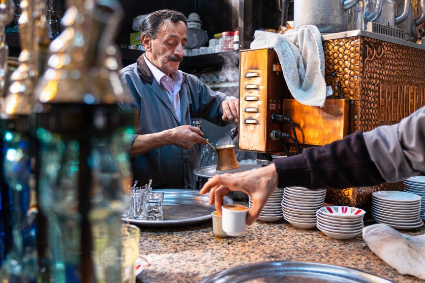
I want to try an interactive exercise with you, and there’s a $400 prize on the line.
I’m going to show you one of my photographs, and for the darkroom portion, I’ll make it easier by showing you what my RAW file looks like. You can choose to do the exercise on your own, or you can play along with the rest of us in the comments below, where you can leave your answers and look at the answers of others.
I’ll play as well, and on Wednesday, I’ll post a link to a video of me unpacking the image from start to finish. And to give you a little motivation, I’ll put a prize on the line and draw the name of one person who plays along to give it to. I’ll tell you more about that on Wednesday.
Here’s that image, both before and after:
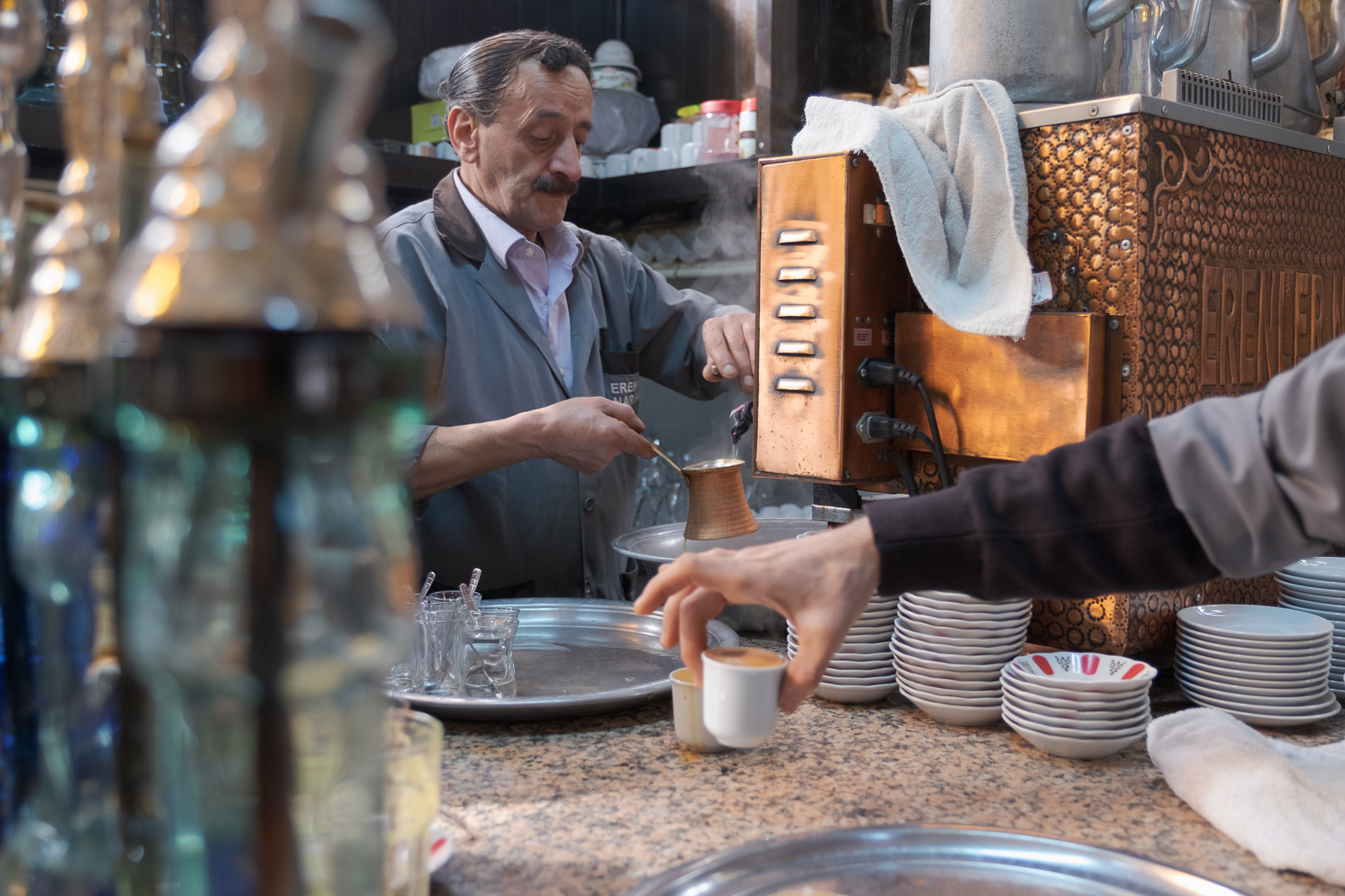
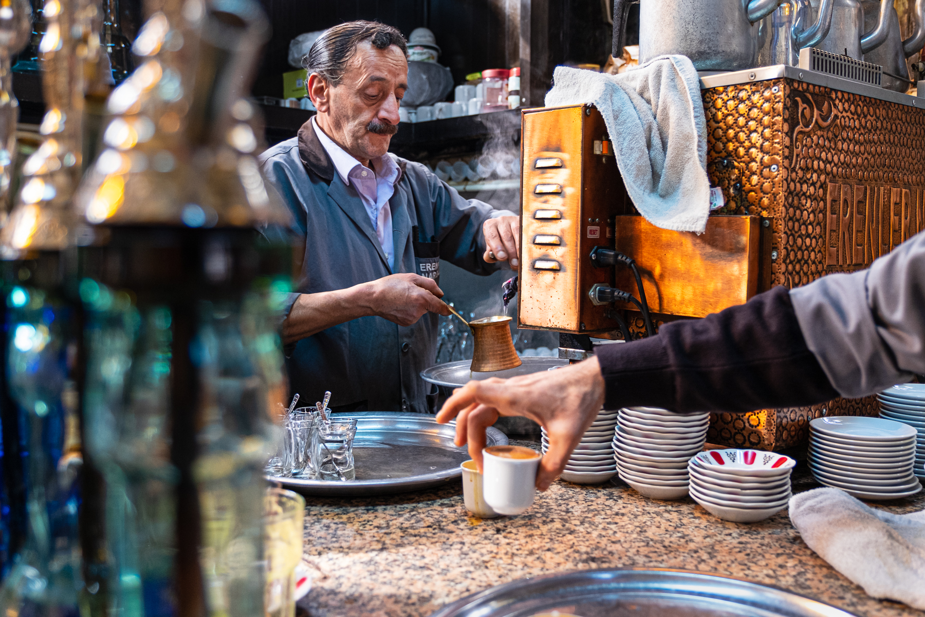
So, what choices made this image look the way it does?
What decisions both in-camera and in the digital darkroom do you think I made? Guesses are fine. But for each of them, because there’s no magic in specific shutter speeds or focal lengths, the big question remains: Why did I choose that? What does that choice accomplish?
What effect does it have in the image? How would the image be different if I’d made a different choice about shutter speed or aperture, focal length, or my point of view (where I put the camera)? What if I’d used the light differently? What about the darkroom? Can you tell which overall changes I made? Don’t worry about how for now. Is it brighter? More contrast? Saturation? And if so, did I change the saturation everywhere? What about dodging and burning, can you see how I might have gently nudged your eye away from some elements in order to draw it toward others?
I’m going somewhere with this, and on Wednesday, I’ll send you that video I promised and talk more about how this approach can forever change your photography as it has done for me. For now, take a look at the images, and if you want to play along, leave your own thoughts and answers to these questions in the comments below. The winner will be chosen randomly and it’s just for fun, but the prize is a good one—it’s worth about $400. Just be sure to reply before Wednesday because that’s when I’ll announce the winner and the prize.
The best thing about this is there are no secrets. Every image in the world is there to be unpacked and learned from, and I want to teach you how to do that because if you can learn to do it with the photographs of others, you can learn to make those decisions and understand the effect of them when you’re holding your camera and making your own photographs.
See you on Wednesday!
For the Love of the Photograph,
David
Comments
David, you have long been my hero, as a teacher, a fellow photographer and as the incredible human being that you are. You have touched my heart and soul with your stories and your photographs. I went through a stroke and have come out of it with a deeper appreciation of life and the ability to do anything! I know you have a strong spirit and will be back on your feet in the right time and will be sharing your knowledge and photography with all of us. Love and peace to you my friend, Richard
The story makes this image work for me. I want to know more about what is going on, who and why the other arm is reaching in.
Irrespective of the beautiful light and the lovely scene, I am interested in what is going on. This image makes me want to know more and to let my imagination run wild.
Too late for me to join the game, but not to say that you David are by far the best coach of photography I could find – and I browse many Blogs and websites on this subject. Why? Because where others get lost into the technical details of photography, you make me think of its soul, and remind me that the best shots are not those perfectly sharp or processed, but those that tell a story and give you goose bumps. Thank you very much for that.
Wow… some pretty harsh comments in this thread. I guess everyone’s a critic.
Personally I love the depth of this story. There are so many layers that keep my eye entertained First I am drawn to the hand holding the cup to the hand making the coffee – up his arm
To the face which is focused on his task. I am not particularly well versed in post processing but the framing done by the green bottles on the left force my eye towards main subject. Hue and saturation have been adjusted. The richness of the surrounding elements tell me this photo was taken in an exotic location and not a local Starbucks.
A mask has high lighted the baristas face which to me is what this photo is all about. Everything else is a supporting actor.
I suspect a fairly shallow depth of field has been used as well as a 50 mm lens perhaps. The blurred objects force my eye to that which is in focus and important: the Barista .
This exercise has been really great for me as it helped me to put into words that which I know but having difficulty articulating. I hope you do this type of assignment again. Thanks David
I’ve seen this image before, perhaps in one of your tutorials. There’s a lot going on in this photo but the focal point is the barista and the arm extended into the photo and the espresso which is perhaps the main object as everything else in the photo relates to it. There’s a link between the barista and the cup as he’s looking down which draws the eye toward the coffee. The arm is connected and naturally points to it as well. Globally, I’d guess processing started with a little sharpening, clarity, and a little saturation. To enhance the important parts, the barista was brightened and the contrast increased. The hand entering the picture and espresso cup were enhanced similarly. I’m guessing there may have been a little extra exposure applied to the highlights of the espresso cup. Perhaps there was a slight dodging of areas in the shelving and shadows of the espresso machine to diminish the effects of unwanted complexity. Edits are subtle to the point one could look at the final image and not assume that it’s edited which is really good.
I really enjoyed getting to “deconstruct” this photo!
I didn’t notice the arm reaching into the frame picking up a drink at first glance. I love the details of the towel on the coffee machine, the empty glasses on the counter, and the stream rising. I noticed that there’s a triangle of warm tones with the bottle lids on the left, the drink dispenser on the right, and the hand in the middle.
My eye initially went to the man’s face, then to the drink he is dispensing/looking at, and then to the bottles on the left. Then it wandered back to the center of the frame to the hand, followed the arm up toward the left top corner, and back to the man’s face.
I love the moment that was chosen—the freshly combed hair of the man, his tired and weary expression. And yet he also looks like he considers his work also as his craft. With the details of the picture, this looks like it is more in the employee’s area rather than right by where a person usually sits to be served. With the positions of the towel on the counter, my guess is that the person reaching in to pick up the cup is another employee, getting ready to put it on the serving tray.
I love the story the lighting helps to tell. It looks early morning sunshine streaming in at a low angle. I love the dimension it adds to the scene with its coming from the side, creating shadows and texture and depth. And the way it lights up the steam! The steam wouldn’t have been as visible if the background behind the man hadn’t been darker/in shadow.
The shutter speed looks like it was quick enough to freeze the motion of the person picking up the cup and the little stream of hot water that is being poured. My guess is maybe somewhere between 1/500th-1/800th?
What about the chosen aperture or where the focus was placed?
The layering of foreground, mid-ground, and background is awesome. The contour of bottle’s lid in the front left has a similar curvature as the contour of the man’s right by it. The places where the layers overlap one another feel purposeful. Having the bottle cover part of the man’s shoulder and arm creates a feeling of the man truly being “at home” or immersed in his environment. This is his place. It also creates the perspective of both literally and figuratively getting to steal a glimpse into his life. Another part of the layering I find effective is the separation between the hand in the center/foreground and the copper cup behind it. Having those separate rather than merged helps tell more of the story/sequence of how the coffee is made.
From what I can tell, the way David exposed for the highlights in the frame, taking care not to lose any detail. I’m guessing the focal length was maybe about 50 mm? I don’t see any distortions or a field of view that would suggest a wide angle lens, but then I don’t see the compression of the layers that would suggest a longer focal length. It looks like a very normal view to me, and has a gentle storytelling effect. It lets the viewer feel like they are actually getting to see the perspective of what it would look like in real life.
The angle of the camera feels like it is around the eye level a person would be at while seated. There is enough of the counter surface visible that it couldn’t have been too close to counter level, and yet it seems lower than the standing level of the coffee man.
For the darkroom adjustments, I think that there may be a radial/subject filter on the man’s face, the highlights and midtones being bumped up. Texture/clarity was added. The copper tones feel warmer in the adjusted image, and the greens and blues are more vibrant. I don’t know if it is more from increased contrast adjustments or vibrance/saturation adjustments. I think some burning was done at the bottom of the frame to darken the silver platter, as well as on the left side of the frame. Some dodging was done possibly on the steam to brighten it and make it more visible against the dark background.
Had this photo been in black and white, I think more of the textures would have stood out. However, in color, it feels cohesive and balanced with the interesting contrasts of warm and cool colors.
Thank you for the exercise, David! That was really fun!
There is decent depth of field, so probably a mid range aperture; putting the containers on the left close to the lens defocused them adding depth to the image. Post had an even greater impact, with a good deal of saturation (maybe a little too much saturation on the coffee machine for my taste) and contrast added with the lightest tones brightened and the darkest darkened. The tonal values of the barista have been adjusted to draw the eye onto him.
I get a sense of tension in image. The increased clarity and saturation as well brightening the shadows takes my from the hand to the barrister’s hands and then his face. It seems he is a bit stressed or under pressure with many orders coming. I find the framing of the subject interesting, with the foreground bottles on left of frame, the coffee machine in the middle and the shelving in the background. If I were to guess, 35mm or 50mm lens, f5.6 or f8, 1/125.
Great exercise…
How you chose to focus on the man’s intense face is what drew me in. He’s concentrating on his task. Shooting with the bottles in the foreground draws my eye in to what the man is doing in the photo. There must have been a light source to the left to highlight the structure of his face. You definitely brought up the contrast and clarity in Lightroom to enhance the whole scene. It also looks as if you played with the highlights, maybe even just on the man’s face. The edited version is also warmer in tone. Either by warming up the temperature of the whole photo or perhaps adjusting several colors such as orange enhanced the coffee machine. Saturating the whole photo also would help bring out those colors. The RAW file is a bit flat, so using saturation would help give it more texture. I love the fact of where you shot the photo. You could have moved over slightly and not had the bottles in the frame. It could have been a cleaner shot but I don’t think that was the intent. It’s a working environment full of shapes and textures. The bottles help frame the whole photo for me at least. I love the framing of it.
I much prefer the RAW version. I fear you have added too much vibrancy and saturation to the second version, perhaps thinking this would appeal to those in that part of the world.
I have quoted your work on my Flickr posts for some time, but now with this I have begun to doubt your skill and/or creativity.
You’ve blown out highlights, overdone hues, and my eye die not know where to land. Too much. Too many items.
Best regards,
Jan
I love the story telling in this image . I think you have come in close and low with a wide lens in this scene. You want the viewer to feel they are there. The arm/ hand picking up the coffee cup is the main subject , being close to the edge of the frame creates dynamic tension . With the positioning it’s also left to the viewer to imagine the rest of the person. Is it the photographer or a different customer picking up the cup? It could almost be the viewers own hand reaching for the coffee. The main elements are the arm/hand coming into the scene with the cup, the barista and the coffee machine . My eye goes from the hand holding the cup, to the barista and on to the coffee machine , then explores the rest of the surroundings. The position of the camera has made the story very clear and what the subject is. There are some nice diagonals leading the eye and creating movement. Everything in the image is part of the story, there is nothing distracting , diluting the impact of the image. In post processing I think the blacks and whites have been adjusted , contrast has been increased . The central area where the story is being told has been lightened which leads the eye there . I think saturation has been increased in the warm orange colours and the blues which complement each other. The warmer colours stand out from the cooler colours in the background . The warmth also gives a comforting feeling to the setting and how good that coffee will taste!
The foreground, middle ground, background compositional choices in this image stand out for me. Besides the more obvious differences between the two photos of saturation, exposure, clarity, vibrance, etc – changes made to the raw file – the choices made when creating the original photo are the bones of the photograph – compositional choices, use of aperture – selective focus and use of deep space drawing the viewer into the main action, point of view (where the camera is placed) i.e. it’s even with the center of action – the hands of the barista which are also at the center of the photograph, with leading lines (the arm, the eyes’ attention of the barista to the pour, the diagonals of the plates, the shelves, all pointing to the hands, the center, the main point. Quiet, smart choices on the part of the photographer!
Dear David,
Every picture tells a story. This story has so many elements. My eye first went to the disembodied arm/hand picking up the hot cuppa. My eye naturally travelled to the next cup being prepared and then to the interesting face of the man behind the counter. The choice of the wide focal length of the lens and the depth of field keeps the focus on the players in the story. The dressing of the set couldn’t be better. The richness of the tones done in post capture is beautiful and adds to the story behind the interaction between customer and businessman. I love the texture of the copper metal of the coffee machine. I also love how the out-of-focus glass in the foreground focuses my attention to all the most important details of the story. This is an excellent example of street photography/photojournalism. Thanks for sharing!
Wow. Tons of comments – I’ve only read a few.
I like the choice of camera position and angle. Including the bottles on the left draws one’s eye top the main central character and contributes to the sense of this being a busy location. Positioning the camera lower to the counter gives the sense of the barista being a heroic or dramatic figure.
Choice of aperature here was important to keep the main elements (barista, coffee machine, hand with cup) in focus while blurring the foreground and background elements .
With post processing, increasing contrast (hi-pass filter?) adds to the industrious, busy-ness mood of the environment. Lightening the barista’s face selectively was important to draw my eye to his focused expression and leads me to wonder about his mood and thoughts at the moment. Warming the scene adds to the rich feeling of the coffee itself and the machine.
Hi David
I think by highlighting you have drawn the viewer in on a central line of the story. First with the hand, then the coffee machine and then too the main character of the coffee maker.
Clever
Hi David,
Apart from basic adjustments in LR, i.e. tone adjustments, contrast, white and black balance etc. most of the work has been done in camera, by choice of aperture and composition.
Hi David,
This is fun but I have to keep it short since it’s late:
What decisions both in-camera and in the digital darkroom do you think I made?
In camera- the man serving the espresso (barrister?) was your focal point, using a smaller aperture for a wider depth of field (more in focus). You purposely placed the bottles on the left to frame him; intentionally out of focus.
In the dark room- I see increased color saturation, possible hypass sharpening and brightening of the barrister.
Why did you make these choices and what did you accomplish? You want the viewer to notice the barrister; I’m not sure if he is just meticulous about his work or frustrated with life. There is a story in his expression.
What effect does it have in the image? How would the image be different if you had made a different choice about shutter speed or aperture, focal length, or point of view? What if you had used the light differently? I think the scene is rather busy, so the lighting helps tell my eye where to move to and linger (on the barrister). Had he been kept darker, my eyes might have wandered from him quicker. An interesting image; I’m curious as to the story behind it (also who the owner of the arm is and whether that is important or not.)
Possibly over processing has led to a ‘painterly’ appearance. I love the painterly perspective.
The image has been warmed, saturated, sharpened. Increased contrast and exposure. I see the warm tones leading my eye from the man’s face, to the machine, to the hand. The coffee machine may be too bright and too warm for such a large mass. Leaving the coffee machine as it was, and warming up the man’s hand and copper frother might make a stronger connection.
The photographer has identified an interesting scene with an attractive aesthetic and a story going on. The first decision was to include a lot of context to give a sense of the location (Eastern Mediterranean vibe) and this has resulted in a busy frame. The camera and so viewer have been positioned to have a clear view of both the barista and coffee cup which are located in the middle part of the frame. The image was probably been made with available light There is a relatively deep depth of field (wide angle, smaller aperture) that includes both the arm/coffee cup and the barista. The effect is to make the process on making and serving coffee, in this location, the story. The out of focus bottles on the left direct the viewer to the central area of the frame and add context and well as some bokeh from out of focus reflections on the bottle tops. The arm coming in from the right pulls the viewer to the coffee cup and the central area of the frame. This was probably directed but could just be a well timed shot.
The challenge for post processing would be the busy nature of the frame and the need to actively direct the viewer so that they can easily appreciate the story.
The exposure and contrast of the image have been increased from the Raw file. Most elements of the image appear warmer, probably from a shift in the colour temperature although individual colours may have been adjusted. All this makes the image seem happier and more impactful. Both the barista and the coffee cup are relatively brighter reflecting local adjustments and the contrast has been increased on the barista either by local adjustment or dodging and burning. The brightness of the towel on the coffee machine has been pulled back after the other adjustments to prevent it from becoming too distracting. All these changes direct the viewer to the elements in the central ‘column’ of the frame where the story of coffee making is taking place while retaining the context of the coffee shop and creating a pleasant ambience causing the viewer to anticipate ‘good coffee.’
Greetings David, So many things , at least from my eye of 50 years of photography scream WRONG! most of which occurred before the shutter button was finally pressed. Where to begin… Lets start with the unattached arm that is PHOTOBOMBING this image. In my feeble brain it just not belong, it distracts me from the real subject the gentleman on the other side of the counter preparing the coffees. Next are the various “light traps” the tray at bottom left adds little to the image other than to draw the viewers eye down and away from the subject. Same for the towel, an area of light that although would be a normal occurrence once frozen by the shutter adds only clutter. The “clutter” of the scene is naturally there in the plates and the glasses and the out of focus foreground to the left that does add a sense of depth and the feeling of surreptitiousness, a discreet unobtrusiveness. The last point I would allude to is that I would have framed this as a vertical. In the horizontal it compresses the stature of the subject. Take off a row of the bell on the left, crop in to include the stack of stripped saucers but not the all white one to the right. NOW go back and do you “Lightroom” tweaking… Frankly it would not have been my choice as even a starting place. Unapologetically, Steven
good morning David. very much an amateur here. I enjoyed the punching up of the colours/tones of gold hues on the coffee machine and the coffee itself.. reflecting the colour onto the underside of the waiter/customer’s hand. adding more light exposure to the gentleman making the coffee allowed more detail on his face and hands and the care he is taking in preparing the coffee. I think i’m missing the point of the jars/bottles in the foreground tho.. perhaps framing him with the bottles and the machine? directing the eye to him and his work?
cheers.
Steve C.
Well, the image was brightened globally, perhaps by increasing the overall exposure. Then the right and center of the image was lit in a way that leads one into the interior, to the barista, whose head, face, upper body and hand have been lightened and sharpened a bit, becoming the main focal point of the image. Love the image….said so when you first captured it, in a previous post.
Hi David,
I see there are a lots of comments already, but I didn’t read them before I wrote my comment.
Regarding your first question: What makes the image work?
To answer this I asked myself: What was the artist trying to say?
Here is what I feel/see:
– the two bottles left reintroduce depth
– to whom belongs the arm coming from right side? I guess a waiter and not a waitress
– I feel that the cup is hot
– there is a towel in case of mistakes
– My eye does not find a place where to stay, it moves between the face, the three hands, the red caps in the shelf and the red color painting in the soup bowls.
I don’t know what you want to say with this picture as I have trouble to recognize the subject. Is the mystery that some of the people hurt themselves due to a hot beverage?
So here is my answer to your second question: What makes it look the way it does?
camera work:
– open aperture
– I once read that you usually do not use a lens with focal length of 50mm, but I think this one is an exception.
– short shutter speed to freeze them movement and the steam
darkroom work:
– more brightness and saturation in the warm colors
– increased sharpness
– increased contrast
– I assume the picture would be more agitated in black and whitee
Nevertheless a very nice exercise and I am very curious to see your view in the video.
Concerning the Camera: I think you’ve used a fairly small aperture to get a good depth of field from the hand holding the coffee cup through to the coffee maker. (The arm holding the cup is starting to get a bit soft at the edge of the photo. On the other side the bottles, or whatever they are, are out of focus, but this helps to direct our eyes into the centre & the man making the coffee.)
The camera is centred on the triangle made up of the hands of the coffee maker & the coffee pot. This is important because it means that the hand holding the cup is below the coffee pot & doesn’t obscure it. This means that our eye can move from the coffee maker’s hands to the coffee pot & down to the hand holding the coffee cup thereby telling the story in sequence. If the focus was placed higher up, the hand holding the coffee cup would be too far down from the rest of the scene & the image wouldn’t be as tight overall. Our gaze, in general, is held in the centre third of the image by the out-of-focus bottles on the left & the bulk of the coffee machine on the right.
The scene was not a rapidly moving one, so the shutter speed needed to be fast enough to freeze the motion of the coffee maker, but not particularly fast.
Concerning the Darkroom: I think you have increased the exposure, saturation & contrast all by small amounts. This has brightened up the rather dull RAW image. This was most important to highlight the face of the coffee maker, the bright metallic side of the coffee machine, the silver platters & the hand holding the coffee cup. The image also may have been tweaked to accentuate the steam around the coffee pot & above the maker’s hands. A small detail, but one which adds a lot more life to the story of the making of the coffee. The result is an image with much more life.
So many things align to make this work. From the hand just picking up the coffee (and it being open, hinting that it is hot) to the barista looking down at what he is doing. A bonus is that he is creating steam that helps with the separation between him and his background. It is nice that both the barista and the hand point into the scene instead of out. As the photographer, you had to make many decisions to create this image: first, you had to be at the right angle to see both actions happening, but not just left and right, but getting close and low. Having the foreground element on the left helps ground the shot and shows there is a lot more going on than in the frame. So many other details like towels and extra plates add so much realism and context. You also waited for the right moment, not sure if you got lucky to have all this aligned or if you had to take a lot of shots, but it is hard to have more than one ‘decisive moment’ in your image. I’ll save my favorite observation for last; the main thing that I think contributed to all of this was that you probably also had to have some sort of report with the people there since they are giving you permission to take the shot (or at least ignoring you). Great shot that shows the sense of place and makes me feel I am there.
I love the “slice of life” feel to this photograph. The person picking up the cup makes it feel dynamic, the bottles on the left hand side make me feel like I’m being drawn into the photograph, like I’m sitting on a stool at the counter. The storytelling is fabulous! I love the light direction, the shine off of the coffee maker, the contrast between light and dark makes this a stunning photograph!
The eye is drawn to the brightest part of the image- the cup then travels to the customers hand then the barrister. The story unfolds as the eye is drawn to different areas of the image by differences in contrast, color, and sharpness. The story-telling makes the image.
For me, the hand of the anonymous customer picking up the coffee cup , is what takes me into the secret world of the barista, adding a dynamic diagonal to the scene and also showing ‘the customer’ = any customer, without the distraction of an individual . The feeling that the barista is an artist in his den is conveyed by his concentration on the coffee, no eye contact with customer or photographer, and – importantly – by the out of focus glass-and-metal-pumps (?) . These add colour and bokeh to the foreground (rather than background) and this technique of hiding part of the scene adds depth and secrecy, as if we are peeking through the bushes and catching the subject unawares. The three hands create lead lines and a visual relationship between the barista and making coffee, and the customer receiving coffee.
The ‘den’ is cluttered and colourful, an Ali Baba’s jewelled den of small details, and the medium depth of field (apart from the foreground glass-metal thingies and the back shelf) emphasises this. A shallow depth of field would diminish the impact of clutter and detail.
Objects are cut off – the tray, the towel, the coffee machine – forcing the viewer to complete the scene. It is immersive rather than framed in any way.
The post-processing has brought out the highlights dramatically, in face and hands, and in the gold face of the coffee machine. This draws attention the the key elements (the face and hands) and adds to the glittering impression of the scene (the coffee machine and the bokeh in glass-and-metal) Contrast / colour curves brings out the colours from flat RAW to more dramatic, and sharpening/ clarity adds definition and texture.
There are two subjects: the man making coffee and the hand holding a cup of coffee. It looks like the saturation across the whole image has been increased to emphasize the range of colors but the man’s face and the hand have been further brightened to attract the eye. The coffee machine has been made the brightest part of the image so becomes the first place your eye settles. That gives the glue that links the man and the hand. I think there is also a slight white balance adjustment to warm the image. Love it!
I think it’s the hand gesture, the way holding the cup is very similar to the design of the air vent of the machine. And thus it shows the observation skill of the photographer..
I love this finished imaged. The focus is on the barista’s face but your eye is drawn to it by the line of saucers, trays and the slightly out of focus hand picking up the coffee. The bright coffee machine could have overpowered this image but the towel distracts the eye, instead focusing on the horizontal lines on the side of it leading to the barista. Saturating the image and adding texture to the mans face and clothing adds more character and increases his presence. The way the cup is being picked up makes it look hot, and the steam adds to the story of this.
Thank you for this exercise… I brought the picture into Camera Raw/ PS and played and compared to your final image to understand how the different steps of processing were done.
I love how you framed the man’s face, both with objects, the arm and with light. Dodge/burn in various areas . I really like how you got the eye to travel to him with lighting his face in comparison to immediately surrounding, and with the carmel color (I used selective color to bring out those), then darkened the cords, the silver of the trays also is a leading technique.(I increased primarily contrast there) and how you increased the contrast to highlight his facial character. Possibly some denoise.
The saturation of the jar colors on the right adds the perfect tension. and the full vignette to again focus the eye looks wonderful. Oh and whitening the dishes… not only does that give the “feeling” of clean, but it highlights the idea this is a coffee shop!
Now what I am wondering is why you didn’t straighten vertically the photo…? (I had to do that on mine, as I couldn’t have the coffee machine leaning! LOL)
Lovely storytelling image! I think you’ve used a wider angle lens to capture the environment and slightly lower than eye level to ensure you can see the serious barista’s face. Lightened up in a line from the face to the hand with the cup, and darker and blurred on the left side bottles and foreground to bring the eye to the main subject(s). Added some contrast and light to the face so you can see his expression and texture in the face (such an interesting face). A little extra sharpness and saturation on the copper parts of the machine (so cool!). Dimmed some of the white/lighter highlights maybe. If I was there, I’d have probably surreptitiously moved the towel and spent a bunch of time photographing the copper parts of the machine to make abstracts (but that’s me).
The most obvious point in the RAW version photo is the hand coming from the right with the coffee cut. It is dead centre and halfway up the bottom half of the image. The second most obvious subject is the man in the background. He is less obvious because he is in the background but he is framed by the verticality out-of-focus glass container which takes up almost one third of the left side of the image. The coffee machine on the right which also has a straight vertical line serves as the right hand of the frame of the man pouring coffee.
The darkroom work has elevated the green of the glass and a couple of items on the background shelf. The golden brown of the coffee machine, the metal container into which the coffee is pouring and the coffee in the cup in the foreground have all been enriched. Saturating the golden brown brings all those elements together. The blue has been increased – that can be seen in the glass and the man’s jacket. Red has also increased. It is seen in the pinker quality of the man’s shirt and the lids on the background shelf and the bowl below the foreground arm.
Contrast seems to have been increased across the image (the sink, the bench top and the background shelves) but especially on the foreground hand and sleeve and on the man pouring the coffee.
The man has been brightened considerably along with the coffee machine and the foreground arm and hand and coffee cup.
The man has an expression of relaxed concentration on his face. He is now the focus of the image but he is also connected to the vessel into which he is pouring coffee because his gaze is at that vessel which , in turn, is connected to the coffee cup held by the foreground arm. That arm is anonymous but the way the cup is held points to its importance in the story the picture is telling of an expert at work producing a product that we all love. There are three metal trays in the image – the one in the lower foreground leads to the one with glasses which leads in a curve to the one in front of the man. The spontaneity and authenticity of the photo is heightened by the disparate elements such as the untidy towel draped over the coffee machine and another towel poking in from the right.
The first thing that focuses me is the framing and the ? intentional capturing and enhancement of the darker triangle of the shirt sleeves surrounded by dark features which is a perfect triangular shape. This is for me which sets the scene focus and naturally took the photographer’s attention and as a consequence the viewer’s natural instinct to focus on the essential action and meaning within the photograph-Seeing is believing!!
I have little experience with making the colours pop ….. This photograph works in spades with Capture-Atmosphere-Focus –
Enhancing the textures of the metal object on the barrister’s left together with the popping lights effectively throws more focus on the white cup-n-hand emphasising movement and urgency-
Love your teaching-Love your work David
Many thanks
Faith
Love the movement and tones in this photograph-
The first thing that focuses me is the framing and the ? intentional capturing and enhancement of the darker triangle of the shirt sleeves surrounded by dark features which is a perfect triangular shape. This is for me which sets the scene focus and naturally took the photographer’s attention and as a consequence the viewer’s natural instinct to focus on the essential action and meaning within the photograph-Seeing is believing!!
I have little experience with making the colours pop ….. This photograph works in spades with Capture-Atmosphere-Focus –
Enhancing the textures of the metal object on the barrister’s left together with the popping lights effectively throws more focus on the white cup-n-hand emphasising movement and urgency-
Love your teaching-Love your work David
Many thanks
Faith
What a great exercise – and very selfless, as always.
POV: The first thing my eye is drawn to is the man centre frame, pouring the coffee. So for me, firstly it’s composition. I imagine you’re sitting at the bar/table, using the bottles in the foreground to create a candid feel to the image. It’s a low angle shot, I believe.
Very quickly, my eye is drawn to the hand in the foreground, which I decided is critical to the overall image and maybe the most intriguing element. It’s the moment you chose to release the shutter, capturing that elegant thumb and finger pick up. There’s a sense of anticipation created for me.
Focal Range: this image is a wide shot, maybe 24mm. There’s no distortion at the extremities so not ultra wide or fish eye. But it captures a lot of detail too.
DOF I think it’s quite deep – f8 or above perhaps. There’s depth the the image – the hand and the barista are both in clear focus and there’s good clarity to all the objects in the frame, with the exception of the bottles, which for me create even greater depth as they suggest distance between the camera and the subjects.
Although there are only two people in the image, I get a sense of “busy-ness”, created by the relatively wide angle? It has an earthy feel – hot and steamy. I can almost smell the coffee!
Processing: you’ve maybe added a radial mask to subtly blur the extremities of the image, sharpening our focus on the transaction.
I think you’ve sharpened most of the image, using texture/clarity and maybe a little localised dehazing (steam)
I think you’ve strengthened the contrast with tone curve tools, adding greater depth the the image.
The entire image is given greater vibrance – the burnished feel is beautiful. I guess you’ve used the brush mask to focus on bringing out details of colour and features, creases and folds. The selective use of added texture and possibly a radial mask to add greater blur to the extremities (esp foreground) give the whole image a tangible feel.
Thank you for this exercise – looking forward to Wednesday!
First the framing and the story, from where you may have been sitting or standing. The way the light is illuminating the subjects gives it depth. Then the adjustments seem to be perhaps some clarity, HDR and enhancement of the lighting as well as lightening up some of the shadows?
I love this exercise! 🙂
Well, the first thing I notice is that you’ve lightened both the man’s face and a little bit the hand/cup.
I see that you’ve used a shallow depth of field, with the focus on the man. And probably a wide-ish angle lens.
Looks like the contrast has been increased, as well as the vibrance/saturation.
Even with the focus on the main, my eye still goes to the hand/cup first. It’s a wee bit lighter than the man, so I guess that’s why my eye goes there. But he in the background tells the story – along with all the surrounding items – says to me that the location is in a market. Both the man and the hand/cup tell the story.
Again, such a great idea! I hope you repeat this exercise! 🙂 Thanks!
Focusing the contrast and saturation on the barista with the leading line of the hand placing the cup brings animation to the photo. The composition forces the viewer to not only consider what is going on in the photo but you are compelled to wonder about the story behind it. Where is it taking place? I’d love to know how long he has been making coffee at that cafe.
David, This is an interesting exercise. I think you chose a lower POV to use the arm to bring us into the picture. My eye then went up to the barista. The blurred bottles on the left act as a frame to keep us centered. There is a decent DOF, the hand of the customer is just at the front edge so I would guess at an F8. A wider shutter would have blurred the hand and expresso. This looks like natural lighting to me. I don’t think you used any supplemental lighting or reflectors. It looks to me like you used the clarity slider instead of contrast. I could be wrong. I am looking forward to your Wednesday post to see how far off I was.
I noticed this image was selected for offset by shutterstock. Do you do a lot with them?
Excellent shot and editing, David!
Looks like you increased exposure, increased highlights, lowered shadows, increased contrast, sharpened the barista and the arm and cup of customer, increased clarity, saturation and vibrance, added a light vignette , and did some dodging and burning.
Have a great week!
Great Image, obviously brightening the man’s face draws the viewer’s attention to the face . The arm both serves as a leading line to the cup, and as a frame around the man’s face.
I can’t say I know anything about darkroom or the terminology, but to my eye, the composition of the pic puts you on the position of semi-peering past the left complimentary foreground, mid frame motion of the arm and hand, and encourages engagement with what is behind this initial framing. The man paused in his work, waiting for the next motion he knows well. Passively active man, towel, pot, machine. Active water, steam, arm, coffee. Are shining things also made active by their shining?
The edited version enhanced with saturation, contrast and light. The brighter metal and greener glass left front now more compliments the increased warmth, luminosity and texture of the mans face and expression. The visual maze continues of steam, towel, machine, arm, coffee (with its own frame), counter. S curve of bright warmth and richness.
Nice towel not blown out. How is this done?
Burnished shine echoed in the mans hair, glowing forehead, light on his arms, correlating position and shape his of fingers, machine front and side, the coffee hand.
Texture increased to add interest to the mans face/expression, also brings complexity to the movement of and inertia of objects paused by the frame or at rest.
Amazing amount of curved and straight linear pattern in left foreground, hair, forehead, arms, fingers, machine, vents, punch pattern, clothing folds, trays, dishes.
Looks like the dishes were left a bit darker but a bit more saturated.
What an interesting and complex picture! I’ve never done this before, what a great exercise, how fun! I purposely didn’t read the other I’m sure more knowledgable perspectives. Haha! I am sure to laugh at myself when I do!
Hi David,
The main theme of this photo is „the making of coffee“…for this reason you emphasized and changed and sharpened the colour of the barman and the coffee cup (plus arm) and the coffee machine! The foreground is unsharp to focus the viewer to the man naking the coffee… and you chose a wide angle to give the whole „action“ enough room and space…maybe the lens was quite open with a shorr time!
Reading one of your photo books at the moment! Really great book!
Best from South Tyrol/Italy
Stephan
Hi David,
I truly love the photograph – it creates such a great sense of place by catching a common moment.
The choices you made in camera and darkroom all clearly lead to the final product. From your choice of location (where you were positioned), lens – clearly fairly wide angle, aperture and focus point – wide enough aperture to create a limited depth of field but having the key subject in focus. Shutter speed is enough create a sharp image and maybe a sense of motion in the hand (or that could be the depth of field too). The darkroom choices involve color and contrast work as well as dodging and burning to focus on the places you want us to (barista, hand and coffee, coffee machine etc), making it more “alive” and dimensional (darkening edges and other less important areas) – brining color and contrast to separate layers (e.g. the bottles in front, coffee machine, etc). Amazing work and vision in all aspects.
David
Great exercise.
Besides the adjustments to lightening, clarity, vibrance to virtually the entire image (a few spots seem to have less or none) what strikes my eye first is the brightest portion of the image which is the louvered side of the machine. From there it drops to the waiters hand (the 2nd brightest portion) & cup & then upwards towards & along the barista’s cup/handle, & landing at the face. This is a strong triangle that anchors the image in the center. This emphasis is enhances by the similar shapes of the louvers, the cups (both waiter’s & barista’s), & the waiters outstretched fingers. I’m guessing entirely that not cropping the out-of-focus LH bottles was to keep the center of the image’s story in the center of the frame.
I love this exercise David. Actually I love all your writing. I think you have slightly increased the lighting of the whole image and then selected key parts for further lighting (barista face, arm, coffee machine and so on). Depth of field around 5 focused on the barista who is framed by the (then) out of focus bells. The action of the arm coming in for the coffee tells the story. People buy his coffee. He makes coffee for customers all day. I think your changes were all about the light.
I believe the goal of this photo is one of an environmental portrait. Through the choices made it connects the viewer to the people involved in the process of making this particular hot beverage. The viewer sees the barista making the beverage and possibly a server taking the final product to a customer. Or at least those might be some valid assumptions that could be drawn.
The use of select depth of field narrows the focus to just the important parts of the process and people involved without losing the context of the environment.
The photo was warmed during post-processing but other than that it appears only minor tweaks were made.
In camera: My eye goes first to the barista’s face, of course. But this is a story about the coffee experience, not the barista. The story is told by careful POV. The camera position is level with the barista’s left hand, which is the active one. That fact alone draws attention to the primary action in the photo, the place where the story starts. It also positions the secondary action of taking the cup–the end of the story— in very close proximity to the primary action — perfect separation! Thus the entire coffee making experience is concentrated in a small space near the center of the image; the barista’s hands are half the story, the cup and customer hand is the other half, and everything else is framing to establish context and establish the persona of the lead actor.
Processing: adroit use of clarity and color emphasize the central story area, humanize the barista (intensity, wrinkles), increase awareness of the attractive/interesting equipment, and reinforce the overall mood: “warmth” and pleasure in the coffee experience.
There’s an increased overall clarity/sharpness to the image with an emphasis on the man in the center. It appears the saturation was adjusted as well-especially in the yellows/oranges which affects the copper equipment, the man’s face, and the even the coffee. I like how a wider lens was used to show some of the environment vs focusing entirely on the man preparing the coffee.
This image falls short in many areas. First there is a lot of nothing, a lot of distractions, a lot of a half of this and part of that. There is unnecessary tension. I am first struck by the big blurry object on the entire left border. That can be cropped. A lot of unnecessary visual real estate on the right as well. The top of the barista’s head is much too close to the top creating issues of tension and balance.
Yes, I do like the additional vibrance, the added light and removal of blah in the shadows. But that does not save this image. It needs to be reframed and cropped. I would love to see this as a black and white and this would add more drama to the image. As it is. it is not compelling. I am sorry.
Hi David,
Hope you are fine and in peace.
In my opinion, all the decisions you made were intended to draw the audience’s attention to the subject of “Turkish-style coffee,” which I assume is the most important aspect of the scene.
As a result, all of your decisions were focused on bringing out the authentic elements in the scene, such as playing with brightness and contrast to make the colors pop for the authentic elements ( the copper coffee reservoir, the copper coffee pot, Turkish style coasters, 3 tea pots on the top right corner) that will help to tell the story in a stronger way.
The towel is darkened to diminish the visual effect since towel is a towel everywhere and it is not adding extra value to the image. Decision of having quite a deep depth of field was necessary in order to show behind and front of the counter since this is image is about serving coffee in a Turkish style. Brightening the hand that is taking the coffee cup should’t have more visual weight than the coffee maker since the story starts with the coffee maker and goes on until the coffee cup is taken to be served to the guest.
Hi David. This image is a great choice, there’s a lot to learn from the RAW image and the processed one. I spent much longer looking at them than I’d intended, so apologies for the length of this comment
The RAW image – in camera choices:
1. Story. The image tells a story about making a cup of coffee and serving it to be drunk. It tells us about how the barista works to make the coffee, but also what happens next, the waiter taking it to a customer. It is clear that the barista’s work is part of a process.
2. Camera position: You are crouching slightly, which brings the worktop closer and gives a better view of the barista’s face. You are close to the worktop, bringing the viewer into the middle of the action.
3. Decisive moment: The choice of when to press the shutter brings in the arm of the waiter carefully picking up the cup. This gives us the story, but it also gives us movement (contrasting with the stationary barista) and a ‘decisive moment’ when the cup is picked up.
4. Focus/DOF: The viewer’s eye is drawn to the barista, despite him being in the centre background of the image. The point of focus is the barista’s copper coffee pot, which also brings the machine and the barista into sharp focus. The depth of field is narrow, maybe 75cm, so the foreground is fuzzy and so is the background beyond the barista.
5. Composition: The barista is seen across the worktop, isolated from the viewer. His eyes are on the next cup of coffee he is making, not the one being taken away, showing him as immersed in his task.
6. Framing: The arm of the waiter, the out of focus bottles to the left and the coffee machine frame the subject, contributing to the sense of his remoteness from the café around him.
The processed image – darkroom choices:
Having been on “Beyond the Shutter” recently and seen you at work, I think I can see some of the darkroom choices you have made to accentuate the features that you want to bring out from the image.
1. Increased clarity, possibly also vibrance and texture in basic.
2. Increased saturation in basic.
3. Medium contrast using tone curve.
4. Increased yellow and orange saturation in HSL
5. Gradient to lighten barista’s face and hands and the coffee machine.
Thanks for this exercise, I really enjoyed it and also learned something.
Just toured the Vermeer exhibit at the Rijksmuseum in Amsterdam. This photo reminds me of a Vermeer painting. Most of Vermeer’s paintings capture a moment in the real life of real people. This photo too captures a moment in the life of a master craftsman – the aged barista. The key to the photo – and to the changes you made – is accentuating the barista who has been making expressos for years. You accentuated his wrinkled face, the worn care in his hands, the pop of red on the tap. It’s a loving portrait of a simple life, of doing something well. You see the final product – the cup of expresso being put on a tray by a younger hand – that part is deliberately slightly out of focus – because the hero in the story is the aged barista and that part of the photo is sharper, deeper, richer and more golden.
As a great American philosopher once said isn’t this “deja vu all over again”? I could have sworn you did this once before or is my mind seeing things in the future and if so I need to start playing the lottery.
Raw files are notoriously flat other than what Joe McNally shoots but then he’s a legend for doing everything in camera. Your efforts here I think are reasonably straightforward in terms of accentuating the subject of the barista and the foreground arm which i really think makes the shot. That mysterious arm is wonderful engagement and intimacy with the viewer beyond just an image of the barista.
What I might do beyond what you did is to darken the secondary supporting details a bit and tone down parts of the gold on the right of the image as its a lot brighter than the man. My preferences are based upon that I really enjoy deep shadows to produce even more depth in the image. I always get into disagreements with the club competition judges about details in the shadows. Embrace your shadows and the stuff in it is secondary so who cares how much you see. I get the sense when i look at the overall revised photo that too much is equivalent. The plates seems too equal to the barista. Anyway that’s my 2 cents and you can throw it in the scrap heap if you wish. Best wishes always and as for the $400 i’d rather have a real crack at breaking into your regulars and participating in one of your workshops.
Making a HANDmade (and manmade) coffee in Italy is like the saucers piled ready to serve, a many layered activity. It involves focus on precise dance moves with utensils, pottery, water, milk, machines and people. The temperature matters. (therefore the colour) and where the beans came from and how they were roasted.
Contrast of tastes in the blend of the coffee is critical for the viewer.
It helps to have a moustache and plenty of years of experience.
You must smell the result.
More layers, I love it! Even moustaches have layers! 😉
I’m not just a casual observer; I’m waiting, and watching my coffee being made. The draw, for me, is in the purposefulness of the action. I love watching people focused on a well practiced task. The bokeh on the left seems to push my vision toward the action. I love the complexity of the details, in the photo, giving context to the concentrated activity. I like the pop in contrast and brightness in the diagonal center of the shot.
David, thank you for putting these photographic concepts into words as I learn the language to express my own observations. This really helps me to articulate, even to myself, what I observe and/or want to achieve when making a photograph. The challenge remains, for me, in putting into practice the concepts I am still learning to conceptualize. Thank you for the kindness.
Of course, the second images pops and sparkles and is alive-alive-o in ways that the original raw image isn’t. Thanks to some increased contrast and warming and saturation and sharpening and decreasing shadows in the man’s face. But none of that would really matter without multiple compositional elements. BAM! The eye goes first to that hand and cup because everythingeverywhereallatonce takes us there: the towel in the lower right and line of plates to the drinker’s arm; the cup and hand that repeats the central hand and cup (and the repetition of the third hand which butts against the coffee machine and loops the eye back down to the main handed cup); and the side of the coffee machine (now brightened) that ends right above that main hand and cup. But that ain’t all: follow that line along the arm, across the silver trays, up the side of that bottle, along the maker’s arm and hand and cup, up the coffee machine and then…either along the second arm to the face OR up the the top shelf and to the barista’s face (which now matters more than it did in the original image)…and we’ve read this photograph. Except for a hidden (but very intentional by the photographer) pleasure for me (I have’t had my morning coffee yet) is that the arm is positioned to look like it is my hand picking that cup of coffee, which like the photo, will be satisfying to the last drop.
High shutter speed to freeze the action, high aperture to highlight depth and different planes. Played on light temperature to make the mood warmer.
The backlight effect has been accentuated to add contrast.
The photographer chose a short telephoto lens or a 50mm to reduce the depth of field and focus the attention on the cup of coffee and the gesture of the waiter filling the container. The bottles on the left are blurred and therefore close the field of vision on that side. The speed is high enough to avoid blurring (at least equal to 1/50 sec.).
The warm tones have been accentuated to make the image more warm (flesh color, warm tones due to the drawers and the coating of the cupboard, the coffee in the cup and the copper container that collects the coffee). The outstretched arm in the lower center of the image leads the eye to the coffee and the copper vessel. The smoke escaping from the same vessel has been accentuated to add atmosphere to the moment (smoke is an eye-catcher).
In Camera: My thoughts are that you chose to selective focus the image to go from coffee cup to the face, you chose 3:2 crop iwhich includes from above the elbow of the server, much of the environment (seems to give a sense of place), placement of the man 1/3 from the left, and chose to emphasize (1) the man, (2)the coffee machine, and (3)the hand with the coffee. You chose side lighting and open composition/framing. For post processing: I think that you increased increased luminosity, saturation and contrast slightly. I think that there is also some localized increarsed luninosity on the face and hand. To my eye, the hierarchy of luminosity in the raw image is the machine, bells and the white towel on the machine. In the processed image it is the machine, the bells, and the counter which creates for me, a nice triangle
Small focal length and large aperture, allows to have several planes that we see clearly in the middle of the image, a line is drawn .. foreground cup in the foreground very slightly blurred, second plane with the pot, third plan with the arm and fourth plan with the cupboard.
The line is drawn by the cup, the hand, the pot, the second hand, the vapor above the second hand to finish on the cupboard pots.
This line separates I think the photo in two, on the left the sharp person and the blurrier “props” like those in the foreground, and the part on the right with the reverse, the crazier arm and the “props” ( plates) clean, including the towels, the texture of which can be seen better once reworked.
My reading direction goes from the head of the person on the left, follows his arm, down to the fuzzy cup in the foreground, up with the arm to arrive at the well saturated plate. “From preparation to service”.
The hand with the cup draws a beautiful shape reminiscent of the pot just behind.
Then our eye travels freely through the many details of the photo…
The processing was done with I think this thought in mind because it is much less readable on the raw.
Sorry for my english, google translate is my friend.
All those implied leading lines around it making the eye focus on the hand with the coffee
I have some very distant memories from Istanbul (tea and Turkish coffee too) and that possibly disturbs me somehow. The hand shows how hot the coffee can be. But when you have added some contrast and clarity the face of the Turkish barista becomes IMO unpleasant – of course you perhaps wanted to show the wrinkles and the hard work.. There is also the deep DOF. The face and the hand somehow are equally important or something.
I do not know which is more important to me – is it the face or is it the hand holding a hot cup. This looks like Istanbul in my old memories, but something disturbs me in this image
Viewpoint frames the subject off-centre, with space ahead of him, shutter speed fast enough to freeze motion (hands) and shallow enough DOF to blur fore- and background focussing attention on the man, coffee and hand with cup. Side light gives great 3D.
In post – lifted shadows, increased clarity (especially around subject and all hands) and increased saturation (especially oranges and foreground). The overall effect of decisions is to guide the viewer’s eye to the subject (man/coffee/hand with coffee cup) and create a great story.
I love how the composition spirals me into the image and the elements throughout the image keep me eye moving to the man’s face, and then his eyes lead me back into the spiral. My gaze can’t leave the image because the composition guides me through all of the elements and then in constant motion back through. The saturated colors and high contrast mimic what appears to be a high sensory environment – it feels rich with smells & sounds and it only makes sense to heighten that with deep, vibrant colors (bonus – it wakes the viewer up like a good espresso!). I also love the triangles of subplots on the outskirts of the image, causing me to want to know more about the unseen.
The framing draws the viewer’s eye into the scene with a classic rule of thirds paired with an out of focus foreground on the left. The hand holding the cup tells a story and gives context to what the vendor is creating. The shutter speed freezes the action in this case. The darkroom work adds some contrast, as well as adding light to middle of the image where the story is taking place.
Hi David,
Andrew in Ottawa here.
The photo is busy in one sense and raw file I think brings this out.
But the processed image brings out the warm colours and it pops.
I believe you worked with the HSL and the oranges and yellows pop and are brighter and you even see this in the cup of coffee. Bringing out the golden colours brings the photo alive.
2 weeks ago I spent time learning a little more in Lightroom and HSL and color grading and now I am experimenting. I am learning to see and understand my color theory better
Cheers
Andrew
I love this image – it’s like an environmental portrait – of the coffee. 😁 The framing and narrow aperture draw attention to the center, as does the gaze of the coffee maker, whose features have been sharpened some. The glow of the machine is brighter towards the center, as well. The customers arm acts like a leading line to the coffee. And the cups bright white color heightens it’s importance in the image.
The face dominates, and everything, including the hand, draws my eyes into that face. Its almost as if the bottle on the left, the machine on the right, and the hand, creates a tunnel towards the face. The increase in brightness and colour in the face adds to the visual effect. The sags under the eyes comes out so well making him ‘human’…
If I were to draw an oval in the center of the image, this would illustrate what makes this image memorable for me. I see a “Thing-like” hand photobombing scene with a cup of coffee; that’s the subject. The hand holding the small cup is balanced by the copper pitcher and the coffee machine. All of the other elements prop up the subject(s) in the middle. Oddly enough, the man making the coffee feels subordinate. It’s all about that hand.
I like this description- the hand and cup being the subject and how the saturation is increased on it and the barista . The copper machine to the right I think could be left without that enhancement and would draw the eye more readily to the oval center of the image (the hand, cup and the barista) making it an even stronger image .