
As a child, my cousin James had a reputation for taking things apart. I recall one Christmas when he dismantled down to the wiring every gift he was given. Remote-control cars? Give him 20 minutes, and there’d be nothing left but a pile of tiny screws, little motors, and the tears of his mother who probably should have known better than to give him such an expensive present.
But the extraordinary thing is, he learned to put them back together again, and it didn’t surprise any of us when he became one of those people who could rebuild or fix anything as an adult.
Taking things apart and figuring out why they work is probably one of the best ways to learn something, and while I don’t recommend it with your cameras since there’s a certain amount of trial and error involved, it’s probably the most powerful way to learn to make photographs.
I was told that the best way to learn to make photographs is to make a lot of them, and that’s impossible to argue with. But I made thousands of photographs for years before they became good photographs. One of the things that turned it around for me was a simple exercise. Now a habit, it’s simple, can be done anywhere, and will change the way you look at—and make—photographs.
Take them apart. Layer by layer, strip them down. And as you do, ask yourself this one big question (smaller questions to follow):
What makes the image work?
It’s simple reverse engineering (though not always easy). Begin by just looking at an image for a bit. Let your eyes wander the frame. Be aware of what you think or feel. Are there hidden surprises the longer you look? Most images can’t be fully enjoyed with the kind of quick glance we give them. Where does your eye go? What’s it about?
Now ask what makes it work. Another way to put it might be this: What decisions did the photographer make that lead to it looking like this? Did the shutter speed contribute anything to the image? What about the chosen aperture or where the focus was placed? Did the overall choice of exposure, either brighter or darker, make the image feel a certain way? Where was the camera when the image was made? Does that contribute something? Can you tell which kind of focal length was used? What does that choice add to the image?
Just a few simple questions, but while so many of us aren’t out making photographs as much as we used to, right now is the perfect time to be asking them. And the more deeply you go with it, the more you’ll learn. Now ask why: Why did the photographer make those choices and not others? Sometimes they won’t matter; sometimes it’s one big decision that makes the image work. Other times it’s a combination of choices without which the photograph would fall apart.
And you can do this with darkroom work too, though there is a bit more guesswork involved. What do you think the photographer might have chosen to do with brightness or contrast? Is it bright or dark? High contrast or low? What about saturation or the way the colours work? If it’s black and white, why do you think that decision was made? Do you think it would be as powerful in colour? Where does your eye go in the frame?
I want to try an interactive exercise with you, and there’s a prize on the line.
I’m going to show you one of my photographs, and for the darkroom portion, I’ll make it easier by showing you what my RAW file looks like. You can choose to do the exercise on your own, or you can play along with the rest of us in the comments below, where you can leave your answers and look at the answers of others.
I’ll play as well, and on Wednesday, I’ll post a link to a video of me unpacking the image from start to finish. And to give you a little motivation, I’ll put a prize on the line and draw the name of one person who plays along to give it to. Ill tell you more about that on Wednesday.
(Updated: The winner has now been chosen and you can now go directly to that video here. )
Here’s that image, both before and after:
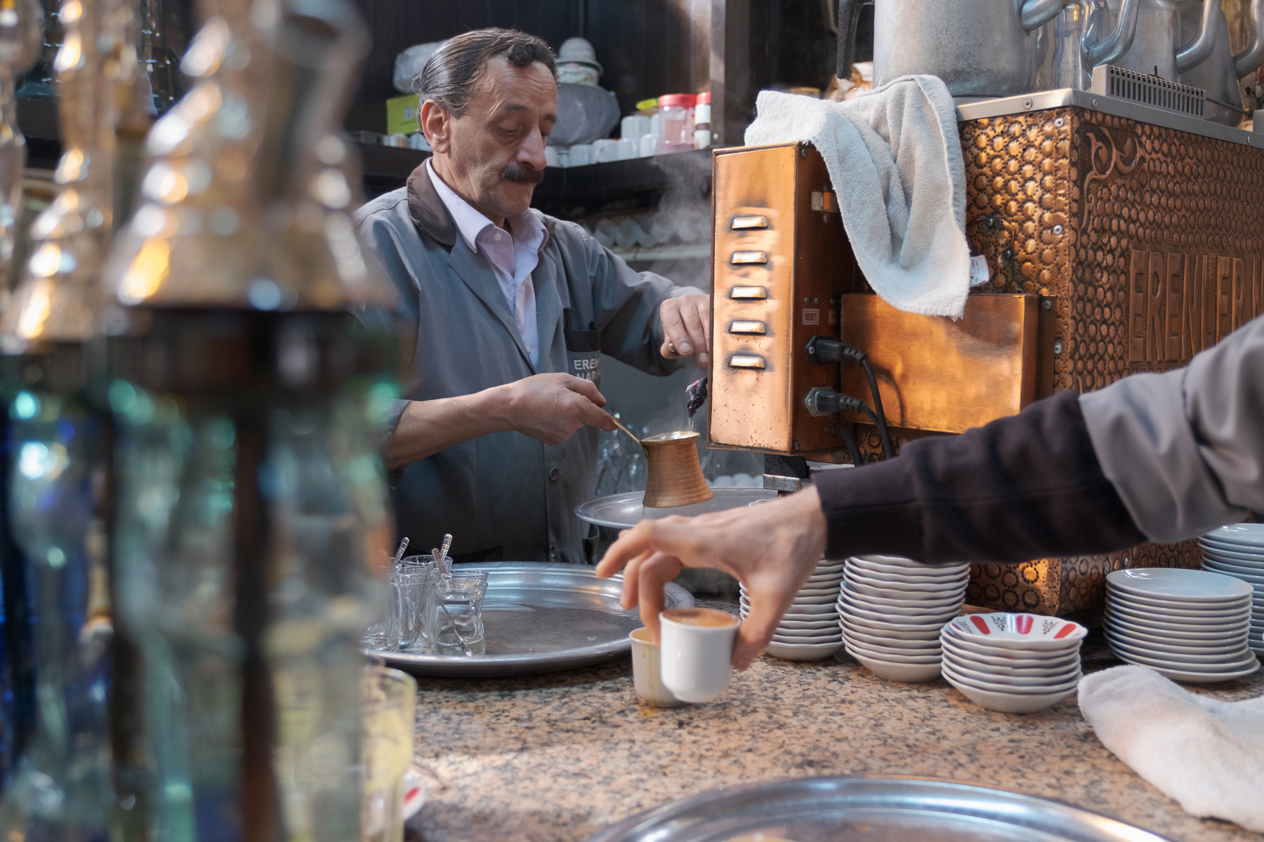
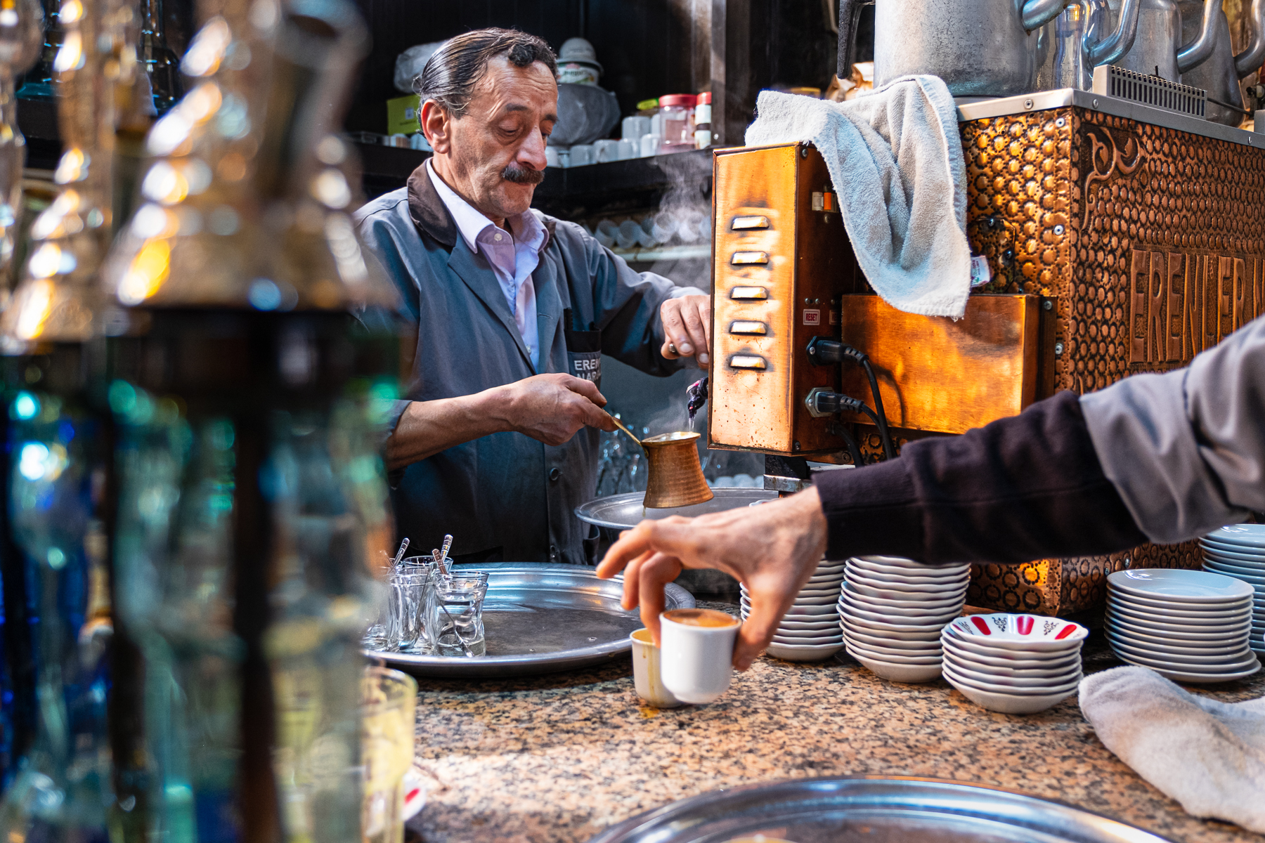
So, what makes this image work?
What decisions both in-camera and in the digital darkroom do you think I made? Guesses are fine. But for each of them, because there’s no magic in specific shutter speeds or focal lengths, the big question remains: Why did I choose that?
What effect does it have in the image? How would the image be different if I’d made a different choice about shutter speed or aperture, focal length, or my point of view (where I put the camera)? What if I’d used the light differently? What about the darkroom? Can you tell which overall changes I made? Don’t worry about how for now. Is it brighter? More contrast? Saturation? And if so, did I change the saturation everywhere? What about dodging and burning, can you see how I might have gently nudged your eye away from some elements in order to draw it toward others?
I’m going somewhere with this, and on Wednesday, I’ll send you that video I promised and talk more about how this approach can forever change your photography as it has done for me. For now, take a look at the images, and if you want to play along, leave your own thoughts and answers to these questions in the comments below. The winner will be chosen randomly and it’s just for fun, but the prize is a good one—it’s worth about $350. Just be sure to reply before Wednesday morning because that’s when I’ll announce the winner and the prize.
(Updated: The winner has now been chosen and you can now go directly to that video here. )
So, what makes the image work? Leave your comments here on my blog. The best thing about this is there are no secrets. Every image in the world is there to be unpacked and learned from, and I want to teach you how to do that because if you can learn to do it with the photographs of others, you can learn to make those decisions and understand the effect of them when you’re holding your camera and making your own photographs.
See you on Wednesday!
For the Love of the Photograph,
David
Comments
Beautiful visual storytelling. The photo, to me, is about business as a characteristic of the barista’s life and life at the cafe (from the way you chose to frame this moment to the dish cloth hang over the coffee machine). It is also about the intrinsic relationship between the barista, his tool (coffee machine) and a customer (the customer is anonymous on a purpose).
The composition (and post-processing) clearly directs the viewer’s eye to the main protagonist, the barista, and it leads the eye to the secondary main point, the customer’s hand picking up coffee (I feel that the dish cloth directs the eye to this secondary point too). The fact that the hand is lightly out of focus (and that it is just a hand – the actual customer is irrelevant hence no face) adds to it being a secondary subject. The coffee machine is an important element of the story-telling too and has been post-processed accordingly.
The objects in the left side of the photo are sufficiently blurred to create a framing for the main subject and their blur also suggests that you were sat very close. I would take a guess that you had a 50 – 80 mm lens and used an aperture of about f7.1 or f8. You were slightly lower than the main subject (sat down?). I would guess that you used shutter speed of about 1/1000th.
I love the thoughtful post-processing too. Saturation and contrast are enhanced, blacks and whites and I would expect clarity too. I would argue that the coffee machine is made a key feature in the photo through post-processing too – adding to the story of relationship between the barista and his tool as well as his client – creating a triangle. Exposure and highlights have been lifted lightly around these too (the barista and his machine and the cup of coffee the customer is picking up). This has been done in a gradual way to carefully lead the eye of the viewer.
Very thoughtful composition that helps to narrate a story, enhanced through careful post-processing technique. I love it.
What makes this image work:
Layers. There are four distinct layers (the typical landscape has three): The blurry bottles on the left, the hand picking up the coffee, the barista and machine, and the background shelves. This creates many things to explore.
A Strong Primary Triangle. The main elements that attract my eye are the copper machine, the hand picking up the coffee, and the barista’s face. I keep moving amongst those three items, and when I wander off to explore something else in the frame, I’m always drawn back to one of those. There’s really no way to fall out.
Framing. The bottles on the left, the back of the machine, the countertop, and back shelf all serve to frame the primary and secondary subjects. Again, acting to keep the eye within the image.
Lines. The arm forms a strong leading line to the hand and coffee cup. The top of the machine is in line with the shelf in back, both of which lead right to his face. His right arm leads to the vessel, and the eye then travels to the bright vented panel on the machine, which leads to the towel and that leading line, adn back to his face.
Sharpness. Primarily on his face, but the glasses on the tray, along with the texture on the machine sides and back, create another strong triangle.
Secondary Elements. The plates with the red decoration, the pitchers (?) on top of the machine, the shape of the foreground bottles all make interesting things to explore.
Light. Darkening the blurry bottles (and bringing out their color), as well as adding contrast and depth to the lower right corner and the machine, create greater variation from his face. In the original shot his face can’t compete with the copper. In the edit, it holds its own very well.
Story. Getting this moment where he is in the middle of creating another beverage while the previous one is on its way to the customer adds depth to the time element of the story. We get a sense of repetition, not just event.
Aperture. Had the surroundings been more out of focus, I think the depth of the image would have been lost. Nothing important is unrecognizable, and what is recognizable and prominent are all relevant to the image.
Shutter speed. Anything faster would only reinforce what is evident. Slower, it would have changed the story to emphasize the action instead of the bigger picture of making and drinking coffee.
Point of View. A little low, placing us in the scene as a participant rather than just an observer, is the right choice. And while the line of the machine and shelf was perhaps not a conscious decision, it was likely subconscious enough from a satisfaction standpoint. I think any skilled photographer gets to the point where these things become automatic, and the eye knows what to do to achieve a possible outcome.
From what I can tell, the image is more vibrant almost everywhere, all very reasonable. My only suggestion would be to back off the vibrance on the machine, and perhaps push the highlights on his face very so slight. He might need to be brighter, but I could be wrong.
I guess about 50mm at f4 and 1/125 sec.
I like the composition in the center of the espresso cup in hand, straight up to the barista’s actions towards the person, framed by the bottles in the foreground and the coffee machine. At second glance, there is still a lot to discover in the picture due to the many details.
A significant increase in contrast and sharpness can be seen in the processed image. Above all, this clearly highlights the coffee machine and the person.
In addition, the individual levels of the picture are emphasized more. The bottles in the foreground, the arm with the cup behind it, then the person in action with the coffee machine and the background. The sharpness also builds up in levels towards the person, where it reaches its peak and decreases again in the background.
I am very new at this but would love to try…I think the photo is so captivating, aside from the popping colours and the culture, because of how I am drawn in. It tells a story. The framing of the barista between the jars and the machine/steam took my eye right in to the main character. His offering gaze led my eye to the cup of coffee he was carefully preparing. Following the reading path I then noticed the customer’s hand in front taking a cup which pulls me for a moment from the barista’s focused world to the hustle and bustle of a coffee shop. The hand then leads me back to the cup being poured and the steam brings me back up to the barista’s face and I get to enjoy the photo/story from the beginning again.
I love the idea of reverse engineering photos. It’s a pretty cool way to learn. Thank you sharing this!
Beautiful photo!
Jodi
Love the shot and everything about the composition. BUT…IMHO it is over-processed. I’m not sure what, but it seems too much of something. Maybe sharpening, saturation, contrast. The RAW file needs something, but for my taste, it got too much of a good thing.
David,
Thanks so, so much for everything.
Don’t get sick, and don’t you EVER die.
-T.
Clearly focused isolation of a Turkish cultural moment with the deft touch of fingers holding espresso leading into the subject. Nice shot!
What makes this image for me is the story that is being told. The subject, being the barista, is perfectly in focus including the detail on the water pouring into his vessel. But to me what brings it all together is the hand of the customer picking up his coffee. Without that detail this would simply be a portrait of the barista.
To me it appears that the aperture used was somewhere around f/8 or f/11, enough to get the subject in focus leaving other items closer to the camera out of focus and therefore framing the subject and the subject matter. The hand is slightly out of focus which is perfect as you don’t want it to be the main hero but the supporting actor. You also used a lower angle to look up to the barista making him even more important to the story. The shutter speed must have been fast to capture the water droplets. I’m not the best judge of focal lengths being used in a particular image but it could have been around 85 mm.
As for post processing, I can see the enhancement in the center around the subject with a little more saturation, clarity and light enhancement. Possibly even a little sharpening. It appears that you also desaturated and darkened the perimeter of the image to bring the eye into the subject while still giving us a sense of place.
Again, this is all about story.
What makes this image work?
Composition: First off, the main subject, the barista, is well captured, busy at his trade. The focal plane gives us peak sharpness on the subject and his working area, with both the foreground and background elements in reasonable focus, though not tack sharp. This brings my attention mainly on the subject, while letting me recognize all of the environment. In my mind, the hand lifting a finished product in the foreground makes the image. It makes it unambiguous what the subject is doing, though I suppose that isn’t a big mystery. Normally, I would be put off by the arm reaching in from the right; it’s the kind of thing that tends to pull my eye out of the frame. In this case, combined with the sharp and bold midtones of the awesome espresso machine, it opens the question of what’s over there. I like it. Making the steam more visible is a nice touch too. The bottles on the left, though totally out of focus, are still recognizable and provide a nice framing element, keeping my eyes from wandering in that direction.
Camera and lens choices: I don’t notice any serious depth compression, so I’d guess a medium focal length lens (50-85mm?). If the background is deeper than it appears, a bit of telephoto can create more intimacy, but I’m guessing that’s not the case. Depth of field is excellent – I’d guess f/8 to f/11. These combine to present the effects mentioned above.
Post processing. Mainly I see added clarity / sharpness and contrast, and lifting shadows on the subject’s face. Maybe a few other local adjustments, such as to highlight the steam, but I can’t really tell.
Pingback: Photographier malgré le confinement et la crise | Les Quêteurs d'Harmonie - Photographie Nature
Most of my photos; it doesn’t feel like I am very deliberately looking for the picture in my head, I just watch what goes on around me and capture images instinctively. Once you are able to control exposure and focus, the instinctive part is timing and composition. At least for candid photos. Of course there is a lot more to it if you are setting up a predetermined scene with models.
For me the image works because it effectively draws you into another culture. The arm reaching for the cup and the chap making the coffee makes it feel like you are there. The post processing just heightens that with contrast and colour.
Love these kind of culture street scenes. Off the bat the selective increase in color saturation of the coffee machine and the colored glass bottles (?) in front help creat more contrast to the rather flat but interesting original. The blur of the front objects and stronger focus on the coffee maker man and the hand with coffee help bring you in – zoom you in- right to the action. Great effect.
I recall you have one from an Italian wine bar maybe Venice where the focus is through some glassware on the hostess lady is pouring wine into a glass to similar effect… love that one as well.
Love the picture and all the comments. However, I still have a question. While I love the softly blurred items on the left and the color they add, but I’m not sure why they weren’t cropped out. I tried cropping them out with a piece of paper and the barista becomes much more prominent and the three hands come together in almost a dance. Would love to hear your thinking.
The way you have composed this is excellent.. the coffee vendor is framed by his surroundings which makes the viewer feel as if they’re right there .. then you’ve edited it to draw extra attention to the coffee vendor .. he was the first thing that caught my eye!
He really “pops” in the image. The RAW images had little contrast and the way you’ve added light and contrast makes it such a strong image.
The photo has been framed to draw us in to this daily life event, the Turkish coffee maker in his stall. He is the protagonist, along with his beautiful coffee machine, which in processing (greater contrast and colour) has become a magical, exotic gold box.
Larger aperture to blur out the left foreground, but not too large, so the arm is still just in focus (if soft). Perhaps with a 50mm.
Timing – the hand taking the coffee adds to the charm and story of the picture. It becomes a human interaction, not just a portrait. I imagine myself taking the coffee and I can almost smell it’s strong rich aroma.
Nice photo.
For me, what makes it work:
The colours are vibrant, and warm.
The right side hand/arm and the eyes of the oldman leads your view to the pot and cup of coffee.
The smoke of the coffee.
It all creates a nice and quiet atmosphere.
I am immediately drawn to the man making the coffee. I can see you have sharpened, added contrast, maybe vibrance. It’s brighter and sharper than the RAW file – I am still learning what all these tools do so can’t say for sure what you’ve done. Blacker blacks, brighter whites. While I am initially drawn to the man, what my eye gravitates to and stays on is the composition of the pot, the hand and the cup the hand is picking up – they are all in a line, with just enough separation that they are distinct objects but so well grouped that I see them as one entity. I also notice the alignment of the two silver trays, and this alignment is mirrored in the placement of the two white towels.
Whew! So many comments. I elected not to read them all and concentrated on the two images.
First, increasing the contrast and clarity improved the 3-dimensionality of the processed image, and is further amplified by the limited DOF (with a 50mm lens, perhaps) so that the bottles in the foreground and the shelves in the background are not in complete focus, keeping them from being distracting.
The viewer’s eye is drawn to areas of greater contrast, i.e., the hand and cup in the foreground, then the batista’s arm and finally his face, showing him concentrating on his task. The arm holding the cup in the foreground also seems ready to offer the cup to the viewer, drawing us into the picture.
The angle of the shot allows you to place the subject – the batista at work – squarely in the image, amidst the “tools of his trade”.
So why does the processed image work? It succeeds in drawing the viewer from the server’s arm and cup in the foreground to the batista work, showing both him and what he produces. It draws you in…
What makes this image work is the arm in the foreground holding the java, almost pose-like as if to show it off. Without it, you have a rather humdrum shot of a barista plying his wares, albeit in a foreign and exotic place. The arm – whether it belongs to a server or customer – provides immediacy. That espresso is hot off the press and some lucky individual is going to get to partake of it. Another important if not critical contributor is the color and texture of the extended hand/fingers and the barista’s face, which substantially enhance the human element. Other things that work: the darkened shadows, the reduced highlights (e.g., the towel on the counter), and the increased vibrance, all of which add the right amount of contrast (though come close to pushing it). A thought on composition: without the arm/java in the foreground, the shot would be a close-up of the barista, his machine, and his work in progress, emphasizing how fastidiously he goes about his business.
Nice with an interactive challenge! By now I’m sure the image has been dissected plenty so sorry for any repetition. The inclusion of the hand grabbing a cup of coffee turns an environmental portrait into a more storytelling one. The scene has a cozy atmosphere and all the clutter begs for further exploration once the initial scene (serving of coffee) has been taken in.
No idea on the focal length used but I see no extreme wide-angle distortion or tele compression, but it is still a bit of a wide scene and all but the bottles to the left are in focus… Maybe ~35mm f/8 from a slightly low angle and close to the counter?
In post you have definitely cranked up contrast and saturation adding to the warm atmosphere and you have lighted the face of the barista to get rid of some of the shadows. Maybe worked a bit of light onto the arm grabbing coffee as well. Not sure if you have darkened the shelves behind the baristas head as well to make him stand out even more, they’re pretty cluttered. Personally I might have turned the “bling” on the coffee machine down, it’s pulling my eyes away from the center scene a bit but a fabulous shot regardless.
Thanks for the photographic heavy content in contrast to the tech-heavy pixel peeping that goes on everywhere. Keep up the good work!
Captivating image!
From my standpoint as an off-set viewer, I experience looking into a story, as though I am looking around the glistening shapes which please my eye with their abstract beauty. This is highly relatable moment that crosses cultural boundaries. So it has a very interesting juxtaposition of being familiar yet foreign.
The warm golden/copper tones that are adjusted in the centre of the photo focus on its human element and direct my eye into the action of the man making the coffee (especially his interesting face) and the person receiving it. The repetition and enhancement of the warm copper tone is very pleasing to my eye and serves to unify the area where my eye is directed to go. Even bringing my eye to the meaning behind the action: a superb cup of Turkish coffee! The interesting arch-shaped hand over the coffee emphasizes this. The brightening of the focal area helps my eye not become distracted or overwhelmed by the surrounding clutter. This clutter is interesting to visually explore but doing so happens after I observe the human story going on. There is more contrast, intensifying and texture in the second picture which adds considerable interest.
I would suggest that the age and physical presentation of the maker lends a tone of importance to the action. I have a sense of his commitment to his craft. He is the most ‘in focus’ element of the picture. Three hands (interest as an odd number) forming a triangle shape in the centre of the photo.
The fact that the receiver is out of frame lends an air of mystery, evoking my imagination. As the viewer, I’ve been placed at the counter and I imagine the receiving person could be standing right beside me (even slightly facing me).
I’ve been trying to hone this skill of deconstructing images since reading The Heart of the Photograph in the hopes it will improve my own decision-making when creating photographs. I still have a lot of room for improvement, but here’s my attempt.
The RAW file leads me to believe a wide lens was used, probably to isolate and get in close to the subject—a barista and the tools of his trade, a master and his craft. The focus is sharpest on the barista’s face and coffee machine. The glass hookahs on the left and the arm reaching in both serve to frame the subject, but also add to the story of a bustling hookah bar.
In the adjusted file, I see the whites are pulled down, maybe so the dishes on the counter, towel thrown over the machine, and containers on the shelf in the background don’t pull the eye away from the subject. There is definitely an increase in saturation and sharpness/clarity overall. There’s a little dodging and sharpening on the barista’s upper body, especially the face, and the machine. The shadows on the shelf behind him have been increased to separate him from the background. The saturation is increased to play up the warm, rich colors. For me, the attention to warm colors and sharpness is just like a delicious cup of coffee—rich and vibrant with a punch of clarity.
The updated image works because
1. It leads the eyes directly to the coffee maker and the coffee machine
2. The additional details it adds to the shiny ness of the machine
3. The clarity the glasses in the tray get
4. The clarity it adds to the smoke coming out of the coffee machine
I wish I could do this kind of editing to my pics…
What makes this image work? It tells a story. The barista’s face is full of character. Is he bored? Is he hot and tired? Who knows, and that’s what’s great about this, we write our own story. With the barista not looking at the photographer the image is more candid; the photographer chose to wait until the barista was not looking at the camera. The lens is wide enough and the aperture is deep enough that there is context and depth to the scene – the little coffee mugs on the back shelf are not bokeh’d out, they have been intentionally included, we can see the steam rising from the machine, there is detail in the saucers in front of the coffee machine. The glass bottles on the front left have been bokeh’d out, which is a choice that was made at capture that they were part of the scene (hence not cropped out) but without too much attention on them. They are likely there for the colour contrast – the blue tones of the bottles versus the orange tones of the coffee machine). By putting the focus on the barista and the coffee machine this is where the most attention is drawn. The tones of orange and blue have been enhanced in the darkroom by increasing contrast, which increases saturation. Texture has also been emphasized on the barista and the coffee machine, which also draws our eye the most to that portion of the image.
I’m not great at analysing images to know what works and what doesn’t and need all the practice I can get. This was challenging and really got me looking at the image for quite some time. I look forward to Wednesday’s video where you unpack the image from start to finish!!
This image is framed so, although there is a lot going on, there is no question what the focal point is. I like the way you added contrast to the overall image to give it more depth. I also noticed the way you brightened up and warmed up the hues on the coffee machine, and the coffee in the cups on the foreground. It gives it a nice, cozy feel. The arm reaching in adds to the leading lines, and the bokeh on the left side lends a softness.
You chose a POV that puts us “right in the middle of it”, as though we were the next server in line to pickup an order.
You chose to imbue other elements in the scene with the same color palette as one of the primary subjects: the coffee.
You brought out the elements of that color palette in the man running the machine (the proprietor?). For me, this connects the machine and the beverage with the man working the counter and reinforces the human connection. The warmth goes from man to coffee to customer.
This image works for me because you have chosen such a universal subject; morning coffee is something many people can relate to, yet this is a unique and interesting take on that. A wider aperture has created some fabulous bokeh in the foreground on the left to frame the subject and the arm reaching in from the right adds a leading line to further draw our eye and attention to the barista and the job that he is doing. There is some beautiful side lighting to highlight the subject’s hands and concentration on the task. The colour palette is pleasing to the eye, using shades of colour from opposing sides of the colour wheel. These colours work really well together combined with more neutral greys, whites and blacks. In post processing contrast has been added by deepening the blacks and lifting the whites. Highlights on the bottles, hair, skin and coffee machine have also been emphasised which helps to create further depth in the image. The steam, whilst subtle, is also more noticeable in the final image and adds a sensory element for the viewer; I can almost smell the coffee brewing and hear the chatter in the coffee shop! I’d love to be there with my camera too.
The low camera angle shows depth – from the plate and bottles in foreground, to person taking a cup of coffee, continuing back to the barista. Barista’s gaze and arm converge on same point. The arm is a leading line, drawing the eye into the area where the barista is working.
I find my eye drawn in by his face, then to what he’s working on, along his right arm back to his face. My eye is also drawn from his face to the towel, down to the arm of the person taking coffee, back to the coffee he is working on. Round and round, immersed in his world.
Light from above and behind make him stand out, as does the blur of things around him.
Post: The after version is brighter, more contrasty and more saturated overall. In addition, the barista’s head, face, jacket, and the glassware on the tray are brighter and more saturated (by dodging). This helps to draw attention to him and his work. Localized sharpening might have been used, again, to draw attention to the man and his work.
Your decision to frame the man with the tools of his trade draws my attention directly to him, from there I notice the arm reaching in for the finished coffee. I would guess that you used a medium aperture and focused directly on the man and a fairly fast shutter speed. This keeps him sharp and the foreground blurred helping to draw our attention directly to him. I get the sense of how busy this shop must be from all the clutter on the counter and shelves behind him.
In the darkroom you have lightened the shadows making him brighter, increased the contrast and saturation. The coffee machine appears quite a bit brighter possibly a bit of dodging on it and a bit of burning in the shadows over his head.
David:
Saw there was a challenge and immediately jumped into Affinity to see what I would do.
Of course I hadn’t read the whole story, Wanted to do my thing without being influenced by outside direction. (Story of my life)
Anyway now I’m finished and have read the article I will try to respond.
Lovely shot, lots of potential.
As obvious the raw is flat. You have increased the Vibrancy, and a touch of Saturation and a very modest vignette to darken the corners.
When I first looked at the picture, I saw a hand picking up the coffee, and the background cluttered but adding atmosphere with a subtle reference to the Barista making a fresh cup.
Upon enlarging the shot I see the Hand and coffee are slightly soft, and the Barista is in focus.
The story changes!
Now the Barista concentrating on his job is the leading role, and the hand with coffee just a supporting extra.
The rest of the imagery is the stage; essential but not the star.
I found the highlights in the bottles at left are distracting, as are the dishes under the arm on the right and the pots on top of the coffee maker. The dishes led me out of the photo.
These items I heavily vignetted and softened in an adjustment layer in Affinity, leaving just an oval covering the face, hands and finished cup of coffee with your adjustments
The highlights in the glassware I cloned from the other bottle
Am I right? Is there a RIGHT way?
It’s all down to taste and I’m certain many would disagree with me.
But that is what makes me enjoy photography so much.
And the fact you encourage people to express themselves without using your rules is the reason I follow your blogs.
This image works extremely well for me……It tells the story of a very busy Barista and the men paying apt attention to the particulars of their craft. I like the framing of the man frothing the milk and the fact that you caught his expression and the enhancement of the steam he is producing. All the areas that you lightened and brought out the colour direct your eye towards the main element of the photograph. The tone is beautiful. Lots to look at here and possibly make other shots within the frame, such as the detail on the machine itself, but no matter where your eye goes it always come back to the focal point in the center. I love the low angle and how you captured the arm just below the steaming gold cup which directs your eye right to it, and from there, up to the man’s intense expression. You also managed quite well to not have the lid of the jar not protruding from the top of the man’s head. The triangular shape of the towel brings your eye back to the arm, and the hand which leads to the cup and you start all over again examining the scene. Even the towel in the lower right corner is a triangle that leads you into the scene. The arm is perfectly cropped so as not to cut right through the joint of the arm. If I had to saying anything that might and I mean “might” improve this image, it would be to just ever so slightly crop the left side a bit so that the third bottle right on the edge of the scene does not show, but this does not matter to me as my eye does not get stuck there, it just keeps going around the wonderful scene to bring me right back to the gentleman working. Great job!
I find the image very nice and interesting to study.
The point of view, low and using a wide angle focal length creates a wonderfull frame between the bottles in the left and the coffe machine in the right. Furthermore this elements also give the image a lot of context and depth, and a dose of color contrast between the cool greens of the left and the warm colors of the coffee machine.
Just in the middle, inside the frame is where the actions takes place. First you see the hand with the cup and then, the repetition with the cup that is holding the barista takes you to the main subject, the barista. For me is the combination of these elements that makes the image works, the guide to thourght image, giving you context and pushing to explore.
Regarding post processing, it seems to be very light this time, more contrast and some clarity to fo lead the eyes.
David, I love what you do, which is why I am here, but I struggle philosophically with your question… “What makes the image work?” The image doesn’t work, the image “is”. Perhaps the viewer has to work to decipher meaning i.e. has to expend energy. Perhaps it is a language thing? Is the image successful at telling a story? Is it a mystery story? Who owns the hand that grips the cup? Why does the cup have no handle? (rhetorical, I know…) Will the had be burned? Does the server care? He has moved on to the next refill. Does the image processing assist in the story telling or hinder? This depends on the story, which, in turn, depends on the viewer. Each viewer has a different history and it is that history that determines what the viewer sees in any image. Some might see a harrowed man, slaving away for customers that do not care to engage. Some might see a proud man, dedicated to his task, working his own shop, making an honest living. For me, I see the machine. The way the image is processed, the foreground hand is blurred and the focus is on the side of the machine issuing (hot?) water. The lens choice is not macro and cannot focus near, hence hand out of focus. As usual, some elements in front of the focus point are in focus, more behind in a typical 1/3 forward, 2/3 back suggestive of F8 or thereabouts. Items on shelves in the background are not too blurred. Camera position is at elbow height. The story could have been about the working man but the contrast and saturation added to the machine draws all my attention. It sucks in electricity through those strong black cables and spits out hot water at the people who dare to touch it. The out of focus, but still high contrast elements on the left push me away from the man and over to the right and I can’t escape the machine. I am drawn out of the image on the top right by the high contrasting edge detail. I can’t even stay for a quick espresso .
Personally I would have cropped the image a little tighter. It is a little too busy around the edges.
Normal focal length lens. f-5.6 whit the hand slightly out of focus. Glasses in foreground out of focus as well. Shutter 1/125 sec.
In post processing the barista’s face was dodged, sharpened and saturation increased. This drew us in closer into the barista’s task at hand. The leading line of the arm also did the same. The espresso machine was also sharpened and saturation increased to help with the setting of a unique espresso bar. Good Job.
What makes this Image work?
1. Composition and the lighting are the easy answer.
Using the bottles in front on the left frame side without taking anything away from your subject- the man. Keeping it out of focus draws my eye into the image. The man is looking down at the coffee- so I follow his eyes. The steam causes movement and is light- so I follow the steam. The light reflects off the copper and becomes a beacon- so it draws me in. The white towel frames the top right so I don’t go off the print. The arm is a leading line on bottom right- again lines leading me in. Towel on bottom right framing the image. Tray on bottom adds to frame. Copper cup in focus with the man= the subject. The white coffee cup is soft focus- so my eye goes beyond that.
Darkroom adjustments-
Increased clarity- overall I can see the blacks increased and the detail is increased as in the steam -with clarity slider.
increased vibrance- blue tones showing up in the tray. Dodged a bit of the bottom tray.
Highlighted midtones in the copper making it pop
Contrast increased with the whites – whiter in towels and his shirt and the shadows are richer
Dodged or increased exposure with a brush on the man
The highlights on the glasses on tray- the copper mug and the white cup create a triangle
This is a great image for this exercise. If the man was looking at camera- then it would become a portrait, now we are getting to be an unobtrusive viewer Arm coming in on the slight diagonle makes the print dynamic, gives movement and light to the image. Using a deeper DOF would have cluttered the image and we would get lost looking for the subject- keeping DOF medium allows up to recognize the arm and still draws eye to the plane of focus and the subject. A slow shutter would blur the movement and tell a different story. A large DOF would create clutter. The one item I would play with is the pewter water pitchers- include the top- pulls me too far back? Removing them- loose my frame? As is- I feel like a fly on the wall. I feel like I am getting the true vibe of the place- not some instagram puff piece- more like National Geographic photo journalism. In this time of pandemic lockdown- this is the kind of image that feeds my soul. Thank you for an awesome exercise!
Fun to think about this picture
Capture:
Wide angle lens – makes me participate in the scene
Slightly unsharp hand – gives the feeling of motion
Adjustments:
Slight color shift to make it warmer
Increase in contrast
More clarity
Slightly increased saturation
Maybe local adjustment (increased brightness) of the face & coffee cup
Thanks for learning
The image works because it tells a story, it is a glimpse into the probably daily life of this barista. The low POV makes the viewer feel like they are sitting there at a table waiting for their coffee. It is framed with the bottles on the left which are out of focus so as not to be distracting. Clearly the focus is on the barista, everything else is somewhat softly focused or out of focus. The line of the arm picking up the cup provides a leading line to (or back to) the barista with his own hands directing the viewer to what he is doing. The white towel provides a circular route for your eyes to follow from the barista to the arm and back around.
Warmth has been added and probably structure and clarity. The hand with the cup and the man have both been lightened up. The details in the coffee machine, glasses on the tray and the towel have been increased as well. The forward cup is also lighter but the one behind it is not, to not be distracting. The imaged was cropped from the bottom to remove the distractions on the table.
Usually love your photos, David, but re this one, frankly, for me, it doesn’t work before or after.
Yikes! I felt myself starting to sweat much like before an exam at university. You asked us to deconstruct this image. I read the comments and initially I thought forget this I am not cut out for this. I am not qualified. But I can tell you this. First off I noticed the light on the barista face and the machines. I focused on him immediately. Second thing I noticed were the leading lines particularly the extended hand delicately picking up the coffee. To be honest, I didn’t know whether or not I liked it in the frame, but then decided it added a dimension to the overall story. I liked the point of view of the camera. The rest of it; focal length, aperture, shutter speed, I don’t really care. I looked for the story. You told a good one, therefore, I really enjoyed the photograph.
Thanks, David. I did my one scary thing of the day:)
Nice DOF. Adjustments (contrast, luminosity, etc) to central objects help draw the viewer’s focus. Composition surrounding the central objects managed in a way to frame and not distract. Warm tones enhance the feel of the image. Make it more intimate.
Upon reflection I wondered what the effect might be if the focus was more limited to just the hand and the cup, or the barista?
The image captures the viewer’s interest and makes you wonder where it is. It could be an espresso coffee bar in Istanbul or a hidden gem in your local neighborhood. The main subject is nicely framed by the intricate artifacts in the shop. Colors are vibrant giving the place a liveliness and makes you anxiously wait for your order to arrive. A beautiful moment in time!
The image works because it is telling what is going on. Shows a place and an action and makes me wonder how it is beyond the frame. For some reason I think it is outdoors or close to a big window. Looks like the place is busy. The guy looks concentrated serving coffee and everything is handy, like the plates are ready to be used. You may have taken this photo from your table that was nearby because there is no obstruction and your camera is positioned lower. Probably at F4-5.6. I like the way you framed it. You show the shelves behind the man; at the top right the kettles and what works for me is the tray at the bottom (front). Without it we wouldn’t know where that coffee was going and would have been a weird empty space. The waiter’s hand is below and not blocking the action behind. The coffee cup is full and probably hot because he is touching it with 2 fingers, so he was not so fast picking up that coffee and you didn’t need to use a fast shutter speed. The bottles at the left are sharp enough to identify them (probably the thing they use to smoke), but blurred to not distract us from the main subject.
As for the post processing, looks that you increased the contrast, the blacks, the brightness and the saturation. That works really well to highlight the man’s face. My vision is guided first to his face, to the coffee machine and to the arm with the coffee cup that is coming out of the frame for me. Thank you for the opportunity David. You are very kind.
Hi everybody.
What makes the image work :
– sense of depth given by the “big” foreground arm (compared to the coffee maker in the middle ground), by the bottles on the left, and by good use of aperture generating adequate depth of field.
– similarity between the arm taking the coffee and the coffee maker arm filling the pot.
– sense of unity given by the 3 hands located in the center of the photograph.
– second sense of unity is given by the cold blueish color of the foreground arm and the coffee maker. It contrasts with the warm yelloish color of the coffee machine.
– the eye is guided from the right part of the foreground arm to the hand holding the coffee and then to the coffee maker who is the sharpest part of the photograph.
– and last but not least, this photograph is full of life, and we fill the love the photographer has for people !
Wonderful exercise, David…thank you!
I noticed:
* since there’s no distortion from a wide angle RAW image, you maybe using a 50mm lens with probably 4 or 5 aperature to focus on the coffee barista and machine while blurring the foreground as well as the background
* the extreme out of focus foreground on the left brings my eye immediately to the barista in both images making him the main part of the story
* the less out of focus arm and cup of coffee lends interest and more information while also bringing my eye back to the barista
* did you use Topaz or equivalent? or lightroom to sharpen the image while popping the contrast and saturation? It’s certainly effective in highlighting the barista
*I definitely notice the glasses to the left of the barista where I didn’t in the RAW image
* it looks like you may have selected the barista’s face to lighten it slightly and lightened the shadows a bit
*the black point seems to have been used unless you used a different program that darkens at the same time it saturates, contrasts and sharpens
* the overall image definitely has a brightness giving it more aliveness
I’m looking forward to seeing your video!
I have not bothered to read other comments as it defeats the purpose of the exercise but will do so after submitting this to find out what I missed out and should have thought of.
In The field:-
The lens used is quite wide, possibly using the equivalent of 17.5mm lens on a micro 4/3rds camera.
The metering used was on the whole scene which left the subjects face, especially his eyes under-exposed.
There is a reasonable depth of field as the bottles are out of focus, the arm crossing the image is slightly out of focus but the face is sharp. f5.6 used at a guess.
Composition:-
The composition has good depth of field as you are view past the out of focus bottles which helps the 3-D feel.
The composition has lots of nice leading lines bringing the attention to the coffee vendor. The lines of the plates, the lines of the
shelves, the rows of plates and that arm reaching in to get the freshly brewed coffee (you forgot the scent;) )!! Even the line of the out of focus glass bottles and the glass cups helps angle in and focus the view on the vendor.
The circle vs circle patterning also makes a lovely repeat motif through the whole image.
There is a nice link; almost a hand shake, between the vendor and the customer.
There is a hint of a nice blue/copper contrast in the original which was enhanced significantly during processing.
Processing:-
Increased the black point very slightly.
Decreased the light on the very bright part of the towel as it takes the eye away from the subject. When duller it also helps the composition by leading the eye towards the vendor. The texturing on the towel has also been increased, possibly by dodging and burning though this seems a tedious way to do something which could be done more easily other ways such as using a mask and bump mapping.
Dodged the switches etc on the coffee machine panel. Keeping connected to that arm;) Something I didn’t really notice in the original.
The vendors face is under exposed significantly and needed to be lightened by dodging with possible burning of wrinkles to increase facial contrasts and look more “characterful.
Emphasised the shine of the hair and curvature of the head by appropriate dodging and burning.
Lift the saturation levels of the yellows and reds thoughout the whole image. Lift the saturation of the blues. Lift the saturation of blue and cyan in the out of focus bottles.
Possibly increased the contrast throughout whole photo.
Sharpening the face, hands and vending mug of the vendor very slightly.
Note; I use linux for processing so some of my processing terms might not be the common terms used in LIghtroom and Photoshop.
Wow, some of these responses are really long, so I’ll try to keep mine brief. Obviously, you used a wider angle lens from relatively close up, as the perspective would have been compressed with a longer focal length and we would not have had the out of focus glass jars on the left (which, incidentally, serve to partially block out any potentially distracting background, thus, keeping the man as our main subject. The arm and hand entering the frame from the right serve as leading lines, drawing our eye to the middle of the frame and then up to the main man’s face once again.
As for post processing, the contrast is definitely increased and possibly the saturation is enhanced slightly. The main man’s face is also highlighted, since he’s our main subject and all lines and light lead our eye directly to him. It looks as though details in his face may also be enhanced.
Well, I guess this wasn’t that short, after all, so I’d better stop here. 😁 Would love to see more of these interactive exercises, David!
The subject matter of this cultural setting in Istanbul gives me the feeling of inclusiveness, waiting in queue for the Barista to prepare my frothy Turkish thick and intensely flavoured coffee rather than just looking at a scene from afar. Experiencing the moment, I believe was accomplished by having very little foreground and the motion/action happening up close within arms length.
A great picture will guide you to the focal points quickly without you realizing that you are exploring the many objects , shapes and colours along the way.
The finished image has been successfully intensified by using light and contrast.
The bottles in the foreground are no longer fuzzy, therefore, framing the picture without distraction.
The enhanced clarity/brightness/definition of the centre of the picture immediately takes you on a rapid subliminal journey to the focal points.
The triangular path starts with the contrast of the granite countertop and the clarity of the hand and arm movement.
For me, the action of the man cautiously picking up the extremely hot cup is the main focal point. It draws me in and engages me in the ambience of the traditional environment.
The enhanced golden toned drawer and textured cabinet and defined cloth leads me to the gentleman’s hand, then up to his expressive face with is my second focal point and then down to the Turkish Cezve which is my third focal point.
I was to have had this experience in April 2020 but Covid-19 forced me home mid my multi country journey. I look forward (like everyone else) for life to return to normal (best it can) and to be able to travel again. Until then, being an armchair traveller is where we are at. Great photo David. Thanks for the challenge and escapism.
Stay safe everyone.
The viewer is looking on this “typical” scene in a foreign country. It is exotic to me and that helps me WANT to examine it more fully. I feel pulled into the scene in a second way and that is the camera angle. Humans would see the scene playing out at that angle. And, third is the tunnel made by the cafe “props” surrounding and framing the coffeee maker. It’s like a tunnel which is another
way to have “leading lines”. The repeating vertical lines of the coffeemaker, the basket, the bottles , the towel, the cup and
pouring vessel make that very busy image grounded and sensible.
Two people interacting in a totally human way are connected by one hand “working” and one hand hand “wanting”. Connection made! That’s the story the photo tells very clearly. The processing supports the story by accenting the human interaction with
enhanced color. The outside edge on the left have been made less attractive by making it less sharp. (That part of the image is a bit difficult for me .) :-{
What makes this image work? For me, it’s the overall mood you were able to create with your choices. The immediate focus is on the man making the coffee, made easy by making his face brighter and sharper, but also desaturating and darkening the background behind it. A closer look here shows the same name or brand on his shirt as on the beautiful copper machine. Begging the question, “Could this be the owner?” The next focus for me is the hand. I absolutely love how this hand is personified. The way the hand is holding the coffee gently and the well placed steam above it (also enhanced in post) shows the coffee is piping hot. But to me the finger placement also gives the hand a humanistic vibe. It’s almost like a tiny human celebrating the joy of receiving his coffee. “He” even looks to be wearing a little hat, or Fez, as the tool the barista is using bares a similar shape and is placed aptly. This story is beautifully framed with well balanced ambient colors and textures. The blurred green bottles, which likely block dirty dishes or unimportant elements, as well as provide beautiful color and texture not only in themselves, but also on the other metal objects in the frame. I love all the color and textures and elements. Cotton, rock, glass, metal…..smooth, rough,….hot, cold…..focused and fun. Such a fun little story told in this image. Clearly intentional and certainly effective.
This is a great exercise David.
Technically, I’m thinking you used a wide focal length and quite a wide aperture. Shutter speed not that interesting, maybe something like 1/100. In the darkroom, you’ve bumped up the contrast, maybe the saturation a tad. You’ve also dodged (or is it burnt – I can never remember)… brightened the barista to bring similar brightness (and the viewer’s attention) to the barista and to the espresso being picked up by the waiter.
Compositionally, I see some relatively subtle leading lines on the right half of the frame that point to the barista. Interestingly, the left side of the frame is quite the opposite, creating somewhat of a frame / block between the viewer and the action, so that we feel like we are an observer rather than right in the action. I like the slightly cocked angle of the espresso, capturing a moment that conveys movement.
Creatively, I like how you’ve been able to use the wide angle to give an inclusive feeling, retaining the chaos of the scene. But you’ve kept the chaos in check with the bottles on the left hand side of the frame and the lighting and leading line cues towards the barista and the espresso, meaning that the chaos is part of the story and not a distraction that makes it hard to know where to look.
I had an interesting experience with this exercise: for a moment, I misread the before and after, thinking that the before was actually the after. I thought it was really interesting how you’d brightened the espresso to make it the hero of the shot, rather than the barista. Then I realised I had it the wrong way around, but I found it really interesting to contemplate the difference in story between the two.
This was fun!
You chose to increase the highlights to show the magic that is something we take for granted here – making coffee (albeit I make it in a much less magical way). The highlights show the colour – the glints of coloured glass, the hammered metals and some contrast or maybe an increase to clarity, makes me feel like I can see that same light glinting from the man making the coffee. You chose to draw our attention to the hand reaching into the scene, so that we can both feel the layers to the experience and somehow transport ourselves to feeling like we might be the next hand to reach out for a warm delicious cup. It’s the way you helped my eye travel on a deliberate path, from the viewpoint of the photo taker, down into the scene to see the person anticipatory grab for his/her coffee, all the way up to the focus of the maker …. and all the light focussed in and around him gave my eye just enough time to pause and wonder what else I might learn about this gentleman who understands the art of Turkish coffee should I just sit quietly enough to let him reveal his next secret.
Take with a grain of salt. I like the blurred foreground framing and giving depth to the man drawing the coffee. The lines nicely go behind and around him. Sets the scene, he is in his own domain. I also like all the round plates and trays that dance the eyes around
I have trouble with the arm and hand. I keep seeing those carnival games where one trie to pluck a prize with the claw. On the one hand, I kind of like the “claw.” The arm seems an interruption, which is not necessarily a negative.
Light, color, and gesture. Of the three, the gesture carries the day. The gesture of the barista and the gesture of the customer grab our attention. Looking at the image, your eye automatically goes to the luminous( the light) parts of the image. Without doing anything else, if you put your thumb over the luminous containers in the upper left-hand corner of the image, the subject of the image becomes much more readily apparent. For balance, the containers need to be there but the light on them needs to diminish. Adjust generally to taste ( contrast, clarity, saturation, etc) and the image is done.
The in-camera decision were to create an environmental portrait by using a wide field of view. The main subject, the coffee maker, is surrounded by elements in his environment including the the tray with glasses and small spoons, the arm of someone (a server?) holding a cup of frothy beverage, towles, supplies on a shelf behind the main subject, and what appear to be two hookahs on the left side (out of focus but identifiable).
The post processing included increasing brightness, color, and contrast on the right 2/3 of the image. This highlighted the main subject and brought out details in the copper face of the coffee machine, including the lettering. The left 1/3 was kept unaltered. No cropping was done in post. The image tells a nice story and the processing makes the elements easier to identify.
For me your aim was to take the low energy, quiet and sedate raw image and transform the mood to imply busy, hectic, early morning rush hour mood. You accomplished with a generous dose of contrast and a careful dodging and burning to keep the hand holding the cup (hot!) and the line to the old man (bush and hurried) the key to the story.
I’m answering the question ‘Why does the second image work better than the first?’ Never tried doing this before…
In both cases the converging lines take my eye to the man making the coffee. This is a natural light image, so the man needed to have his shadows lightened. The metal surface to his left (our right!) has been lightened too much and draws attention away from the subject. I think the photo is a ‘slice of life’ image which would be improved if the hand from the right side was absent, then the scene could be cropped for more impact.
It’s the gesture of the hand that catches your attention first.! The old gentleman making the coffee rounds out the story. The bottles in the foreground frame the picture and add color and interest. I tried it cropped so that the right side was gone right to the wrist. To me that’s a stronger composition. I’m not sure why the whole arm needs to be there.
Post: definitely more saturated to bring out the warm tones. And the old gentleman is definitely enhanced. Also
The bottles with more color and detail.
Definitely an interesting picture. My daughter would love the coffee. I’m a tea drinker myself.
This image works for me because it tells a story. The preparation of a cup of coffee in a foreign land, the customer receiving the result. The selective focus, color and use of light draws me into the story. I don’t need to get technical to appreciate this image.
My guess is you shot from about 5 feet in front of the espresso cup with a 24mm lens with an aperature of F10. You used natural light (maybe a window) from photographer’s left which lit up the drawer. This pulled in your eye to the center of the frame which then dropped down to the hand and then back around and up to the barister’s face. The side lighting added character to the barister’s face. I think you simply used a “s” curve in Photoshop to increase contrast overall and thereby also some saturation. The narrow depth of field (Hand to face) and brightness in the focal plane keeps the eye on the subject.
In the original photograph my eyes are first drawn to the lightly illuminated espresso cup and the hand. The rest of the frame feels very disturbed due to its uniform dullness. There is no focus, my eyes have nothing to hold on.
So, what makes this image work? You clearly focused on a combination of coffee drinking and preparing process by increasing sharpness/contrast of the coffee cup/hand, head and the barista machine/towel forming a wonderful triangle where my eyes cycle around and rest. I also love the echoing of the two little triangles coffee cup/fingers and the barista hand/ cupper pot.
The slightly more saturated glasses/caps on the left side add an extra depth effect.
A few thoughts: there is just enough depth of field so that the hand holding the cup can be mostly in focus, with the barista actually in focus (therefore it looks to me as though you focused on the man but thought the hand was important). The brilliant touch here is that the cup the hand is picking up shows us what the man behind the counter is doing. Is he making a latte? An Americano? No, he’s probably making Turkish coffee, because the small vessel implies that that’s what’s in it. The foreground cup is just below the cup the man is pouring something into, and from a different perspective, one would obscure the other or they’d be farther apart. Normally a hand reaching into a shot would ruin it, but in this case it illustrates something. As noted by so many, the increased saturation and contrast is an improvement and makes things pop. It’s a great story-telling shot.
The impact was increased on the man making the coffee, the main subject of the image. It is interesting for me to see that he is positioned almost in the center, only slightly to the left, perhaps the bright orange coffee machine is enough to counterbalance it.
The man was the main focus of local adjustments, with increased exposure and contract, maybe even sharpness to show his face features. The whole image got some contrast and vibrant increase, which intensified the color and texture of the above-mentioned coffee machine.
What Makes this Work?
Show with Wide-angle, pushed in close. This yields a large DOF and focus to the back of the frame.
Intentional stuff near the lens ‘shit in the way’, to move attention to the people
Intentional Alignment of the angle of the two arms & Intentional Alignment of the 3 coffee vessels, to increase the connection between the two people and their interaction
Clarity – Added Overall to create interest throughout and make the photo a longer read
More Clarity on Barista’s face to emphasize the intense focus on his work
Warmer WB – Added Overall, to add the energy of the sunlight in the space
Touch more vibrance – Added Overall, to add more pull into the Barista, Hand and lifted Coffee
great exercise.
have been doing this in one way or another since you introduced it n years ago.
I didn’t read any other comments because I don’t want to be influenced by something I may have missed in analyzing this on my own. In a photograph I look for impact, creativity, in your case personal style (humanitarian), composition, color, center of interest, lighting, subject, technique & statement . I am first drawn to the bronze color which leads my eye immediately to the center of interest which is the barista. He is concentrating (and also calm) on what I’m drawn to next, the dripping coffee, the steam & how ready is he to close the handle. I make espresso daily so I can smell the area aroma and I do in this scene. I sometimes give myself a project of just photographing circles, triangles & squares, just as a little personal project where I might want my eye to bounce around to. So here I see the relationship in the 3 hands, the head/arm/bottles, the circular plates/saucers/cup and the squarish bottles/brass squares, etc.
It works because I am interested in the man & his coffee making. It tells a real story about him and his livelihood. I wonder if the man holding the cup is a customer, family member or the server? How long has he been in business, is this coffee station a hand me down from his father or a new business he started? It looks like he does a good business since there are all the saucers and cups. How big is the station, does he sell sweets?
I am by no means a photoshop expert so my knowledge is limited. The Raw file is flatter and looks a little cooler than the tweaked final. In the final I would like to see a little more detail in the steam. The specular highlights in the bottles and the counter glare at the center left bottom toned down just a hair, maybe 4%, the highlight at far right by the coffee pot and definitely the little highlight by his thumb. I would take out the spot on the tray with the glasses. I personally am not bothered by the coffee pots upper right corner being cut off but I wonder if seeing the pots make it a stronger image or if there is too much negative space or something distracting above his head . This crop may have been intentional just for those reasons. DOF and focus are good. Blurry bottles don’t distract the eye from going to the main subject and don’t distract from the secondary. I think the side lighting is beautiful. The eye is opened up nicely.
For me this photo meets my criteria for making a great photograph!
Interestingly, I can’t decide whether you used a winde angle lens or a telephoto lens (I guess it’s more on the long side…). Also it seems that you hold the camera at chest hight rather than at head hight, giving the viewer the impression to be in the scene (as opposed to have an overview); the hand picking the cup, or the arm it belongs to, amplify this impression by linking the scene to something outside the picture (as does, to a minor degree, the tray at the bottom).
As for post processing – not much, I’d say. Adding some contrast, some saturation and clarity; maybe some amount of de-hazing – in any case enough to transform a rather flaw picture into a radiant eye-catcher.
(Although this is not the question, I’d like to add that imho the concentrated facial expression of the barista in his working environment would give a fine picture even without the coffee-picking hand; however, this would require a different cropping of the image.)
Wow! A lot of people have made a lot of comments! This is my first time commenting, so I will make it short 🙂
I’ve been in an Italian cafe in Montreal that had a very similar scenario – just the tiniest bit of room to produce fabulous coffee surrounded by all the paraphernalia and clutter, which then frames the barista in. I also liked the increased golden light – gave that warm coffee feeling.
I don’t know what the weather is like where you took this picture – but in the middle of a cold, cold Montreal winter – there is nothing like a hot espresso in a tiny cafe full of the steam and smell of the process…I miss it….and this photo reminded me of it…
Low camera angle to put us ‘in the scene’
Something like a 35mm full-frame equivalent lens to put the coffee maker within the context of his surroundings and emphasise the coffee, the arm and saucers.
Global saturation increase to lively up the colours.
Its in colour to emphasise the warmth of the scene, it has a mediterranean feel.
Some extra light, contrast and colour on the coffee maker to make him stand out more.
I would go for monochrome and further emphasise the coffee maker and darken the left and right sides to hold our eyes in the centre.
I like the image a lot. I like that you had a relatively fast shutter speed to freeze the action, as so many of these kind of shots blur the action to give it a “busier” sense of place. It’s refreshing. And I love that the arm leads you in, and helps “tunnel” you in to the subject of interest. It’s a really nice image, but I have to say that not all of the adjustments work for me. I can’t get my eyes away from the outlet strip cabinet. It’s the first and last thing I see. I would think splitting the difference so the man’s face was more of the target would help here. (less bright and saturated in that area). Or help me anyway – lol. What do they say? “Opinions are like a***oles, everyone’s got one”. Again great image, thanks for inviting us into the conversation.
For me, this image has some elements that are competing for importance on multiple levels.
First, the spatial depth is being significantly flattened by several strong tangents—background and foreground intersections.
1. The barista’s face aligns with the horizontal shelf behind him and the machine’s top horizontal edge.
2. The cabinet shelf support (a vertical element) aligns with the machine’s vertical edge and the barista’s cup and the cup in the foreground. This forms a powerful element of composition, which perhaps distracts the viewer from the subject.
3. The junction of the two fabrics of the sleeve on the arm align with the corner edge of the espresso machine.
4. The finger on the hand holding the espresso cup is aligned with the top edge of the cup just behind it.
These tangents are working against visual (spatial) separation.
Second, the strong triangle formed between the barista’s face, the towel, and the barista’s cup is a positive structural element. However, this is minimized by the strong horizontal line created between the blurred bottlecap edge, barista’s left hand, and the machine’s vent and plug. Also, the barista’s left arm and the sleeved arm are creating an overly strong diagonal, which is competing against the positive element of the barista triangle.
Third, the blurred bottles on the left are taking up too much area and could be cropped back showing only a partial or single bottle.
I like this image, but feel it would benefit from a post production subduing of some of these conflicting elements.
My husband and I have been benefiting from the work you share for a long time. We are very appreciative of all that you do! Especially now, you are a very welcome diversion from the chaos. We also love the waters of British Columbia, where we have cruised every summer for many years.
I typically am not much of a deep thinker (to my shame) in life or when looking at a photo.
First impressions, I either like it or not but I definitely love the warmth, drama and tension in this photo!
It almost has too much going on but with the depth of field framing and lovely editing,
I am challenged to look closer and linger over every detail to absorb the beauty and perhaps even the story.
Many times, I may not understand the true intentions of the photographer or the photograph but enjoy the process and presentation anyway.
It works because a beautiful moment of time is captured, whether planned or unplanned and then, the skilled photographer/editor uses his or her ability to present this moment in the best light possible to say something or not and either way I get to behold and enjoy the beautiful fruit of their labor. Works for me. (if that made any sense at all) ; )
I like firstly that there is a story.
The emphasis of focus is on the gentleman making the coffee and the machine with which he makes it. The gentleman is framed to draw attention to him. Everything in this area is in focus so I’m guessing the aperture was mid range and not taken with a long telephone as everything on this plane appears to be in focus and also retains depth. The frame itself is out of focus yet retains enough clarity so one knows the context of the environment.
Secondary focus and interest has been given to the cup of coffee held by the hand. The actual pouring of the coffee from the machine is framed by his hands and the hand holding the coffee cup.
The eye moves through the story of proprietor to coffee made to coffee being made so one is drawn in to look more closely.
The image has been sharpened to give a crisper look.
Saturation has been increased with an emphasis to the warm tones on the main subject. Warm tones to me would connote the warmth of the environment, congenial and a place of gathering as coffee shops usually are. The warmth of the coffee with the steam rising. The warm of the metallic machine.
Highlights have increased in the front bottles and the whites have been increased throughout to look more white and crisp.
Shadows brought up to bring more detail on the machine itself. Blacks deepened.
I’m noticing more blue tones in the silver trays and the towel which echoes the front bottles and provides and counterbalance to the warm tones of the coffeemaker, hand, and machine.
Great photo. Thanks for the opportunity to take a look around your photo.
You sharpened the right 3/4 of the image, because that’s where the interest is.
For in camera settings, I think you framed the subject so that we can see all of what’s important…the barista making coffee, the server getting the finished coffee, shutter speed fast enough to stop the motion so that we viewers can see what is going on. Post work seems to have been to brighten up the center of the image (barista included), slight bump in color/saturation, and added a little sparkle to the bottles in the foreground.
The man making the coffee is nicely framed and the hand from no where adds story, action and mystery. Great basic materials.
Cropping out the serving tray gets rid of a distraction and compressing the vertical dimension tightens the composition within my willingness to suspend disbelief. The viewer is drawn to the man’s face probably via some dodging & burning but here, in my opinion, the heavy-handed saturation and contrast start to get in the way. Your use of light & shadow to lead the eye down the sleeve and into the subject is excellent!
I think the edited version shares a sense of experience and conveys an exotic wonderment, it’s easy to smell the coffee and hear the street noise.
Thanks for another excellent opportunity. I’m sure your eyes are crossed from reading lord knows how many of these. Get some rest & pax mentus dear sir, peace of mind.
Nice Shot! Thanks for this exercise. My opinion of your camera and darkroom choices follows:
Your in-camera settings were to keep the gentleman as the main subject, looking past the green bottles on the left which are in soft focus, by using these possible choices: Aperture f/5.6-8.0, ISO 200, at 1/150-200th second.
Your digital darkroom choices for processing, many in ACR, were possibly as follows:
Select the gentleman with the “back button focus”. Slightly lighten the image in ACR allowing the viewer to notice his concentrated expression shown on his aging face, as he pours his Turkish coffee which also exposed details in his forearm and hands during in this action.
In ACR most of the image has lightly brightened surroundings that are lightly saturated, which enhanced warmer colors in the existing light.
Behind the man’s head, the background is slightly darkened, to help the viewer see the man more clearly, showing his expression.
Because of the brighter and warmer surroundings that display warm colored patterns, a silver tray with clear glassware is accentuated, as well as a person’s hand that is delicately passing a cup of a warmly colored liquid across the counter.
In the left foreground, the slightly unfocused glass bottles has a bokeh effect that is slightly saturated showing a pleasing warm green on the shiny glass bottles, which causes the viewer to clearly see the man and his coffee.
From added saturation, the foreground countertop shows a gentle streaming light beam, allowing the viewer to appreciate the shadows caused by the existing light.
Thanks for the opportunity to critique your beautiful work. You are an amazing photographer, teacher, and communicator. I enjoy your books and look forward to your emails which help motivate me and make me THINK!
Let me start off by saying that the composition is great! The left hand side of the photo being blurred draws the eye towards the centre of the photo.While I like the unadjusted photo,the changes that you made in the adjusted image makes it even better.I guess that there is some dodge and burn on the hand picking up the coffee which makes my eye glance over it and straight to the main subject.The increased contrast and the saturation of the barista and the coffee maker certainly catches my eye! There is a sense of geometry there with blurred left side and the hand picking up the coffee,which makes the “bottom” of the picture and the coffee machine on the right.
The smoke rising from the cup takes to me the moment and makes me imagine how the coffee might have tasted!
Thank you for sharing and taking the time out to inform us about your technique.
Also,sorry if there is any mistake in my english. It is not my native language.
Hi, I like what this image conveys to the five senses.
It feels like actually drinking that cup of coffe, from the barista which is making it to the hand of the waiter that’s catching the cup (focus seems to be on the cezve, aperture f8 to catch both the barista in background and the hand in foreground?) you smell the scent of coffe, diffusing with smoke from the cezve (sharpening in postproduction?), you feel the heat of the coffe in the cup, held with only two fingers by the waiter (exposure 1/2000 to freeze the movement?), you see the gold colour of the coffe, emphasized by the copper colour of the coffe machine and of the cezve (saturation in postproduction? but not everywhere) , you hear the hissing of the coffe machine and the rumors of customers in the bar, even that overfilled cup on the table and the towels laying around helps conveying the sensorial message, it’s almost like you’re savouring that coffe in person.
And that’s exactly what I want to do now. Salute!
With the eye drawn to the exquisitely shaped hand holding espresso, and the man’s face, you’ve provide two related subjects for the image. Increasing the contrast in these two areas and brightening them, makes sure we start there in exploring the image. The many repeating shapes is another aspect to love about the image. Curve of silver platter, which you’ve deliberately kept in foreground, adds call-and-response elements with the circles and arcs of the silver platter in back, the stacks of saucers on the right, and the out of focus gold curves at upper left. The horizontal lines (vents) in the center of the image parallel similar bands on the left side. And what may be a serendipitous unplanned delight, the matching parallel slant of the forearms of espresso maker and server. This repetition of elements deepens the image and lets the viewer appreciate the entire scene. Enhancing the luscious golden colors of espresso and copper instruments, and adding perhaps a touch of blue to the shadows, adds these complementary colors to the enjoyment of the image. I can practically taste the espresso!
In the first photograph, I feel like my eye is drawn to the mans face most of all, because that seems to be where the framing is at. However, after the edit, the colors are brighter, bringing more life to the image – it almost looks like a painting. Also, my eye is now drawn to the hand picking up the coffee, and then the man farther back in the image. I’m guessing you did some dodge and burning on the arm and coffee, to brighten up that part of the photograph. Now my eye roams over the image more and looks at it longer, trying to draw the story out. It is a beautiful image! And I’m still curious!
I love what you did with this photo. A very tight, pleasing triangle with the solemn man preparing the coffee, the hand holding delicately that little cup of frothy coffee, and the bronze coffee machine with its beautiful carved surface combining to tell a story in a brilliant way. I love the strong, sharp colors that are close to what you can actually see with the naked eye, with all the blue and bronze highlights. The layers are precisely defined, bottles, tray, hand, bar surface, plates, machine, man, shelves, giving an extraordinary sense of space. The light hints to an outside café (but the bar is probably just inside the front windows of the place). Finally, I notice the blurred greenish-blue bottles in the left foreground framing the image nicely, the blue elements balancing the predominant bronze, their curved blurred top contrasting with the sharpness of the face, the straight lines of the machine and the details of the arm and hand. Simply brilliant. Would not mind displaying a large print of this image in the coffee corner of my kitchen…
It is a simple image, but also a complex one. It has layers, it tells a story but you need to look a bit to get the story. It looks at first as if it has a bit ‘too much’ content, soft bottles (or pipes?) on the left foreground, lots of stuff on the table. But yet it is not messy. Partly because of the narrow depth of field but also because of composition. The content needs to be there, otherwise it would be missing something. It is not quite clear what the old man is doing but it is obvious that the ‘hand’ is picking up the drink he has prepared. Great shot. But I think it is a bit too much post-processed, too much saturation, a bit too much contrast, maybe a bit too much sharpening. The raw is bland, but I think the perfect image would be somewhere in between the two. Thanks for the chance to comment. Interesting exercise.
I think this image works because it is making us participate in the story of an instant in the daily life of a cafeteria employee, making our attention fall on the cup of coffee that an anonymous hand takes, with which the viewer can identify .
An excellent composition makes our view, entering from the left side of the image and avoiding the unfocused foreground, is directed towards the person who is working with the coffee machine; is already telling us a story.
The elements that surround it, be it the body of the coffee-making machine, such as the white cloth that is on it, or the worker’s own arm, inevitably brings our gaze to the hand that takes the cup of coffee, to return, in an infinite circuit, to the operator of the machine.
As a final result, I feel that the image is alive, in motion, and I am the invisible owner who drinks that coffee.
In short, I think the image works because it involves us making us participate in it, aided by a successful management of lighting, contrast and white balance, with a very effective “hardening” in the textures and a correct approach.
I look forward to Wednesday. Thanks a lot, David!
Did someone mention the towel? The picture works because of the towel. Without the towel, the coffee machine would dominate the picture. – Of course, in this case David could and would have taken another composition. So I am not saying he was lucky.
Most of the other things I noticed were mentioned by others already.
Also, I downloaded the BEFORE version and adjusted it such that it came very close to the AFTER version in tone and clarity. Obviously, from the low resolution JPG called RAW I could not get the back the details in the steam etc.
Layers in image all contribute – foreground, middle ground and background – plus all in focus.
Barista is framed by bottles and coffee machine.
Arm draws eye back into middle of frame where main subject is.
Darkened whiter areas like towel laying on coffee machine and objects on shelf behind coffee-maker’s head.
Gave more definition to barista’s face through light and shadow. Sharp focus too.
Complementary colours – gold coffee machine versus green bottles.
Tells a story.
This shows the intentional framing of foreground, middle and background. It also shows the patience to wait for the right moment to expose the frame with action to tell the story with the arm in the middle ground and person making the coffee. Everything you need to know about the subject of the image is in the frame. The question for me is was this setup, happy accident or how long did the photographer wait for the correct moment. The retouching enhances what is already in the frame. Different values of exposure were used to direct the observer feather.
I love that the arm leads us right into the center of the image to the focal point. His gesture and the gesture of the man behind tell us the story. The mood is enhanced by your darkroom editing, vibrant, exciting, intriguing. No doubt your editing gives us a clearer representation of the light you actually experienced, warm and glittering. It makes me want to be standing there waiting to enjoy whatever they may be serving. Which is another reason why this image works-mystery!
The photo captures the essence of a “shokunin” in action.
For me, the subdued tones of the coffee maker accentuate his single-minded focus on the process of his work. This is further heightened by the brighter tones and unfocused tools of his trade around him.
I’d almost suggest that the blur of the waiter’s arm lifting the coffee cup shows how the cup of coffee itself is almost secondary to the process of production.
What a great exercise! For me, the processing changes the focus in the before and after. In the before, my eye is guided by the out of focus bottles on the left side of the frame to the hand picking up the cup of coffee. By bringing up the highlights, and adding contrast, my eye now goes to the copper coffee machine which then leads me to the barista making the image more about him than about the person picking up the cup of coffee. Brings back good memories of my time in Istanbul – thank you!
What I like so much is the path the eye takes to explore the image. It starts on the coffee machine, continues to the barman’s face and right arm, and finally takes the foreground arm to leave the frame, everything in a swirl fashion.
This path wasn’t so clear in the unprocessed image. In fact, the barman’s face and arm were easily skipped: the eye just went from the coffee machine to the foreground arm, because the latter and all those white dishes below had more visual mass than the barman itself.
Post-processing just added detail, texture and luminosity (in order of importance) to the barman’s face and hair. Just enough to pull the eye from the coffee machine and complete the big turn.
Composition helps to frame the previously mentioned path and the elements involved.
The camera on a level with the man and the hand. Large shallow depth of field aperture to direct focus to the man. In the darkroom, the image has become brighter, above all, the man has become brighter, which directs eyes to the essentials of the image.
The photograph was taken from a height of the level of the barista’s cup, slightly looking up toward the barista, giving him more of a hero stance. At the same time, the hand reaching for the cup gives the viewer inclusion, almost as though it is the viewer’s own arm picking up the coffee.
The out-of-focus, greenish items on the left give added depth to the image as we take a sneaky look at the action. We see many glasses, plates and saucers cleaned and ready for use indicating this is a thriving business.
This tells the story of the brewing and serving of the coffee from a busy shop.
The post-work on the image has been carefully controlled. It is a little warmer in tone to reflect the warmth of the coffee shop. Additional saturation, clarity/sharpness appears to have been added where necessary to bring out the best of the image composition.
My eye is first attracted to the warm, yellow panel of the machine although I could well have started at the barista’s face which has been brightened to attract me there. The machine itself has been clarified/contrast added to better show the metal textured surface.
From the panel, my eye is taken up and towards the barista’s face via the white towel. This has been dodged and burned (D&B) to more clearly see the folds and move the eye towards his face.
The barista’s face D&B and brightened to allow the eye to briefly rest here.
Following his gaze, via his lighter shirt (D&B) towards his hand and the handled jug he is holding (added a little contrast and texture?) This leads to the hand picking up the cup, nicely separated from the barista’s jug, the cup of coffee being lifted (D&B) along his arm and back to the yellow panel.
This forms a good triangle (panel, towel, face, jug, hand, arm) and keeps the eye within the picture. To help retain this, the lower right towel and lower silver tray have been darkened so as not to take the eye out of the frame.
Several small items have been enhanced with a form of clarity to encourage other areas to be explored, e.g. the glasses on the tray and the cups, jars on the shelf behind the barista, the counter surface darkened, as well as both skins, barista’s coat and arm/sleeve.
The post-work is subtle and adds much to what is already a good image. The viewer can smell the coffee and hear the noise.
So…
The first thing is the POV, which eases us into the scene, kinda makes us feel like the voyeur that wathces the interaction. Secondly it is the faceless hand – that could be mine, or anyone’s – that shows the human interaction. Thirdly the frame that has the vertical blurry cups (?) on the left to stop the eye, the rest busy, but slightly out of focus “stuff” of the trade that give us the tools to understand and “feel” the scene. Then it is the main character that we focus seeing him in all his glory focused in making – what else – coffee! And lastly it is the subconscious main theme: coffee! Which ofcourse everyone likes… I won’t get in the details of the colour manipulation of the phototgraph, because I believe that it plays no role in making this photograph “work”. It could be in b&w and it wouldn’t have mattered. This is my humble opinion, David, and I hope I didn’t mess with your brain too much. (I will tell you a secret, as I photograph thirty sth years now. In situations like these, I work with pure instinct and afterwards see the results and analyse the frame. But, that’s me…)
Definitely “a pinch of” saturation and clarity with fast shutter speed. All of this plays a vital role in focusing our attention on the barista, the action he is taking and its final result, ie. coffee. Great storytelling.
Man you have some reading to do ! You have a great lead in to this image with white cloth and arm to the right catching the eye and bringing it to the centre of attention and primary subject, and making you see the details of the story. It’s a full story with elements of time, sound, air, and movement. I can’t quite taste the coffee strangely, but it’s close. The lens choice makes that work too, not too wide, not too long, and then the treatment tweaks it into crispness ( mostly contrast ? A touch of clarity ? Hard to tell cf. below re rendering ! ) where required and adds a little weight to it.
For my taste, I’d have cropped a little more off the left side so the ‘shoot through out of focus elements to add depth’ takes up about 15% of the image rather than nearer 25% and would still perform the same function.
The image brings up an oddity for me, I have 2 screens calibrated , which render the same image of mine accurately – and you can see the change in calibration as the screens are different – as I move from one screen to the next. Your images render differently, on both blog and email, so some calibration is not transferring somewhere. I guess this is a situation we all face, not being certain how someone else’s screen renders our images !
Like the shot btw !
The hand reaching for the cup of coffee is the magic here.
I’m guessing a radial filter to lighten the barista’s face. A bit of saturation and clarity added.
Great image. I find there is a tension between the hand and the face, taken with fast shutter speed to freeze coffee filling jug by barista,
Light enhanced in processing. Possibly saturation increased.
Wide angle lens to capture environment. Some out of focus but do not distract.
I find this an interesting photograph. It is busy, but with your editing, my eye was taken straight to the barista’s face. You seemed to have sharpened this but left the hand holding the cup blurred. Our eyes go to the sharpest parts of an image first and I guess you wanted us to “see” the barista then take a look around. The hand holding the cup wasn’t sharpened and because it is blurred the eye seems to skip over it. You seem to have sharpened the coffee machine too and added some extra vibrance to draw the eye. Thank you for making me stop to look into the image in this way. A truly worth while exercise.
This image works for me because:
First thing I noticed was the sharp and focused face in the background, well placed between 2 big masses of the foreground (green blurred bottles) and the squared golden coffee machine. Then I traveled between these masses like in a valley to find his hands working on the machine, I see both of them and I like this. Then a surprise to see a third hand which let me guess a story. It makes me wonder where/when/why/who??? And I like it even more.
Technically speaking the saturated colors and contrasts in the light bring the face in evidence.
The lower point of view creates the valley leading to the hands from left to right starting at the face finishing with the arm leading to a “to be continued story”.
Threat shot!
In the action and story telling.
It would be interesting to also see it in black and white. Although the golden and yellow colors are very attractive and warm…
This was a nice exercise!
Thanks for doing this! 🙂
At my state learning and trying to understand composition I think this image works for me because:
First and most important is understanding “your vision” and to
have something you are trying to show us the viewer. As opposed to just taking snapshots.
The POV is very close to the counter (12″?) and a wide angle lens (24mm?) So we the viewer are drawn into the scene. As opposed to using telephoto from 12 feet away.
In the raw there is a lack of contrast. In post by bring up contrast (exposure 1stop?,
Maybe color temp or saturation?.) I believe your showing us the the coffee maker was in a sunny bright place.
Your also showing “the moment”and a sense of action going on around us with the arm reaching in. With the arm being a little on the soft side of focus, and sharp focus on the coffee maker, I feel the presence of the server as being near me as I imagine myself sitting there.
With the blurred bottles on the left and the arm reaching for the coffee cup, is what makes this picture works for me as a sense of being there.
I haven’t read the other comments, but I’d like to offer a few of mine. The photo works because of the choices that the photographer makes that brings the viewer into the photo.
Technically, the image is shot at an angle that maybe gives the perspective that the viewer is there at the counter. The bottles in the front are blurred out, almost like one is seeing them out of the corner of their eye. The action – the hand grabbing a cup of tea and the tea master making another cup are in sharp focus in the center and pull the eye in. The background behind the tea master is slightly blurred, again drawing the eye into what is in focus. The shutter speed is set so that the steam from the tea that is being prepared can be captured – giving context to the image. It’s not too slow though as there is no blurred motion (I’m not looking at the RAW with the camera settings so this could be slower and posed rather than candid). The framing of the image focuses on the tea master, and his focus on his craft and the arm reaching for the tea cup give the impression that the shop is busy and he is too busy to stop for a photographer. At least, that’s the story I see without any additional context.
In post-production, the photographer has taken a very well framed image that appears a bit flat out of the camera into something much more vibrant. Saturation looks like it’s been applied to the entire image, but some areas – such as those in focus – appear to have more saturation as well as contrast, serving to give a more three dimensional impression. Moreover, the overall saturation (and selective use of contrast) helps to bring the warm tones of the sun into the image; the unprocessed image feels like it could be either outdoors or indoors but the final product gives the impression of being in an outdoor market or tea shop/cafe. The brighter colors also give the impression of somewhere different, a place with bright colors and unfamiliar spices.
I look forward to Wednesday’s video!
This image works for me because:
The use of complementary colour, blues and golden yellows. The use of DOF to bring focus to the key elements, the vendor and his equipments. the use of leading lines to re-inforce the focus on the vendor. The inclusion of hands (an odd number) as the key to the story of coffee from machine to customer. Using clarity on the most important elements of the image. framing the vendor by all of his equipment. Using rule of thirds and diagonals, the arms and the ’empty’ counter space.
For me the photo works because of the story it tells. It’s busy, there is a lot going on, but it all adds to the layers of the story. The man making the coffee is the focus of the shot, but the equipment, the cup of coffee, the hand grabbing the cup all tells the story of of a hectic market. I appreciate the edits, just makes the key parts of the photo ‘pop’ enough to add to the story.
Working the scene during the shoot and then identifying the shot that works best is still my weakness ~ continuing to work on that! Thanks for sharing this shot!
I love this photo – it’s a wonderful environmental portrait of a pro at work, and the hand reaching in freezes a moment in time. The post-production that sharpens and brightens the copper of the machine and the pot seem to add to the professionalism of the barista – the pride in his tools – and combined with the lighting on his face, focus the eye in what is a crowded scene.
Firstly I want to start by saying that it’s an amazing story telling image!!! But I am truly amazed to observe that by amending few details in the image, it does make a transformation in the way we perceive an image for it’s story and feels.
In the raw image, my eyes were first drawn to the man behind pouring. But in the processed image, my eyes went straight to the hands holding the cup! What a change in vision…
I loved how the layers in the image work. From the man behind pouring to the vessel to the hands holding the cup. Loved those layers.
You worked on contrast, sharpness and definitely texture and colors in the image. Though it works very well throughout the image, I only personally feel that those hands are a bit saturated. Almost the color of the tea and background! I am thinking maybe a warm tone down would be more natural.
However the way and the angle at which this is made just perfectly works together. I am glad you only took the hand holding the cup, and not the entire human being, as his face, body wouldn’t have added much to the image.
Amazing! Truly! So much to learn from your images. And thanks very much for this challenge.. it really does open up your minds vision to see this!
Thank you so much David!
in the first image i was drawn to the hand and the coffee but in the second image the story changed to the old man with years of experience and his i would imagine, prized coffee making machine used over the years culminating in a customer carefully lifting their coffee to be savoured and enjoyed thanks to the skills of the maker.
the other item around the man, machine and reward (coffee) by being out of focus or cluttered drew me in towards the man, machine and ‘prize’ being retrieved to be enjoyed.
great idea with before/after photos and thinking challenge you stimulated… helpful and thank you!
The scene is full of clutter. But it is organised clutter, with everything in its place, exactly where the barista wants it. The barista’s slicked back hair, groomed mustache, rolled up sleeves, and focus on what he’s doing, shows that he means business, and further shows that this is not his first rodeo. Just like your cousin James tearing things apart and confronting a heap of dismantled components, this barista clearly has confronted all the challenges of running a café. Who is now the General of making the perfect brew, worthy to be picked up with a careful touch as shown by the hand in the foreground.
The processed image has more intensity in its colours (sharpened maybe?), but it doesn’t look cropped. The composition as a whole draws the eye past the blurred glassy objects on the left to the barista in the centre, but somehow the perspective lines of the coffee machine don’t distract from that centre. I think it’s because there’s a strong edge to the machine as the perspective lines split to left and right. The strong colours on the machine also guide the eye to the barista. The whole composition has the effect of giving the viewer a glimpse into a secret world, like going back-stage in a production.
In the unedited image the hand and cup are really about as far as my eye goes. Everything else is just sort of there as the background.
In the final image the unfocused items at the left are the hook to draw me in, then I follow the light streak to the hand and cup, then up the edge of the machine to the Batista’s hands, follow to the steam to the cups under the shelf, then the shelf leads to that look of total focus.
Guessing now, white balance has been corrected, the overall exposure was increased slightly, the image was warmed some, contrast has been increased. Either some dodging or selective exposure adjustment has been done along the light streak from the left and up the path of the hands, with some selective burn in darker areas. Color, light and line to lead the way.
The camera position leaves me feeling a part of the scene, watching my coffee being created and aware of other customers. But my focus is on the man who makes it happen.
Technical guess now, aperture priority mode to control depth of field, 50mm lens, give or take a few millimeters and aperture between f4 and f8 to give some background blur.
Looking forward to seeing the video!
If I were to drawn lines over the different elements in the images, they would largely take my focus to the barrister. Even the angle of the hand is more or less parallel to the top of the machine. To emphasize this in post processing, you have created the light around him so that my eye goes there before anywhere else. The person picking up there coffee is a brilliant addition to the foreground.
The out of focus bottles in the foreground gives the photo depth and stops your eye wandering out the left hand side of the frame. The face that has been brought out of the background by lightening it and darkening the background. The steam has been enhanced to give the atmosphere of a working barista and the hand coming in to take the coffee adds the working scene. The arm adds to the story of who is the coffee for, how many people are waiting the get theirs, is the room crowded and noisy. Little details, like the hand not blocking the barista’s cup add to the subtlety of the image.
I think this would have been shot on a 35 – 50mm length lens (full frame equivalent) length, or thereabouts. If it was from a longer lens it would have compressed the scene. Aperture around f4. A smaller aperture would bring the bottles into focus, losing depth. A bigger aperture would lessen the depth of field, making the arm holding the coffee softer than it already is.
A longer lens would would flatten the scene, as it is you can almost smell the coffee.
David, there is always ‘room’ to work a photo and the choices we make are often the same…everyone has a certain look that appeals to their take on the visual world and we learn the sequence of sliders that fit our view. Thanks for showing that there is an actual FLUX that we need to find…
Obviously you felt that color was important to the storytelling in this frame because of the brightness and saturation—luminosity of every color from the coffee maker and the green bottles on the left. Being in color gives a sense of warmth and “aliveness”. It feels busy and I can hear the stem and clinking cup cups and hum of conversation. I wonder if that same warmthness could have been achieved in B&W. And there is a painterly effect applied—or it looks like it—making it feel more vibrant!
It is a wonderful picture that tells a complete story. The eye is first drawn to the face of the barista. His concentrated posture draws the eye to himself and then directs it further to his own hands showing how to make coffee and then directs the gaze to the hand of another person picking up a filled cup to give to a guest.
Is it a High Dynamic Range Image? It looks like a painting.
This is about seeing a moment that is familiar and ordinary to many folks that have visited small, old world eateries and coffee shops.
What makes this special for me is how you have used the combination of hand, arm, body, and facial gestures to trigger great memories of what I have enjoyed about finding places like this.
I then start to anticipate how special this cup of coffee is likely going to be while I am day dreaming about the sounds and aromas in the room while exploring the scene.
The zig-zap diagonal lines in the composition starting from the middle right edge create energy and lead the eye to the white cup in the middle, then up to the steamer, the barista’s hands, face, and then back again where I started to explore.
There is so much character in his face and attention to detail of his work to make this one cup as good as all of the others.
The shallow depth of field in the image shows how you connected with the barista’s focus on his most important task. He certainly does not seem troubled by your presence with a camera and the scene feels very genuine.
I like how there are so many resting spots for the eye throughout the zig-zag lines that keep me interested in exploring the entire image.
The blurred glass bottles on the left, the stacked saucers, the loose towel, the pots on top of the steamer, along with the cups and spices on the shelves all provide great context of this heavily trafficked space without being too detailed due to the limited depth of field. The color palette is great. Lots of bold contrast makes it interesting too.
Thanks for sharing.
The vendors face and body to me have much character and i would highlight those aspects more than the coffee machine, it has great colour but not much character.
The picture has different levels. The gaze is directed from the bottles in front on the left to the arm on the right and finally to the face of the man in the middle. Thematically it’s the other way around. The man brews the coffee, the hand places the cup on the tablet to bring it to the viewer. The man’s face is lightened to draw attention here. The contrast is increased so that the age of the man and the coffee machine are emphasized, which gives the impression of tradition and earlier times.
It is certainly an interesting shot.
The final picture has had added contrast and saturation.
I suspect the focal point was on the barista’s face with a medium aperture, around f5.6 and a 50mm-ish lens.
What I find intriguing is that you have decide to retain the highlights on the side of the coffee machine. As this is the brightest part of the image my eyes are drawn to this area. I wonder if you decided to edit the photo this way to emphasize the role of the coffee machine.
I think the image works due the additional arm coming from the side of the frame. The arm holding the cup personalizes the situation and allows the viewer to engage with the scene at a deeper level. Additionally, the low vantage point and partially obscured view – giving a voyeuristic point of view and adds a level of interest.
Thanks for the challenge.
Best wishes!
I really like this image as it tells a story. That story is about making coffee, and of pride in doing it well. It is a cluttered image in as much as there are many items in the frame, but rather than distracting, they draw our attention to the barista. It’s impossible not to follow his gaze to the coffee pot and from there you see the hand carefully picking up the finished product. This is because of the out of focus bottles on the left of the frame, and the low point of view. The shape of the piles of dishes follow the shape of the arm. Post processing, there is no cropping or vignetting. The baristas face has been sharpened I think and contrast/clarity applied. The yellow tones of the machine have been highlighted, which cause the eye to move to the face.
Thank you, David!
This photo, and its POV, put me back to 2003/4 when I lived in my favorite city, Melbourne, Australia, in one of the many cafes my wife and I frequented. I’m enjoying my Lavazza long black and watching the barista concentrating on his craft of 30+ years. For me its all about the hands and the expression on his face which have been brightened/lightened. He’s nicely framed by the rich golden sunset glow from the espresso machine and the dark blue of his jacket. Not a paper cup in sight. Not a Bunn drip coffee (?) maker in sight (never saw drip coffee in 2 years, not even at my local diner). And no worries.
Thanks
Hi David,
my first out of my stomach “reading” on this image was: man, I want to drink a cup of turkish coffee – right there and right now (I can really smell the freshly brewed coffee).
What makes this image work for me:
* the direction of reading this image: starting from the men’s face towards his hands (one keeping the coffeepot, the other operating the machine) finishing at the (out of focus) waiters (?) hand, just picking up one (hot!) cup of coffee. That direction tells me a nice little story.
* beside the man “at the brewing” machine (who is the central part, look at his focused facial expression) I also like the non-intruding (hip level) perspective of the photography and the very nice out-of-focus bottles to the left, which contribute in leading the observers eye to the man in the middle.
* the post-processing is good and crystallizes the man very nicely. I do only partly disagree with the gold color of the machine: for my taste it is too saturated, I do like the original tone, which matches the color of the coffee pot in a better way.
All in all a very good photography catching the decisive moment and telling a good story!
Without reading any other reactions first I would say it’s all gold-tinted coffee colored items that contribute to the making of the coffee as the centre subject of this image. The counter, the copper-machine or kettle, other kettles, the shiny concentration of the coffee-maker’s skin. And even some or certain objects on the counter contribute here. The impression is that all these items and colors have been enhanced by increasing the saturation.
This image works because
1) It tells a story: “How to make a real and good turkish coffee” The athmosphere is given by the shop.
2) The choice of the photograph
– the focus was made on the subject: the cup of coffee.
– But also the subject is pointed out by 3 lines ; the man, the coffee machin, the arm with the hand
– the aperture is probably large to give a low depth of field
3) in the post production
the emphasize was made in the central part of the picture where the story is. It was brighted whith a high contrast and clarity.
I find the image more powerfull in colour to clearly identify the coffee.
Thank you for this exercise
This really is a great picture. Obviously, it tells a story but your question and the question I’m asking myself is, how is the image composed and post processed such that the story is told so well. The RAW image is already a good picture, but it doesn’t tell the story nearly as well as the finished one.
What I ask myself first is, what is this image about? It’s not about the guy making the coffee. Neither is it about the hand picking up the coffee. Rather it is about the relationship between the two – the man producing the coffee and the hand picking up the product. So, there is a sense of completion that is expressed through that relationship. And there are a host of ways, both through composition in the field and post processing that you have succeeded in drawing me into that relationship.
Framing is an important element in this image – the way you have framed the man making the coffee. He is framed on the left of the image by the out of focus glassware that is just interesting enough to warrant being their but not so interesting (because they are blurred) as to draw my eye away from what is central to the story. On the right of the image is the coffee machine, which serves to complete the frame and generate a sense of intimacy. By brightening the man’s face and perhaps adding a touch of texture or clarity, you distinguish between the frame and what is framed drawing my eye to one of the central elements of the story – the man making the coffee. But the brightest element in the image (and likely where my eye alights first) is coffee machine itself, which serves to direct my eye down along its verticality to the crucible at its base. This is reinforced by the man himself, whose gaze is also on the crucible that he is in the midst of filling. But the journey isn’t complete until we get to the hand picking up the coffee. Here again, you’ve added brightness and clarity so that all of those elements – the man’s face, the coffee machine, the crucible and the hand are seen in the context of a continuous relationship that is the true subject of the picture. When our eye makes it down to the hand elegantly picking up the coffee, it feels almost like the punch line of a well told joke. It feels like an exclamation point, the denouement that gives the reader a sense of completion – an “aha” moment. The questions as to why the man is making coffee and why I should be interested in a disembodied hand are completely resolved. And here again, is the importance of what you have done in post namely, to add brightness, clarity and perhaps a touch of vibrance to all the elements that compose the central relationship. So, the brightest and most vibrant parts of the image, where you want to direct my eye, are the man’s face, the machine and the hand. You have also added some texture or clarity that also draws the eye and helps to distinguish between the peripheral and what is central to the story. It is interesting, that hand is actually not quite in focus, which might be due to depth of field or, more likely because it is in motion but, in any case, for me, it adds even more depth to the image.
The attention to detail in composing the image is apparent. Even the towel on the coffee machine is pointing in the right direction. There is this wonderful circle that my eye follows – the man, down the coffee machine to the crucible, to the hand and back up to the man again, who is contained within the framing elements. But what’s truly wonderful, is that as I do that circular circuit through the relationship between the man who offers the coffee and the hand that is receiving it, I am picking up all sorts of detail that add to the story – the stacked plates, which neatly follow the curve of the arm reaching in from the right of the frame, the beautiful (and beautifully lit) golden coffee machine, the pots and pans and all the other paraphernalia that are part of the coffee maker’s world and give us added insight to his commitment to service – he is an artist.
I would make one more comment on how important your choice of depth of field is in this image. If the out of focus glassware had been in focus, the intimacy of the picture would have been undone. It is important in the picture that I feel a bit like a voyeur, peeking into the interior world of this man in this very concentrated and private moment in his life where he is fully immersed in being who he is. It provides a vulnerability and honesty that makes me feel a certain sense of privilege at being invited into such a private moment. The wide (ish) angle lens that you’ve chosen to use also adds, immeasurably to the depth and sense of intimacy.
The image works because…
You are telling a story about the preparation of coffee in this particular location. In order to draw the viewer into your story you have used a number of techniques. All aspects including composition, camera settings and image processing must come together to help communicate the meaning of your image…
A. Composition (draw the viewer into the important aspect which is the preparing the coffee and the coffee machine)
All parts of the composition are done to draw the viewers eyes to the barista’s eyes which are focused on the preparation of the coffee. (reason for the image)
1. the arm reaching in shows the final drink product , the coffee (the arm and coffee are also slightly out focus when compared to the person making the coffee.
4. the arm of the person making the coffee comes from the opposite side of the fame from an out of focus area. Opposing arms is used to draw your eye to the preparation of the coffee.
5. The aluminum trim on the coffee maker acts a leading line directing the viewers eyes to the head/eyes of the coffee maker. The head of the barista is surrounded by white cups to assist his head to stand out.
6. The head of the barista is framed by the shelves of the cupboard.
7. The barista eyes are looking directly down to the preparation of the coffee. (reason for image)
8. The preparation of the coffee barista hand is above the hand holding the final product coffee. i.e. preparation comes before the final product.
9. The three bright trays also lead the eye to the preparation of the coffee.
10. The final product, the coffee is framed by the monotone counter top.
11. The two towels are in a place that tells the viewer don’t look here there is nothing important.
12. Finally the words on the uniform and the coffee maker (ERENLER?) tie the two together as they are in the preparation of the coffee.
Camera Settings
1. shallow depth of field to focus the viewers eye on the preparation of the coffee and to a lesser extent the final product the coffee.
2. Shutter speed was sufficient to freeze the barista hand (subject) and to a lesser extent the hand holding the final product the coffee.
Image processing
1. you have increased the saturation of the coffee maker and the barista (thus making them an important aspect of the photo)
2. Overall the image has increased contrast and saturation for the extra punch.
3. Face of the barista has been brightened to draw the viewer in and to see where the barista is looking which if of course the preparation of the coffee.
No long answer from me. For me it all comes down to the light! Our eyes respond to the light, like a moth. How we arrive at that light is endless.
Hi Dave!
I think it works for different reasons:
1.- IT WAS CHOOSEN from a set that you shot in order to tell a story. You choose this one because it shows in a simple way (even the complex visual) what you wanted to tell and makes the viewer get into the scene.
2.- COMPLEX VISUAL I mean it in the mindset you already have for any shot. You decided to use foreground and some details on the frame since the POV of the consumer. The arm grabbing the cup completed the scene and this is probably the main reason you choose this one.
3.- YOU DECIDED TO GO COLOUR, although many of us would use B&W, color on this one wraps prefect the warm atmosphere in the scene. B&W will definitely cool down the same scenario.
4.- IT´S NATURAL, not posed. I´m sure, on this set of shots, you had some other where the barista looks to the camera and change his mood. Unless using actors, it´s difficult to get natural shots completely framed like this one.
5.- RIGHT MOMENT AT THE RIGHT TIME
That´s it on my point of view.
Did I get the prize?
; ) Hahahaha
I´ll toss my cup of coffee now.
Cheers David !!!
Hi David,
What a great shot! Some thoughts:
1. The Story
There is a story in the barista’s eyes, in the way he makes and waits for the coffee, in the arm of the waiter as he picks up the finished product, and a story in the customer who will receive the coffee. And mystery. Where is this shop? The customer? What is the barista thinking? There seems to be a sense of pride in the waiter picking up the finished cup of coffee.
2. Composition
POV is set above the finished coffee cup but slightly lower than the barista, framing both perfectly and somehow connecting the man’s efforts with the finished result
Uses both the rule of thirds for the barista, but centers the finished coffee
Great depth due to focus on barista, aperture setting that blurs the green bottles on the left
Great tension between the green bottles and copper colors
Angle of the shelf behind the barista also provides depth
3. Camera Settings
I’m guessing a fairly wide angle lens with a wide open aperture to blur the bottles in front.
Low ISO: sharp photos
4. Post Production
Probably some dehazing, increased detail, contrast and saturation, particularly in the orange and green colors.
Dodging and detail on the barista face and on the arm of the waiter. Skin tones also warmed up.
Copper colors brightened and saturated
Luminosity on bottle tops
Clarity, contrast and vibrance throughout
I feel like you increased the overall clarity and saturation of the scene. The bottles on the left look more blue than in the RAW file, and the yellows look deeper and more golden. Possibly increased the contrast as well. The biggest difference in how I read the image is the before image seems to be all about the man making the coffee. I found the arm reaching for the cup to be almost a distraction. The altered version tells me something different; one where the barista is part of the scene, not the whole story. By drawing equal attention to the arm by brightening it and the coffee in the cup there is the suggestion that there is more going on than just behind the counter. Now my imagination is wondering about the people in the unseen part of the image.
Without reading other comments…
Presumed processing adjustments:
• A global increase in contract and saturation (perhaps clarity and/or texture?)
• Local adjustments work to highlight the vendor.
• Darkened areas surrounding his head and the OOF left side foreground, serving to draw the eye in to the vendor.
• Brightened shadows and skin tones on the vendor’s face further empahsizing the face with character lines (perhaps implying a bit of world-weariness?)
• Added detail to the rising steam through more contrast adjustment than that applied with global adjustments.
Possibly increased saturation on the copper equipment on the right side beyond global adjustment.
Guesses on settings?
• The focus seems to be sharpest at the plane of the vendor’s hands, specifically his left hand.
• I’d presume an aperture in the 2.8-5.6 range, guessing at 4.0
• Lack of noise would imply a lower ISO
• Shutter speed in a range that avoids showing motion (assuming the customer is moving the cup) and camera movement (faster shutter speed implied by assumptions of lower ISO and wider aperture).
Why does it work?
• Positioning and contrast adjustments to the vendor’s face all draw the eye to this as a starting place to explore the image
• The darkened, blurred bottles on the left edge serve to further this initial point of interest.
• His downward glance leads to his hands, the copper cup and on to the customers fingers holding the white cup and then along his arm to the edge of the frame where attention is drawn to the copper appliance.
• From there we move back to the vendor’s face, having moved through a triangle of interest, amplifying the primary points of interest within its implied boundaries.
What detracts?
• There’s lots going on in the frame.
• The processing works well to bring attention to the primary elements but for me, the white towel above the customer’s arm is a magnet to unimportant detail. Not sure what could mitigate that, though.
Summary
This is exactly the kind of photo I have trouble making. So much detail, so much to look at, yet you’ve created a version that very effectively combines loads of context and detail with processing that brings primary attention to what matters. Very. Cool.
Hi David,
Great idea! Here’s my reading;
The image benefits from some framing (we are framed in on the left by the out of focus glassware and on the right by the edge of the frame itself, but more importantly, by the hand reaching in with the cup, which directs our eyes back into the frame. The scene itself is somewhat crowded and busy, so that framing works for me–it tells me to look deeply front to back through the middle of the frame, where, the action is, literally, in the middle of it all.
Because of this framing, my eye starts at the cup, interestingly enough, partly due the the delicate gesture of the hand holding the small cup, and then proceeds backward toward the man making the coffee. It helps to explain to me what the man is doing (steam and other details could be almost any culinary or delicate manufacturing scene), and it explains his intensity and focus in whatever he is doing.
For me the timing is perfect. I like the hand and the cup and the gesture. I also like the angle. I’m positioned at a bar, perhaps, waiting my turn, perhaps my cup or a cup I will serve to someone else, once it is place on my tray. I also like the lower point of view, as it gives the man stature and a kind of authority in this place.
The processing works well for me: the man’s face and the hand with cup are a little brighter and warmer than the rest of the scene. The shelf of cups behind there man is there with enough context but also diminished a little by the processing, thereby bringing the man forward. I might be inclined to clone out a few of the spectral highlights in the glassware framing the left edge. They do grab my eye, but I like the cool green tones as a color contrast with the otherwise warm, orangey-brownish palette.
Overall brightness and contrast added to main subject area of image. Maybe selective adjustments to customers coffee surface and sprinkling on coffee surface. Also selective adjustments on servers coffee cup.
Image works because coffee machine pulls me in and then the tension between the coffee cups and servers eyes. Also the empty glass coffee mugs being partially hidden.
You’ve used enough depth of field to show the barista sharply. The blurred objects in the foreground provide more context without distracting the eye. You’ve increased texture or structure to bring out the textures, particularly of the metal. I especially like how you’ve emphasized the steam. The story is about the barista and the beverage, so you’ve left most of the customer out, which gives us a feeling of anticipating the flavour. Nice work.
What works? This is really fun.
The out of focus bottles on the left work for me. For some reason I can’t put into words it just helps with the left to right read of the photograph. My eye bounces away from the bottles, to the hand with the coffee, to the gentleman pouring. (So I seriously almost typed the word barista like this was a starbucks or something… ) . The expression of the not-barista (boy I really wish I knew the correct term) and the position of the hand on the coffee says that it’s hot. Freezing the motion also feels right. Motion blur would suggest it was done in a rush and this doesn’t seem like that kind of scene.
The post processing decisions seem really minimal honestly. I am only seeing a contrast adjustment, making it punchy and more saturated. Maybe some color manipulation on the bottles and the oranges but I think I am trying too hard. I don’t see any burn / dodge except for the towel on the counter on the right and the one on the coffee machine (still need the correct terms! ) and maybe on the gentleman’s face and steam from the machine. I can’t tell if there’s a vignette even. So you either had a very even hand or I’m blind. Either way.
This is a ton of fun. Thanks for this.
My eye is drawn to the hand with the espresso coffee, then moves to the coffee machine and to the man who is making the coffee. The photo looks like saturation, highlights and contrast were increased. I am guessing the f/stop was about a 5.6 so you have a blurred foreground and background which nicely frames the subject and activity of the man making the coffee and the customer who ordered it. The tray in the foreground helps my eye move from left to right in the photo and then up to shiny coffee machine to the man’s face. The shutter speed is high enough to stop the action and make the subject sharp. The low point of view helps the eye move from bottom to top of the image.
I think the framing leads my eye to the man’s face, the out of focus jars on the left “push” my eye back to the face, the bright copper on the right “pulls” my eye but the arm leads back to the face. The final image is brighter, perhaps from using the de-haze slider. The copper coffee machine is a little too bright for me. The portion with the 5 louvers and the portion with all the circles is too sharp for my taste, I would soften those areas a little.
Exactly what I was thinking. Face and Hand wiht cup enhanced with dehaze (sharpening, contrast, saturation) and brightened. And yes, the copper a little too brigt for my taste. All in all, a casual shot that nicely conveys the mood of the moment.
I love this images and that we can talk about it together. The golden color, the (diagonal) lines, the greys in the picture, the timing for the arm coming into the frame, the use of the mass of things, repeat by plates, all chooses that make it an intriguing photo.
David, this image works fine because it tells a story pretty clearly and the focus is just right to bring attention to the coffee maker or the patron whatever, with the waiter’s hand holding the coffee cup being an extension to the action that was just a second earlier performed. The framing of this guy with the paraphernalia around him lead the eye to the main figure in the picture. As for my feelings, as I come from Greece and such images are also the same as familiar with that of the people from Turkey, nostalgia certainly comes up to mind and also familiarity with the whole scene.
As for the retouched photo, colours are more vibrant without going too far and the contrast increased which adds to the strength of the image as well. Generally, the development of the photo is not farfetched and it looks natural, which is a thing I also like.
Composition
– You made sure to leave some mystery by not showing more than the arm taking the cup.
– You framed the subject(s) (is there more than one?) using the blurred canisters on the left and the coffee machine on the right, and even the silver plate at the bottom.
– You created a definite foreground, midground, and background
Dark Room
– You brightened the whole scene but with an emphasis on the coffee machine (and on that, I’m not sure why – perhaps to pull the eye toward the main subject, the man in the back, but I’m wondering if keeping it a little darker might have been more effective in drawing the eye to the subject; the coffee machine feels like it’s competing for our attention).
– You also brightened the hand of “the hand and arm” to help draw the eye to the midground but also, to help emphasize this mystery person as a main player in the story; separately, or as part of this brightening, you emphasized the “coffee stains” on the hand.
– You brought down the shadows in the shelves behind the main character’s head so that his head stands out better against the objects that are on the shelf.
– You brightened, and perhaps added some saturation to, the main character’s face and hair to emphasize the lines in each.
Having said all that, if I’m completely honest, I’m not sure this photo “works”. I hope I’m not out of bounds here, but I feel it’s too busy. It’s not clear to me who/what the subject is. There are at least two stories going on (the man and “the hand”). The canisters on the left are too prevalent. Overall, there is just too much competing for my attention.
I’m looking forward to your Wednesday follow-up David.
Probably f/5.6-ish, perhaps 50mm. You’ve pushed the vibrance and brightened the oranges. You appear to have brightened the face of the barista, but not so much his hands. The foreground hand is brighter, as is the side panel on the coffee maker. Quite a bit of global contrast has been added, but I think micro-contrast as well, which has made the glasses on the tray sharper. Ultimately, the foreground hand, the glasses, and the face make up a primary triangle of interest: the actor, the action, and a supporting player. There may be some grading here (orange/teal) in the highlights and shadows.
The image works well due to the focus on the subject (barista) where everything else is in service to him, in story, in interest (no other faces), in activity (making the coffee, serving the coffee), the leading lines of the shelf and machine (nicely aligned, by the way), the use of interesting negative space on the left, turning the coffee machine into negative space (even with the texture).
For me, who I’m from the part of the world the image was taken in, middle eastern Bazaar, this scene is familiar and it made me feel nostalgia. So this is my main reason for loving the capture.
I think the 35mm lens has been used. The blurry Shushas (water pipes) in the foreground tell me that you tried to take the shot unintentionally capturing the natural face gesture of the old coffee man, who doing this job for a long time, in his old, narrow yet luxury and colourful coffee shop; you add saturation of the blue and green Shusha’s glasses to show the contrast between them and gold colour coffee machine. It represents the variety of attractive and shiny atmosphere of Eastern bazaars.
The coffee shop was in its rush hour, full of costumers, perhaps tourists, that waiting eagerly for their coffees: I imagine the waiter with a big plate full of coffee cups and other orders on his hand, and he tried to pick up the last cup and put it on the plate, but we just see his hand. Meanwhile, the old coffee man preparing another cup of coffee, that shows there were other costumers waiting for their own orders, or maybe it was your coffee.
You wisely add more clarity to all of the frames, to show the lively atmosphere of the bazaar.
Adding more brightness to the face of the coffee man shows me his calmness and confidence, unconsciously proud of his old, famous business, packed with curious tourists, and locals, admiring and enjoying his traditional handmade drink.
The capture works for me a lot! Thank you for sharing.
Composition is terrific. Leading lines and triangles of the arms and framing by the out of focus glass on the left and beautiful copper on the right. Low angle with slightly out of focus hand delicately picking up the coffee. Wounderful image. Processing looks like overall sharpening. Besides the barista’s face and hands, look at the towel. Saturation/vibrancy were boosted. Burning above the barista’s head, lower part of his arms and smock as well as the lower part of the reaching arm from the right, all darkened down. Dodging the highlights on barista’s face, shoulders, arms, reaching arm from the right all increased to give increased contrast drawing your attention into the centre of the image. Look at the steam coming up above and below the barista’s left hand. So much more. Great exercise.
In the original RAW file, with flat contrast I find my eye is drawn straight to the face, as this is where the camera was focused. In this version the face is nicely framed by the out of focus foreground but it is viewed without any context.
The position of the camera for the shot is low down in order to bring the foreground hand into a prominent position in the frame, but post-processing is needed to give it some separation from the background, increasing its importance in the composition.
In post processing you have globally increased contrast and saturation to give the overall image more “pop” but also you have brightened and sharpened the hand lifting the coffee cup in the foreground. This to me means when viewing the processed image my eye goes to the hand lifting the coffee cup first then moves to the hands (that I now understand are making the coffee) and on to the face. I now know who the face belongs to.
Ok here goes: In Camera: 1. depth of field – focus is on the man making the coffee, his hands and the coffee ladle . The out of focus bottles to the left foreground frames the man as eye seeks out what is in focus. The arm to the right lifting the coffee cup also is softer focus. eye moves around the image to “land” on what is sharp adds to the energy of the photo.
2. Leading lines creating energy – arm to the right leads viewer into the picture to the man and the opposition of diagonal lines with the arms of both people pointing to the focus on the coffee being poured, adds to the energy to the photo. The contrast between the soft focus of bottles to the left and the implied movement of the arm lifting the coffee cup, with the solid mass of the coffee machine to the right creates energy.
3. DOF: 4.5? allows for soft focus in foreground but enough depth of field to provide the context . too much DOF here isn’t needed and if everything was equally sharp it would be harder to direct the eye – it would be too busy and confusing at f/16.
Digital darkroom decisions? Created more contrast by adjusting deepest blacks in High Dynamic Range in the shelf area behind coffee server’s head makes the man “pop”. Adjusted white balance : Cooler temperatures for the clothing, the towel, racks of supplies and then warmer temperatures in coffee machine, coffee foam, skin tones and counter top. Saturation Increased: saturated colors really bumped up in the warm tones and some increase in the cool colors of the bottles to the left as well as coffee maker’s jacket and shirt balancing the intensity of warm color in the coffee machine. Overall clarity increased.
It looks as if the vibrance and saturation are applied to bring up the colors and contrast. Also perhaps a bit of sharpening, since the hand with the cup seems very sharp. I really like the emphasis on this hand, with the slightly defocused figure in the background. And there is a great feeling of depth, with the foreground and distant background thrown out of focus.
NICK
Landscape format placing extra emphasis on space, and immersion, allowing the story to reveal itself at eye level, as opposed to a standard portrait of the coffee maker.
A 50mm fast lens ? to give a natural perspective and field of view.
A decision to widen the aperture in order to allow more light and move closer to the subject to create a shallower depth of field
A fast enough shutter speed has been set to freeze motion on the subject’s hands
Increased ISO to compensate for the faster shutter speed
I think Focus has been set at the centre of the photograph where a complex set of positive and negative shapes create a dynamic focal point.
The left-hand side one-third of the picture is out of focus and pushes the eye gently into the middle third where the action is. The decision to increase the contrast and vibrance results in the warm and cool Bokeh on the left, juxtaposed with the sharply focused warm and cool combinations of the uniforms and brass texture on the coffee machine, creating a sense of depth. The added vibrance also results in bringing the coffee makers face to life.
The opposing forces of the subject’s arms push towards a central point where space and time seem to collapse. Both hands and cups meet in a complex set of dynamic positive and negative shapes suggesting movement, whilst at the same time freezing motion.
All in all, a sublime observation of the passing of time in the everyday
Thanks, David
David,
On the creative side what works is that its a story that has multiple dimensions. You feel as if you are in the action, not just an image of pouring coffee but also the hand with the finished product (server or patron?…or does it matter?). You’re engaged with the image because of the multiple actions. Framing the action within the bottles to the left and the arm (leading line to the right helps direct the viewer to the main subject). I like the background and that you know where you are. This is all very clear.
The POV is good in that you are low and at the level of the action of the pouring and not looking down. Makes you part of the scene and not a detached observer.
RAW files are always flat so the post processing is what needs to happen. Give it depth and 3 dimensional aspects. Highlight the important part of the frame. Direct the viewers eye to where you want it. It can be done in a variety of ways but I tend to do the following in LR as my workflow which your final product seems to fall in line with:
Increase contrast which brings up the richness of colors and starts to separate the components of the image. Adjust highlights up or down (you brought them up to give character to the face). Then I balance the shadows to what I have already done with the contrast. Then I usually do a small clarity, vibrance and saturation increase as too much immediately looks unnatural. Adjust sharpness and pair the image to the camera/lens if it didn’t already do that.
After all that I sit back and adjust individual areas with burning/dodging/saturation or hue adjustments/graduated filters to slightly vignette parts of the image, etc. For example the face might need a little bit of punch given its importance so you may have worked to pop it out a bit.
My only piece of criticism is the orange is a bit strong….not a lot but i’d tone it back just a smidge as the piece of equipment seems to be slightly more powerful than the human. I know this is a subjective comment and hopefully won’t get me banned from this discourse….smile.
In the end its making an image visually prioritize the actions to tell the story.
I’m not a coffee drinker so i’m less engaged than if it was a good beer…..but others may enjoy the story more.
As always,
Stay safe and enjoy life
This image works because it takes me to the scene. I can almost hear the hiss of the steamer, the clink of the cups and the glasses. The conversations that are being had between the patrons as they drink whatever this man had made for them. The man is making some kind of beverage, yes. But he seems to be quite deliberate about it and that same feeling conveys in how the waiter is carefully picking up the cup before taking it to whomever ordered it. Yes, there is the technical aspect of the image. The depth of field you chose and the point of view lend to a feeling of peeking behind the curtain, so to speak. Including that beverage making machine – it’s obviously a valuable piece of equipment – and it adds to the story of care. The processing you chose to do with this image has almost a painterly vibe and again this supports the story because, at least to my mind, a painterly look offers a feeling of timelessness. And taking good care in what you’re doing, as this man is doing, is timeless in its benefits and quality, both to the person taking the care and the person receiving the final product.
Thank you for offering us this valuable exercise. It was quite educational.
Without reading any of the other comments, here are mine. What makes this image work are the hands. Yes, the story is about the coffee and how it is prepared. The focus is definitely on the barista, and your processing makes this abundantly clear, by allowing the light and definition to show through. But my eye is drawn to the hands – both of the barista’s hands and of the server’s hand. I love the way you caught the server’s hand between and below the barista’s. For me, the server’s hands anchor the image. Without the server’s hand, the image would have lost its impact. And I love the repetition of shapes being held – the copper mug above the espresso cup. You also contrasted well the blurred glasses on the left and to the front with the sharp, crisp espresso machine and plates on the right and to the back. Had you used a different aperture you would have lost the effect.
This image inspires me to venture more into the realm of street photography.
The barista is framed by the bells and the coffee machine. The bells are blurred which helps with the framing, so a lowIsh f-stop was probably used. The hand taking the coffee tells the view we what they are looking it and what the man in the background (barista) is doing.
Both the hand and the barista have been brightened to draw our attention to them.
Without the customer’s hand reaching across to get the serving this would only be a static record shot. As shot it tells a story. Both images are fine as far as processing, it just depends on one’s preference. The 2nd image has increased contrast and sharpness.
There are so many things that “work” and I type too slowly to want to spend time repeating what everyone else has said about how to use composition, light, shadow, sharpness to lead the eye around. I love the story that is included getting in close with a wider point of view. I favor my 70-200…usually from 150-200 because I’m more successful with that focal length. However, I’m more frequently trying to go wider and get in close. I’m definitely still making bad sketch images and love exercises like this that challenge me to improve.
What works for me is the invitation to view a story of creativity and art in the every day….there is the coffee and then my eye is drawn in past the shiny to the man …a man with a visible seriousness, attention and focus to his art…
There is a brightness and sharpness in the second that brings more focus and punctuation to the moment although I am not sure exactly how you achieved this…
Lovely photo!!
I agree with all the comments about the composition: the leading line of the hand reaching in, the implied line of teh barista’s gaze etc. BUT, I think the processing is overdone … to contrasty for my taste. Further, the contrast appears to have been applied globally (can’t be sure). I think it would be improved by slightly turning down the colorful bokeh on the left and putting more focus, via brightness and contrast on the central elements… the barista, the coffee, the arm/hand/cup
Oh my goodness. There are So Many Things that make this image work. And the more one lingers over the image, the more one sees. So where to begin…..First of all, the composition. Moving around physically as a photographer to position oneself regarding alignment: I love the way the three hands line up to frame the coffee as it is being made. (Waiting for the exact moment someone picks up the finished cup). This makes the focal point of the image, to my eye: the tumbling line of the hands, from the beginning of the coffee making process to the end. The clear focus on the hands of the barista and the coffee he is making show the beginning of the story and then the end of the story, slightly out of focus, is the hand in the foreground…slightly blurry, as the hand lifts away the completed coffee to end the story. The sweep of the arm from the left side keeps us in the story because of the punctuation mark created by the finished cup of coffee. In addition, the line of the incoming arm helps form another triangle…arm, edge of coffee making machine taking us to the face of the barista. So here is a story, that causes me to linger longer than a ‘simple’ photo.
The fairly narrow depth of field places the focus on the face of the barista, the face of the machine, and the cup of coffee he is creating. The ‘barista plane’ is sharp but the foreground and the background are out of focus. This definitely centres our eye in this area. The shutter speed is fast enough to capture the steam but not too fast I would say. I’m thinking lighting is an issue also, looking at the shadow thrown by the plugs coming into the machine? The blurred hand taking away the finished cup of coffee is more a result of depth of field than shutter speed would be my guess, but I’m pretty new at all of that so…..Up the ISO to allow for DOF and shutter speed?
The digital darkroom…..the overall image seems to have been given more contrast…S curve? Clarity, contrast sliders? And sharpening in the focal areas. And the colours seem to be more saturated overall. More light (and colour?) has been brought to the front of the coffee machine, further enhancing the triangle created by the barista, the angle of his arms and the coffee he is creating, A vertical, bright rectangle (adjusted?) on the face of the machine, bounces our eye back to his face, his gaze taking us back down to his coffee cup, up the side of the machine, round and round on the centre of focus. (I seem to be again caught in the composition, which I think is such a crucial starting point for this image!). The brightness on the right hand side of the machine just above the (much darker) outstretched arm (arrested by the lucky throw of the towel!) keeps us in the focal area as well. The enhanced glow of the gold on the coffee machine, found also in the barista’s coffee cup and the foam on the top of the finished cup of coffee, more triangles, more focusing.
The more you look, the more you see. There is definitely a lot to see in this image! And your questions, David, and this exercise are brilliant!! Thank you so much!
Overall this a busy market scene reminiscent of markets everywhere and the act of getting coffee normal and repeated frequently – so why did I find this photo appealing. The photo is intimate – I feel right there like I am standing in line smelling that strong Turkish coffee. Framing provided by all the objects normally in a shop focus my eye to the man, he is encircled by his wares. The leading line of the arm draw me in. From raw to processed , the additional contrast, brightness and saturation on the area around the man give him a glow so that the eye goes to him. His downward eyes on his task , focus my attention on his task. There are probably many ways to shoot this image, but the feeling is warm, intimate , quiet and calm and since I have been in many markets that is usually not the vibe one picks up. This photo works for based on the feelings and memories it evokes .
I like the cropping, in cameral. The narrow focus of an open lens, the concentration of the Barista, as well as the “hand,” of the customer, ready to sample the creation. Lighting the sleeve and hand of the customer, leads one into the image, while adding some light and contrast to the Barista’s face, hand, and upper body, brings him to life as the main subject of the image. Adding a little brightness and contrast to the copper cabinet on the right adds an overall warmth to the image. The bit of added contrast to the granite or marble table adds solidity to the image and also helps lead the eye to the Barista. Fine capture, fine post, David! I truly love images that bring ordinary people doing ordinary, everyday things to life. It’s all part of the endless carnival of life and should be celebrated.
I can’t say if the image works, because the concept is somwhat nebulous to me and I don’t know what your intention was. But I find it quite engaging because of the way it was done. I would tend to think you used f/8 and got close to the foreground object to bring us into the picture, while giving it depth and intimacy. What makes the image “work” for me is the diagonal, dynamic structure of the gesture over a contrast of warm and cooler hues and tones. We have a continuity between the hand grabbing the cup and the arm holding the container above, doing another coffee for himself or someone else. The man making the coffee is revealed in details but has his eyes closed , whereas the arm grabbing the coffee is in ful details; the owner of the arm is left out of the image out of the image, leaving the rest to the imagination of those reading it. The image is about the friendly, warm exchange between the two persons. Even the details and golden colour of the machine points to the willing act of exchange. A very fine presentation!
The barista is nicely framed in both color and content. The light on his face has been enhanced to make it more prominent in the scene. The triangle of the thee hands draws my right into the scene. It’s warm and inviting in tone, but slightly chaotic in composition – just like a real coffee shop. It puts the viewer right into the moment.
Oh. and COFFEE. 🙂
My comments on the image are as follows:
The key to this photo is the triangle created by the three hands. If you just showed, in portrait orientation, the hands from near the top of the coffee ern to the bottom of the cup, you can tell the story. The other objects just add validity to the setting.
There is some compression created by the lens used. My guess is around 70mm.
There is slight vignetting applied.
There is a saturation boost.
Selective sharpening was applied to the center portion of the photo.
And, finally a slight boost in contrast was applied.
Thank you! What an awesome idea for learning!
What makes this image work? I feel I should begin my comments with ‘Once Upon a Time’…because there’s definitely a story being told here.
For me, after I’m drawn into the photo by the barista’s face, highlighted by the light coming in over his shoulders, I follow his gaze down to the copper pot and the steam rising above it. Then as I look up, the draped towel catches my attention, it’s folds pointing directly to the arm reaching in from the right. As I observe the hand gingerly pick up the hot cup of coffee, I realize we’ve just arrived full circle. Both the beginning and end of the story are neatly placed in the center of the photo…one stacked on top of the other. To add a solid FINE to this tale, the shapes of the copper pot and coffee cup seek to mimic each other. ‘And they lived happily ever after??!’ Perhaps!
As far as post processing, I think the addition of contrast and saturation does a wonderful job of giving warmth to the scene…and bringing this story to life. Thanks again…looking forward to your teaching on Wednesday.
You probably used f/5.6 with a 50 mm lens so that the arm (which is just a tad soft) as well as the coffee maker would be in focus without making the items on the shelf behind the coffee maker so sharp that they would take on more importance than they need.
Using a wider angle lens would have gotten too much in the image, possibly all of the arm owner; showing only his arm and hand creates some mystery about him.
Having the camera fairly low (maybe 10” up from the counter) created an intimate view, giving the coffee server a sense of being important + that position closed up the space between the arm/hand and the server and his utensil. If you had taken it from eye level, the arm/hand would have been lower and the coffee server would not have been framed by the curve of the brass (?) out-of-focus tops on the left.
As for the darkroom changes, (assuming you used Lightroom) it looks as though you added Clarity which helped to make everything look sharper and have more contrast. You may also have added a bit of exposure (0.5) and/or Contrast to make the server’s shirt & dishes be whiter. It also looks as though you may have added a touch of saturation, adding a bit more to the yellows & oranges in the coffee machine & utensil, the coffee in the cups, and possibly a little bit more to the counter.
I think you dodged the server’s face and top of his arm, dodged & burned the hand with the cup, and darkened the hand-towel and counter under the arm to lead the eye into the center of the frame where the main story is.
What makes this image work beyond what I’ve already said?
1. The out of focus foreground on the left
2. The coffee server being off to the side and sharp + the intent expression on his face as he’s preparing the coffee.
3. The brightness/contrast that you’ve added to the image makes the server stand out from the background more than it did before processing. It does the same to the arm & hand of the person reaching in from the right.
4. Adding the arm/hand of the coffee drinker adds a dynamic element to the frame which wouldn’t have been there if you had not included it.That creates a connection between the server and the drinker.
5. The contrast of colors between the teal blue of the glassware on the left and the orange of the coffee machine on the right is very pleasing, as is they’re being on a diagonal line to each other.
Love this! My two cents. I wrote this without reading any of the comments so I wouldn’t be influenced by others, so sorry if it’s just repetitive. I really like so many of the choices made. Edit: The edits bring out concentration on the subjects when there is a lot of stuff surrounding them that could be very distracting – the guy making the coffee and the person taking the coffee. Extra sharpening, contrast and light on those areas. This is like a gentle HDR only on that part of the image. My eye immediately went to the face of the coffee maker. The bright gold vertical panel helps your eye to travel from the coffee maker’s face to the hand of the guy taking the coffee.
Aperture: Looks like a mid-range aperture (e.g. 7-9?) because the two subjects are both in focus and so are part of the shelves behind the coffee maker, but the bottles that are close and the closer tray are out of focus. I think this image would probably also work with a larger aperture and only the coffee maker in focus, as long as you could still know there is a hand in front taking the coffee (that’s probably what I would have done with my old camera because I was always having challenges with low light). The out of focus bottles on the left help as a partial frame and give a sense of depth.
Subjects: are positioned beautifully! It must have taken some patience (or maybe just good fortune!) to get the coffee maker positioned with his hands apart and face in 3/4 profile and then the hand taking the coffee in just the right place! Note: I always have trouble with situations like this where there are so many different things that can clutter the image. Mostly, mine look like chaos. This is where choice of aperture was just right.
Light: It looks like natural light is coming from the left side almost to the back of the coffee maker’s head. To my mind, this is perfect for lighting the coffee maker’s face. Would have been very flat if light was coming from where the photographer is located.
I love this image and I think it works because I feel like I am sitting at that counter waiting for my cup! and watching the skill of the maker behind the counter as he prepares each cup for his patrons. The focus is definitely on him- and the arm reaching in to claim a cup adds to the real moment- doesn’t matter if it’s out of focus as that is what’s creating depth and the ‘action in the moment ‘ feeling of this wonderful photo- wow!
For me, this shot really works because if feels so intimate. The “clutter” and low point of view give the strong impression of sneaking a peak into someone else’s little world – the mundane and oft repeated morning ritual of stopping at the neighborhood shop for one’s morning coffee. The post-processing help focus the image on the reaching (and leading) in of the hand to make it clear the focal point is the barista. The color palette adds to the flavor of timelessness with it’s patina glow.
The photo is fantastic, in both RAW and enhanced version. There are many elements that make this work, as my eye continues to revolve around the whole scene. The diagonal of the reaching arm draws me into the foreground where I then engage all the verticals – creating a myriad of textures from the glass bottles, the machine, the body of the barrister. Many other repetitions and textures occur in the plates, granite, hair. Nevertheless, the human face is clearly the focal point. Striking warm tones contrast with dark shadowy places. I really love this because it is a playground for my eyes:)
Thanks David for this lesson. It seems to me that you focused on the barista, with your camera at the level of your belly, f between 2 to 4. At the darkroom it looks you add contrast, saturation to the coffee machine and to the coffe at the top of the cup, and you increase exposure at the rigth side of the coffee machine. It has been not only a useful but also a funny exercise.
Well, it works but barely. It is quite busy and lots of distractions. There is no Bokeh per se. It is in focus at critical points, such as the face of the waiter and the hand. You did not shoot this wide open but f8-11 is possible., with a wide angle lens, hand held. You came back in the post to brighten the image, especially at the waiter’s face. The image is warm, nice sidelight, no harsh shadows. It is casual, you can feel you are in the picture. You are that close. The story of Turkish coffee being served in a foreign land is interesting. I thought the waiter would be the focal point but it simply is in the area of the hand. It is sharp, with the finished coffee cup and the other cup being prepared right above and nicely separated is the story. It is the shot of everyday life and an everyday occurrence, preparing coffee.
Targeted contrast increase to control values, and targeted sharpening to control viewer’s eye movement, are your main tools. Artistry is in the choices of where to increase/decrease brightness or sharpness. IMHO I would have darkened somewhat the basket in the upper right (with the towel draped over it) and the yellowish wooden panel right center.
I love the idea of the shot – process and finished product – and it’s almost Cartier-Bresson-like in that it beautifullly captures the precisely right moment (though I guess this wasn’t just a “wait for it” shot!). Bottles F/G L nicely out of focus so they don’t distract, but serve to move the eye away from the LH edge of frame. Barista is sharp, but hand in centre of frame holding coffee cup needs to have more emphasis as it isn’t quite so crisp. Required D of F greater than a realistic aperture will deliver, I guess. The AFTER version is slightly over-cooked for my taste, but has gone a long way towards giving the Barista and the Hand more equal weight. It looks as though this was achieved by increasing contrast in that area one way or another and leaving the colour contrast of the Barista largely alone. Slightly less saturation overall would be an improvement for me, but I am hobby photographer, and not savvy in the area of what sells.
Great pair of images for tyhis exercise. Thank you.
in general, it appears you added contrast and saturation plus some blacks. the barista is obviously the center of interest, so I’m guessing you added extra contrast to him…
The cup of Turkish coffee is the point of interest and reason for the photograph. From a ‘flat’ photograph that was not highlighting this you have made the adjustments so that it is now the point the eye goes to. You can now smell the coffee!
It’s all about the light and directing the warm soft glow of it from the face of the coffeemaker to the hand receiving it. This is what turns an image into art! I enjoy the learning journey that teaches me more how to do this.
In the before image it was hard to tell what the main subject is, or where you want the viewers eye to go. The object at the edge of the left side of the frame is a bit overwhelming and I find it blocks my eye from seeing the man making the coffee. Which is, to me, the main subject of the photo. That along with the hand in the mid ground picking up the small coffee cup.
So for your after image I feel that you brightened and sharpened and increased the contrast on this area of the photo. Now my eye is drawn to the man making the coffee and then down to the hand of the man picking up the cup. There now is a story with the connection between these two elements.
Though I still feel that the object on the far left is a bit distracting, in the after it is less obvious and perhaps could even be considered as a frame to the main subject, the man making the coffee.
Great photo! Full of life and excitement for coffee! Your low POV brings the hand, cup and face into focus and draws the viewer in. The selective focus makes the items on the left fade and frame in bokeh. Your darkroom work on brightening the image was really important, especially on the face. This was a fun exercise. Thanks!
You have shifted where we look from the before and after shot.
The before shot has nothing that stands out. You’re eye would move to the hand in the cup first because it is closest to us. Then the eye would move to various points in the photo. They all have a similar lighting, saturation and texture. There is no clear path where to look or for the eye to follow.
The after shot has more details to it. It seems you have added more vibrance to the flesh tones of the hand in front and the man in back. As well, you have brightened the exterior of the espresso machine. It seems like you have burned the man and the hand to bring out the shadows and darker parts of them. For me, it is maybe a little too much because it makes it look like the centre part of the photo has had an HDR effect applied to them.
I realize by doing this, you have made the eye move from the man ,to the machine and then to the hand with the cup and back to the man. And this subtly creates a theme for the photo that relates to coffee. Your changes to the raw photo has intensified the sense of coffee in the picture to the point where the viewer might actually be reminded of the smell of coffee.
Thanks for this fun exercise.
The rectangle on the machine is what makes it work for me. As a whole it leads me to the hand, the four vents point to the face. Without this the whole image would be weaker. Your processing to brighten the skin helps is find the human elements in the image.
Its a great image, tells the story of passion, pride and skill required to make Turkish coffee. The man’s face and concentration show artisanship, care and pride. The post processing is clever, as you’ve drawn the eye around the frame and into the central figure. The composition framing the man in the center but in the back means the viewer is pulled into the frame by the inclusion of the arms, and hands around the central coffee pot. Love the saturation of the green glass and the shine added to the metal surfaces of the copper plus the added contrast to the grays of his overalls against the chrome of the kitchen area really separates the subject. and that continues for the tray, and the warm light on the servers hand. Makes me long for travel and decent (European) coffee 🙂
First of all, I like the story this tells of the place and the moment—the concentrated expression of the barista making the coffee, and the hand (shows movement) picking up the cup. The steam (more frozen movement) captures the moment, too. The aperture highlights those elements while bringing in the backstory of the place; since the surrounding elements aren’t in full focus, the eye goes where it should. I like how you added more contrast and brightened the image of the barista, which also brings more focus to the story. This was really fun and I’m learning a lot from your podcasts, listening on my daily walks! Thank you!
It’s a lovely environmental portrait. Very busy picture but my eye is drawn to the barista with the use of shallow depth of field. The image pop nicely with pushing of the blacks, contrast and saturation. The hand on the right completes the story. Light comes from the left behind the barista and it adds texture and dimension, especially on the machine which is also enhanced with a bit of a reflection from the right. Like how the light falls on his hands and the slight reflection from the machine on his face. Use of light adds depth…almost a 3-D effect. The enhancement of the steam puts emphasis on the main activity and completes the story. The bottles on the left is toned down not to distract as it is almost a third of the picture and it provides a nice frame. The gold tops provides a nice balance with the copper of the machine. Sharpness is spot-on on the Barista which is the main subject. Looking forward to your version on Wednesday.
The in-camera composition sets the stage by framing the “action” with the out of focus objects on the left and the bright gold coffee machine in the center right. However, the original image is kind of flat and the lack of depth takes away from the story…sort of merges all the stories. By sharpening the barista and the hand with the cup and then pushing the saturation, the story begins to focus on the act of making the coffee. By making the skin tones similar to the tones of the coffee crema and the machine the eye begins to associate the three objects. The intruding arm with the hand holding the cup provides motion and another layer of depth. A certain amount of dodging and burning must have been necessary to make the trays a more substantial part of the backgrounds depth and interest. So overall, changing saturation, light and sharpness added the depth and interest to focus (hah) on the story of making coffee.
I’m a total amateur but the photo works because it tells a story. You framed the man making the coffee with the “shop” itself. The colours are sharp and even lend to the culture. Love it!
I really like the use of the framing within a frame in the photo.
My two cents: The man making the coffee is the main focus of the image. His concentration and the position of his hands are intentional as the shutter clicked. The shutter speed had to be fast enough to stop the action. The aperture was chosen to put him in sharp focus while blurring the bottles on the left. One thing I find interesting is the age of the man making the coffee. Seems like the baristas in Starbucks are all quite a bit younger! This gives me the impression that he has been at this for many years, skilled in his trade, comfortable with all the tools of his trade. I am curious to know if the hand reaching in with the cup of coffee was serendipitous or you waited until that moment to take the photo. Knowing you, my guess is that you watched for awhile, saw that this was happening repeatedly, and waited, rewarded with the wonderful arched hand holding the top of the cup. The point of view is lower than what I would expect would be eye level. Was this chosen so the camera was held more at waist level to be less conspicuous, or to capture all the elements of the scene, or both? In the editing, I see an increase in saturation and brightening of the coffee making man to draw the eye directly to him (which mine certainly was).
BTW, your readers may be interested to know there is an excellent book by George Barr called Why Photographs Work (Rocky Nook, 2011) that goes through this process for 52 photos. You may even be the person who originally introduced me to this book, and for that, I say many thanks.
What I see that makes this work is the leading lines toward the man making coffee; the coffee maker then the shelf directing your eye to his face. At the bottom, the white dishes lead you to the hand holding the cup. The warm glow of the coffee maker and the reflected light on the hand contrast the coolness of the jacket and the glass bottles. The DOF gives it a painterly look with the glass bottles out of focus, but holds the eye in by framing the man from the side. Stopping the action with a fast shutter speed allows the heat from the coffee to touch the hand – you can feel it.
All comments above have truth! Except for the one where it comments that the photo does not work…
Hi David
What a great story, which transports the viewer back to Istanbul. I love the look of concentration on the Coffeemeister’s face, which we are drawn to. The arthritic had taking away the fist cup of Turkish coffee. The all important and millimetric separation of the coffee pot from the hand.
I like the selective adjustment that have been made that pull one into the centre of the frame, and give the image a lot of punch compared to the original flat RAW one.
Capturing the essence of a place is what Travel photography is all about and you have certainly achieved this. Many thanks for sharing it with us.
We will have to wait for the pandemic to subside and safe vaccines to be available before we can start to travel again.
Many thanks for sharing the image.
The second photo tells a different story – moves from ‘picking up the cup’ to ‘the maker’.
The second photo doesn’t look natural, just too highly processed unless its for something like a holiday brochure. So the question now raised is ‘what is the purpose of the photo’?
Can’t see that we can get any further until we have that answered.
What makes this image work for me is memory – the memory of being in Istanbul, having tea and coffee at a local place – the Bazaar! It speaks of the crowds, the clutter that non-descript look of the barista that will suddenly turn to a big smile when you thank him for the good coffee. Yes, there are the technical aspects I like – a little more clarity/texture on the man and machine giving it that “old world” and well-used effect (for both man and machine). The golden hue is common there and gives a luster to the photo.
Or maybe I am missing my travel days! ;( Just brings back good fun memories. Thanks David.
Hi David, thank you for the opportunity to analyse one of your photos – I have never methodically done this before looking at the processing as well as the composition.
I like the fact that the coffee maker / barista is framed by the verticals of the bottles on the left and the edge of the coffee machine on the right. He is also aligned on the left hand third, leaving plenty of room for the rest of the paraphernalia that tells us where the photo was taken.
The depth of field means that the items on the left frame the barista but don’t have enough detail to detain the eye for too long, but the colours tone in with the Barista’s coat and are of a similar hue.
Most of the colours are muted, except for the coffee in the cup in the centre (but on the bottom third) which matches the colour of the coffee machine and the pot in the Barista’s hand, so these really take the attention.
The hand reaching in adds some movement to the photo which, coupled with the placement of the cup just below the pot in the barista’s hand makes you see some steam coming out of the barista’s pot (not sure if the steam is from the pot, but the first impression is that it is).
There is enough detail in the photo that the eye keeps searching around, and finding new things to notice. For example the hint of a name on the Barista’s coat seems to be the same as that on the back of the coffee machine.
The light from the side really highlights the man’s face and also highlights the interesting textures on the coffee machine. But it also creates lots of interesting highlights and shadows.
The man’s expression also looks as though he is completely engrossed in his own thoughts and unaware of the photo being taken (not sure whether it was the case, but it doesn’t look particularly posed to me).
In terms of the processing and adjustments, it looks as though the mid tones have been made to pop a bit more (like the clarity slider in Lightroom), and the curves have probably been adjusted slightly as the highlights look a bit lighter and the blacks a little darker. Possibly a bit more vibrancy as the reds on the dishes seem brighter too.
Great image. The processing highlights the barista, my now goes to his face and to the hand reaching into the shot but what I really think makes this work is the layers. From the glass and metal objects in the right foreground all the way back to the shelves of stacked espresso cups behind the barista.
The layers add interest and help tell the story.
The barista’s face is the focal point of the image. The lines of the coffee maker converge on the barista. The arm holding the coffee creates a triangular shape between the barista, coffee, and right edge of the photo. The bottles to the left attempt to create a frame (see below). The arm and the white cup is in the center of the frame draws the eye toward the barista’s cup and then to the barista. The white towel returns the eye back to the arm.
The whites are whiter and blacks are blacker, more saturation and clarity, appears to be made uniformly across the whole photo. Burning of the background behind the barista. The editing on the barista draws attention to him as a focal point.
The bottles in the foreground out of focus and the serving plate in the foreground are a distraction. I would moved in closer and just a little to the right to remove those distractions. I also find the brown thumb on the hand holding the cup a distraction.
Hi there, David, how this finds you very well.
Thinking of crop, i think it works like this because if you had gone tighter you’d probably lose an important piece of context. The point of view, suggests someone waiting for her turn to have some coffee or perhaps already enjoying one while watching the man’s concentration filling another cup. Seems to me that if you’d shot this from a higher perspective, you’d probably include too much distractions on the left side of the frame where the cool colored glass shines (even though without becoming too much of a distraction) filling that space while sending me to the center of the image due to it being rendered out of focus. I think something around 50mm was used at an aperture of around 5.6. Shutter speed maybe around 1/250. In the raw file, the espresso machine catches my eye first when compared with the processed image. In the latter, my eye goes from the small cup and hand holding it and then to the man holding the copper cup. I like the timing, with the white coffee cup right below the copper one and the hands of both men suggesting a hand shake, again i think the point of view also helps here. The towels on the right audio help to frame the man and the other important elements in the center.
In post processing, i think overall contrast was increased, supported by a tad of clarity. Saturation was also globally increased (it seems to me), perhaps due to the increased contrast. These two aspects contribute to draw my eyes towards the man, due to the light and shadow play on his skin and shirt and to the mystery hand holding the cup that, in this way, has a brighter and more saturated light reflecting off its fingers.
All the Best,
Sérgio Vasco
It doesn’t work for me because the out of focus objects on the left are a considerable distraction.
What makes this photo for me (which I would say is a photo of the cup of espresso) it the background it provides. The craftsman who made it, the arm of the server who brings it, and the accoutrement of its making and serving are all in the frame. The post-processing all seems to be to add some contrast to what had been a flatly lit scene. The slightly defocused bottles to the left help frame the subject. This would be the “A” photo in a class where the assignment was “Photograph a cup of coffee with as much as possible about it in the frame.”
The image is about the barista’s concentration and his hands as well as the customer picking up his coffee; and the light coming in from the left. Global contrast, perhaps saturation and / or vibrance and / or color balance. Perhaps some selective sharpening?
What doesn’t work for me is the very bright reflections from the bottles on the left edge (close to the baristas face). As my eye is drawn to him my eye also falls off the left edge of the frame. I also think a crop (to 4:5) is better suited to tightened up the composition. I’d also like a radial burn to eliminate the peripheral distractions and keep my eye focused on the attention. (I made these edits to your after image but it doesn’t seem like there is a way to upload the file).
Image has depth – a distinct foreground, midground and background. These layers cause the eye to work through the image. Arm coming in from right causes a bit of mystery – is it a server or a customer. Finished image seems to have upped clarity in mid tones and it appears to have increased vibrancy. The vibrancy makes the brown/gold colors pop and complements the thought of coffee. A really good everyday scene.
I think this image works because it shows “intent”-and by that I mean the intent of the subject.
At first glance, the raw image had me looking at the barista and the hand with the cup in equal measure.
The advanced image, my eye goes to the cup being lifted ( “intent “of the resulting cup being ready to consume ) and the barista as the secondary subject (“intent” of creating the beverage to fill the cup)
The perspective and resulting contrast helps separate the two, but also “blends” them together so they are pieces that create the whole. That tells a more complete story of the moment.
Composition…obviously; the interaction of the barista and customer, with the customer secondary to the ‘star’ of the show, the coffee-creator. Raw image was obviously flat, but by increasing saturation and clarity and highlights on the barista and overall contrast…he really becomes the only place your eye can land.
What a wonderful teaching moment. Thank you.
I consider that the selection of the capture angle and the flats play a very important role in guiding the attention towards the objective and also in recreating that atmosphere of intimacy and tranquility. The blurring of the containers in the foreground adds a lot to this lens.
Another element that I really liked is the composition, the more focused waiter and the consumer, which we only see part of it, not because it is not important but because it makes the scene more powerful.
Adjusting the saturation and contrast creates a more vibrant image, adds volume to certain elements, and also helps create that sense of expertise, age, and intimacy.
The barista by itself would have been a story. Look at the concentration. It is my assumption that a shift in lighting the barista, coffee machine, water and steam, things very close to the barista and his work are lightened, almost like a radial filter was added to lighten it. But you included other elements that while are not central to the story, certainly enhance it, such as the arm reaching for or leaving the coffee cup, the “tools of the trade” all around, etc. My guess would be the aperture was fairly narrow as some foreground elements s are not sharp; neither are some background elements. Perhaps a touch of warmth in temp or saturation was added to the coffee machine to bring out the gorgeous copper color enhanced by the sun or whatever light was hitting it. I’m thinking overall you did minor editing: selective touches to enhance some things to make them more central to your vision
Ooooh, fun! I love doing “post mortems” on images!
Why this image works – for me, the aperture and shutter speed are ancillary.
The barista is framed well, and if it was just him in the frame I’d say it would be a ‘good capture’. What rockets this to the top for me is the patron reaching into the frame, daintily picking up the cup. Bam – decisive moment. With the arm reaching into the frame, it’s transformed from a shot or a capture into a ‘story’.
The little punch and vibrancy added in post is icing on the cake. Yep, aperture’s fine, shutter’s fine, etc etc. This image for me is all about the artist behind the camera, capturing a story during the perfect moment.
And this is why I come here. Excellent work, sir!
This is fun! And thank you for including the before and after. From my view, what make this image work is a fine coming together of elements. The reaching hand mid frame (the end product) and the making of the coffee just in the background – such a lovely connecting of the dots. The processing to enhance and deepen the color and texture gives the photo a depth that makes it feel as though I’m walking into the scene. The lens choice works so that the view is somehow both deep and wide. And though I am typically a fan of a sparse frame, the busyness of this scene works by adding context and story. This is the kind of image where I want to study every detail from corner to corner.
Thanks for the chance to learn and win a prize!
Great idea, I’m always up for learning from successful photos. Here’s what I notice-
Composition- The lines of the coffee maker converge on the barista. The arm holding the coffee creates a triangular shape between the barista, coffee, and right edge of the photo. The bottles to the left create a frame. The hot water cup is roughly centered in the frame and creates a focal point. The whole image except for the bottles in the foreground is in focus so I don’t think it was a very wide aperture.
Adjustments- I notice the whites are whiter and blacks are blacker. There’s more saturation and clarity. It looks like those adjustments were made uniformly across the whole photo. The only burning I can spot is the background behind the barista, which looks darker in the edited photo than the original.
It’s a great photo, thank you for sharing and taking the time to teach the technique behind it.
Great shot! IT is sharp from foreground to background, except the Things on the left, but that doesn’t matter, even gives nice Bokeh.
I See three hands in the Center coming from three different sides which is good for the dynamic impression.
The camera Position is well choosen, the barista is framed well andalso a Main object in the photo. He is very concentrated in that, what he does, which is expressed in the photo with the deep sharpness and the detailed structure, which can br Seen in the retouched version.
The color, especially gold, gives the scene a warm and aß we call it in Germany “gemütliche” athmosphere, so in the retouched photo the goldcolor looks even more warm.
Here I would like to take a cup of Coffee and discuss with you about Photography!