
You wouldn’t be wrong if you called the last article I posted a bit of a “think piece” and wondered when the more practical advice was going to show up. Think of that last one as a nudge towards considering why an intentional use of composition is important if you want to make images that don’t just show us what something looks like, but feels like. This email is more like the how-to, though it’s only a taste, really.
Composition—where and how we place elements in the frame, relative to each other and the frame, and the choices we make to change how those elements might look (like the close use of a wider lens to enlarge foregrounds relative to backgrounds)—is so much more than some a few simple rules. It is principles that are known to work to make us feel a certain way. Part One of this article was intended to get you thinking about how compositions make us feel—about the human experience of the photograph. Today I’d like to discuss three examples of this in hopes that it clarifies what I mean.
Use Contrast
This is a suggestion that can go in many directions. Using contrasting colours can make us feel different ways; so can using contrasts of line or shape. What about contrast of size? We call that scale, and exaggerating that contrast (like Elliott Erwitt does in the image below) makes us feel the size of the dogs, both the small one and the much larger one, much more than we likely would if Erwitt had stepped back and shown the whole scene.
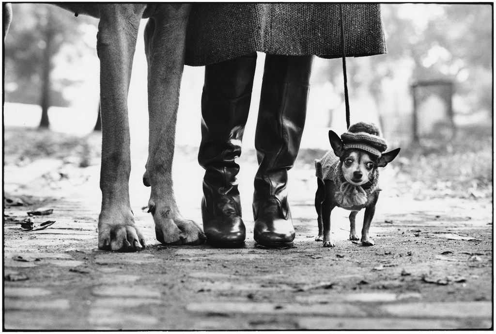
Without the immensity of the legs on the left filling the frame—a great compositional choice that exaggerates the sense of scale—the image would feel differently to us. Erwitt is a master of contrasts. Another of his favourite devices is the use of juxtaposition, which is another kind of contrast: the contrast of ideas. Here’s one of his more popular images that immediately comes to mind
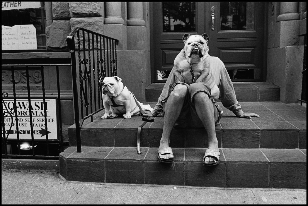
How Erwitt composed these images allowed these contrasts to be clear, even exaggerated. Had he done it differently, less intentionally, the illusions would be lost and we wouldn’t feel the humour.
Use Point of View
If I could get photographers to move around and play with point of view much more, I’d be a happy man. Take a moment to watch this short video by Ed Kashi and Ashley Gilbertson called, “It’ll Be Better Next Year.” Take special note of the compositions of the still images and how Ed’s very intentional use of point of view sets these images apart. In the same way (and sticking with the cowboy theme), take a look at the image below by Sam Abell.
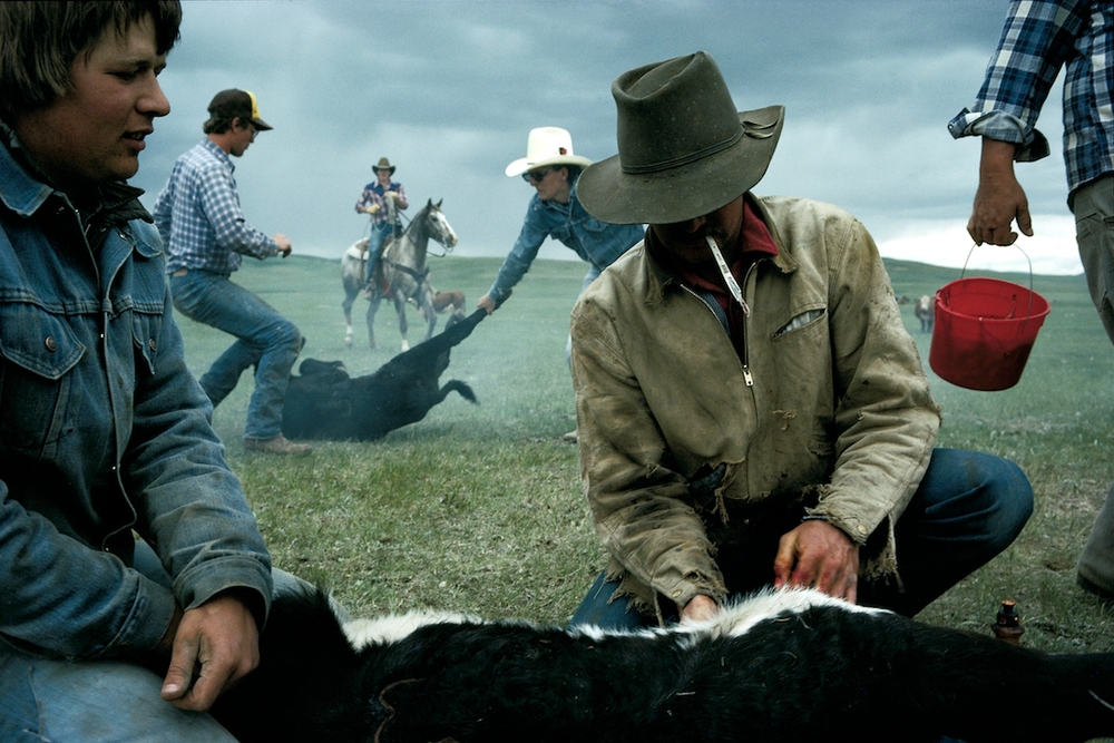
Abell’s intentional point of view (specifically, low and close and with a wider lens) allows us to feel included in this scene. By showing only part of the cow in the foreground and allowing the person with the red bucket to leave the scene, Sam pulls us in, and we feel the energy of the scene. That point of view also sub-frames the action in the background, pulling us into the very depth of the image. I think a whole masterclass could be done on this one image alone.
One of the things I love about making photographs is how so much goes into one image. Abell’s image above is a great example of a masterful combination of things, including the choice of moment: the moment the cowboy in the back was framed by the two cowboys in the mid-ground, at the same time that red bucket (which balances the image so beautifully) swung into view.
Use Energy
This is a harder one. Often it comes down to the choice of moment. Some moments just have more energy than others: the look on a face, the tension in a gesture. Abell’s image has great energy, and that comes from the way the background cowboy is pulling on the reins and the way the two mid-ground cowboys and the gesture of the calf create such tension. A moment later and the scene might have felt much more serene, and this image wouldn’t have felt the same way to us.
But there are others. Among them:
- How does hiding certain elements create a feeling of mystery, for example?
- How does your choice of light and what you do with it affect the mood of an image?
- How does your use of sub-framing (or the frame-within-a-frame device) draw someone into the image and allow them to feel like they’re much more immersed in the scene (not to go on and on about it, but Abell’s image above makes great use of sub-framing)?
Here’s the big question I’m hoping to get you to explore: what do we respond to emotionally in photographs, and how can we be more intentional about creating that?
We respond to depth, mood, and energy.
We respond to rhythms created with repeating elements.
To contrasts and juxtapositions.
To the kind of mystery that’s created when our compositions hide certain things rather than show it all.
We respond to certain colours.
We respond to the stories created in our minds when our compositions imply certain relationships between elements.
We respond to the serenity of a landscape that feels more spacious because we gave it more room in the frame.
We respond to the tension we feel when different elements in the frame pull our eyes in two different directions.
We feel cramped when the frame is overly packed with the subject matter or, in a portrait, the person is facing out of the frame, her nose almost touching the edges of the frame, rather than facing in with lots of room to breathe. Neither is right. Neither is wrong. They simply feel different.
Are you open to exploring this a little more?
The best way is with photographs you love—the ones that make you feel something. Study them. Pull together a collection of images, preferably those made by other photographers. Do a search for the great images of the 20th century, or grab some from my portfolios. Find the ones that make you feel something.
Once you’ve selected them, ask what it is within the frame that makes you feel something. What choices did the photographer make? Is it the choice of moment? The way the elements are arranged? The way the light was used? Anything else? If you can figure out what you respond to emotionally within a photograph, you can figure out how to put those same things into your own work.
I know I’ve said this before, but it’s all there. Nothing is hidden. Pick those images, those visual poems, apart. If you want to write stronger poems, you need to know what makes poems work. If you want to make more poetic images that create feeling, you’ve got to know how photographs work—most especially what makes them work for you.
Want to discuss this? Ask a question? Leave a comment on this article below. I’d love to hear from you.
I’ll be taking the next few weeks off, returning in early January. I hope you and yours have a wonderful holiday. It’ll be a strange one this year, and very possibly a difficult one for many. I wish you all the kind of light and love this holiday has always represented, and a new year that brings us all a little closer to the kind of normal in which we thrive. Thank you for allowing me to be part of your creative life this year. On behalf of Cynthia and me, I wish you joy and peace. Merry Christmas.
For the Love of The Photograph,
David
PS – Want more like this? I send these articles out every two weeks to photographers around the world who want to improve their craft and explore their creativity and I’d love to include you. Tell me where to send it and I’ll send you a copy of my best-selling eBook Make Better Photographs, as well bi-weekly articles, first-glimpse monographs of my new work, and very occasional news of resources to help you keep moving forward in this craft we love.
“Each and every one of your emails inspire and motivate me to want to jump right out of my chair away from my computer and shoot for the love of it . Thank you David.” – Millie Brown
Comments
Thank you!!
David,
Thank you for these last couple of articles. My last 2 of submissions to various sources came back with replies similar to; “Nice, but it looks like everyone else’s, and the weak images overwhelm the strong ones…”
I thought I was doing alright, but not so much anymore. You’re always inspiring, and it’s refreshing to hear and read what you have to say, thank you for that.
I have gone back into the galleries of some of my favorite photographers to get a grasp of “why”. Ernst Haas is one of my all time favorites for many reasons. And if nothing else, it’s been a pleasure to revisit his work
Hey Mark. Thanks for this. Remember that while the feedback you’ve been given can be really helpful, it is very limited and says nothing about your progress. It doesn’t reflect growth in your craft, or even your vision. It doesn’t speak to the risks you are taking or the ways in which your compositions might be getting more intentional. It doesn’t reflect growth towards greater poetry. It’s not totally unhelpful, but don’t give it more weight than it deserves, or than you can meaningfully act on. Feedback tells us what other people think, and not much else. Don’t get discouraged!
Hello! I found the last two posts very intriguing. I just received your book, “Soul of the Camera” and purchased a few ebooks. I am just a beginner, but do you offer videos, online course? Thanks for these blogs.
Merry Christmas
Joy Drennan.
Hello Joy! Thanks so much for this. Yes, I do offer some videos. I haven’t done so for a while but you can find about 80 episodes of Vision is Better on YouTube here: https://www.youtube.com/channel/UCrCj4BerLCMsHV3QT6OBB_A
I also have a couple courses. The next one will re-open again in January, and if you get my emails I’ll send you information in a few weeks, but much of the information about that course, The Compelling Frame, can be found at https://www.thecompellingframe.com/
If you don’t get my emails, but would like to, you can let me know where to send them here: https://www.mycontactsheet.com/
Hi David. Love your blog. Hopefully Santa is bringing me a bundle of your books for Xmas. Is it still possible to get hold of The Created Image Videos? The links don’t seem to work. Festive greetings from the UK.
Hi Colin, Thanks for the note. I’ve sent you a personal email about this. We’ll try to make it happen for you!
Hi David,
Sam Abell was one of the first photographers to inspire, encourage and teach me, several years ago. He had so many catch phrases I typed and printed them in blocks and made them into book marks. I still use them to this day and my husband will often come out with one of Sam’s pearls which is so good.
Compose and wait – for something to happen
Compose on the back layer first
Subject second
Fine photography is the result of a thoughtful process
Something should be implied
Bad weather makes good pictures
Keep the sun at your back
Put people above the Horizon line
I love Sam for his kindness and the gentle way in which he explains and teaches. I also love that you have referred to him – he is very special!
I was part of the Zoom group today in Sydney – you were thought provoking and inspirational. Thank you!
Happy Holidays!
Wondering about the red bucket. I find it distracting as my eye goes right to that first, and I like the rest of the image much more. Can you speak to why you like it?
Hi Tamara! Happy holidays to you too!
We all read photographs differently, but here’s my take. I see the red bucket and it pulls me into the image. High impact but low information. Why is it there? I look around the frame for additional clues, get pulled to the background and through the image to the foreground as the story unfolds. Cowboy on horse, cowboys with calf, cowboys castrating calf (you’d know that in the original context, a Nat Geo article with a clear caption). Suddenly the red bucket makes sense. It’s an exclamation mark. That’s what it contributes to the story.
Visually the red bucket also an exclamation point and not only pulls us in but also serves to balance the image. What first seems an accidental detail becomes the thing that keeps us in the image. For me it also gives life, a sense of spontaneity. It’s an imperfection that, for me, adds to the completeness and the poetry of the image. It adds a layer of complexity. As a result it won’t play well on Instagram or with those who want to glance at an image and move on, but for those who want to explore and image, to really read it, I think the bucket makes it. There’s also an interesting connection made with the repeated element of red. Blood on hands, red shirt, red bucket, that ties those elements together, creating another triangle of visual interest.
Remember too, that photographers don’t always make images so we like them, but so we read them, are drawn in by them, even ask questions of them (as in, “I wonder why the red bucket is there?”) Instagram has dulled our sensibilities when it comes to reading images. We’ve stopped appreciating the complexity and have started to lose the benefit of a more sophisticated visual palette. Or so I think.
Does any of this help?
Thank you David for always been so generous. Great advice, great photos, great video.
Wish you a merry christmas!
David,
Thank you and Merry Christmas.
Thank you for always challenging me to look deeper and go further. Merry Christmas!
Composition is the toughest part in photography, or i guess in painting. After learning the mechanics and how my camera works, this is really the main problem we face as an amateur.
Ted Forbes says the same thing about this.
Thank toi and happy Holiday.
Wonderful inspiration as usual! I just sent you an email which I hope reaches you. Hopefully you’ll get it before closing down for the holidays. Merry Christmas!
Thanks Lynne. I got it and just sent you a reply. Looking forward to seeing where this leads us. Thanks for asking.
Thank you for the gifts David, Peace and joy to your and yours.
Great article, David. The video was stunning – the whole thing and not just the still photos – spectacular though they were.
Great images, great thoughts. Have a peaceful, joyful holiday season, looking ahead to a better year for all, including the ranchers…
Well said! Dynamic symmetry lines coupled with an anchor in the foreground (when possible) attract people to your image but they don’t know why!
Break the rules! Negative space in the frame? Centered object? Give it a try!